
Effective Visualization of Multi-Dimensional Data — A Hands-on Approach. Introduction Descriptive Analytics is one of the core components of any analysis life-cycle pertaining to a data science project or even specific research.
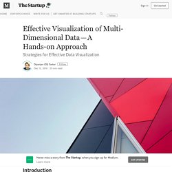
Data aggregation, summarization and visualization are some of the main pillars supporting this area of data analysis. Hadoop 101 - Cognitive Class. The Building Blocks of Interpretability. Learn. Learn. Plotting the Course Through Charted Waters. If Data Visualization is So Hot, Why Are People Leaving? There are prominent theorists and practitioners in data visualization that simply do not believe there is such a thing as a dedicated data visualization role in industry.
For those critics there is no profession, only a skill used near the end of a long process performed by scientists, analysts and engineers. In contrast, there’s a celebratory data visualization community that gathers for the Information is Beautiful Awards and looks to people like David McCandless as a thought leader. The more serious are in or allied with journalism, the more exotic might call themselves artists, and the freelancers and consulting firms that dominate this area might see themselves as a bit of both. The past and future of data visualization – Nick Brown. This weekend a friend of mine stumbled across old gold in the form of Willard Cope Brinton’s 1939 book Graphic Presentation.
It’s available to read online (from the always awesome Internet Archive). I highly recommend you spend 10 minutes perusing the book’s many example graphics. There must be 1,000 varieties of charts and graphics catalogued in the 500 page book, and despite being 75 years old, it still feels incredibly relevant today. I was particularly struck by the introduction titled Magic in Graphs: Whichgraph?
A research portfolio about visual explanations, learning and interactivity. What data are you using to tell your visual story? So You Think You Can Scroll. Jim Vallandingham @vlandham Abusing The Force.

GitHub - cookiengineer/machine-learning-for-dummies: Machine Learning for Dummies (aka Artificial Intelligence aka Deep Learning) Machine Learning for Dummies: Part 2 – Chatbot’s Life. The last article covered an introduction to Neural Networks and Evolutionary AI Concepts, in particular Genetic Programming and NEAT.
In case you’ve missed it, it is required to understand this article. Machine Learning for Dummies: Part 1 – Chatbot’s Life. I often get asked on how to get started with Machine Learning.
Most of the time, people have troubles understanding the maths behind all things. And I have to admit, I don’t like the maths either. Math is an abstract way of describing things. And I think the way machine learning is described is too abstract to understand it easily. So in this article (series?) A Complete Tutorial to learn Data Science in R from Scratch. Introduction R is a powerful language used widely for data analysis and statistical computing.
It was developed in early 90s. Since then, endless efforts have been made to improve R’s user interface. The journey of R language from a rudimentary text editor to interactive R Studio and more recently Jupyter Notebooks has engaged many data science communities across the world. Data visualization: A view of every Points of View column : Methagora. We’ve organized all the Points of View columns on data visualization published in Nature Methods and provide this as a guide to accessing this trove of practical advice on visualizing scientific data.
As of July 30, 2013 Nature Methods has published 35 Points of View columns written by Bang Wong, Martin Krzywinski and their co-authors: Nils Gehlenborg, Cydney Nielsen, Noam Shoresh, Rikke Schmidt Kjærgaard, Erica Savig and Alberto Cairo. As we prepare to launch a new column in our September issue we felt this would be a good time to collect and organize links to all the Points of View articles together in one place to make it easier to navigate this wonderful resource that the authors have provided us.
For the month of August we will be making all the columns free to access so everyone can benefit from this practical advice on data visualization. This should not be the end of the Points of View column though. A Snapshot of Current Trends in Visualization. Guest Editors’ Introduction • Theresa-Marie Rhyne and Min Chen • February 2017 Read the Guest Editors’ Introduction inSpanish | Chinese Translations by Osvaldo Perez and Tiejun Huang Listen to the Guest Editors' Introduction English (Steve Woods): Spanish (Martin Omana):
One Dataset, Visualized 25 Ways. “Let the data speak.”
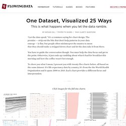
It’s a common saying for chart design. The premise — strip out the bits that don’t help patterns in your data emerge — is fine, but people often misinterpret the mantra to mean that they should make a stripped down chart and let the data take it from there. You have to guide the conversation though. You must help the data focus and get to the point. Otherwise, it just ends up rambling about what it had for breakfast this morning and how the coffee wasn’t hot enough. To show you what I mean, I present you with twenty-five charts below, all based on the same dataset. Click images for the full size charts. What Makes A Good Data Visualization? — Information is Beautiful. Hi there. I’m David McCandless, creator of this site and author of two infographic mega-tomes, Information is Beautiful (2009) and Knowledge is Beautiful (2014). I’ve created a lot of data and information visualizations.
Around 540 over six years. IBM Design Language. Visualizing data is central to this key moment in time, when the borders between big and impersonal, and small and intimate data will blur as we’ve never seen before. The greater the quantity and kinds of data collected, the more we need to experiment with how to make it unique. Instead of starting from standards, begin from a blank page and experiment with a custom visualization. Even if you come back to the basics, small details from your process and play can enhance basic charts to reveal more about topics users are interested in. Business intelligence tools lead people to believe that the ideal process to create visualizations is to load data in a tool, pick from among a list of out-of-the-box charts, and get the job done in a couple of clicks. Yet, simplified solutions are rarely able to frame hard-to-define problems, let alone solve them. Data Journeyman. TimeViz Browser.
Imrich, P.; Mueller, K.; Imre, D.; Zelenyuk, D. & Zhu, W.: Interactive Poster: 3D ThemeRiver. Poster Compendium of IEEE Symposium on Information Visualization (InfoVis), IEEE Computer Society, 2003. Imrich, P.; Mueller, K.; Imre, D.; Zelenyuk, D. & Zhu, W. (2003), © 2003 IEEE. Used with permission. Image courtesy of Ben Fry, MIT Media Laboratory, Aesthetics + Computation Group, © 1999-2005. Anemone by Fry, B. (2000) is a technique related to the visualization of structured information. Image courtesy of Michael Zornow. Tutorials and Resources Archives.
The Data Visualisation Catalogue. Motion Periodic Table. D3 in Depth. Interactive Data Analysis - Jeffrey Heer - May 23, 2013. 39 studies about human perception in 30 minutes. Bars and pies for proportions Much is said about the relative merits of bars and circles for showing proportions. All five of these studies legitimize the use of pie charts when conveying proportions and some even show their superiority over bar charts.
I did not encounter any studies that said we should not use pie charts for showing proportions in all cases. Eells (7) was among the first to publish a paper on this topic in 1926. In his time, pie charts were ridiculed much as they are today for their assumed perceptual inadequacies. He also wanted to know more about how circles were processed. Not only did he find that pie charts were read as easily, quickly and accurately as bar charts, but that as the number of components in the chart increased, bars become less efficient encoding the data. He found that 50 percent of people use the outer arc to make proportional judgments, while 25 percent use area, and the other 25 percent use the inner arc or angle. Archived Webinar: Learn the Essentials of Data Visualization.
Categories: Opportunities, Webinar Tags: Data Visualization, Webinar Earlier this month, we held the webinar, Learn the essentials of data visualization, with Stephanie Evergreen, a US-based expert on using research to present data effectively, and Andy Kirk, a UK-based apostle for better designed data visualization. 7 Data Visualization Types You Should be Using More (and How to Start) Declutter your data visualizations — storytelling with data. Dear Data Two. How Information Graphics Reveal Your Brain’s Blind Spots. This story was co-published with Source. Visual Evidence. 7 Data Visualization Types You Should be Using More (and How to Start) Junk Charts Trifecta Checkup: The Definitive Guide. The Junk Charts Trifecta Checkup is a general framework for data visualization criticism. It captures how I like to organize the thinking behind my critique pieces. The need for such a framework is clear.
Tell a Meaningful Story With Data. Rudyard Kipling once wrote, “If history were taught in the form of stories, it would never be forgotten.” The same applies to data. Companies must understand that data will be remembered only if presented in the right way. All the 'little of visualisation of design' Datavisualization.ch.
DataIsBeautiful. Which chart or graph is right for you? This paper helps you determine when to use what type of chart. Close Download the PDF. D3 Tutorials, D3 Screencasts, and a D3 Newsletter. Happy (Belated) PiDay 2016! References for visualising uncertainty. Data Visualization and Analytics to Grow your Business. Tailoring a Visualization Product to Your Business Once we’ve indentified the business, dashboard, data, and design objectives, we create a product that’s custom tailored to the way your business operates. Home - Seeing Data.