
The Nerdy Charm of Artisanal, Hand-Drawn Infographics. When sociologist W.
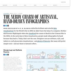
E. B. Du Bois crafted his brilliant and colorful data visualizations for the World’s Fair in 1900, he didn’t have the help of a computer. Periodic Table of Elements. The periodic table: Which elements are in danger of running out? Today marks 150 years since Russian chemist Dmitri Mendeleev published the first recognisable version of the periodic table – a visual representation of how chemical elements relate to one another.

Since then, the substances depicted have been used to make everything from rocket fuel to raincoats, but our overreliance on some – especially those used in smartphones – is starting to put a strain on resources. Click on the picture to see the enlarged images, or pick up a copy of the new-look BBC Science Focus for the full infographic – available from 6 March. AKC Top 100 Dog Breeds in the United States – Gwynn Group. Gwynn Group — February 13, 2019 Inspired by our love of intricately beautiful data visualizations and furry friends, we decided to dabble in creating our own display of AKC’s Most Popular Dog Breeds list.
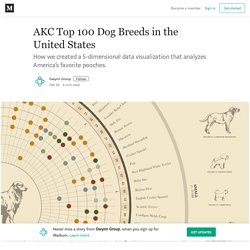
We were so passionate about this project, and so thrilled by the way it turned out, that we wanted to share every step of our journey from conceptualization to our final visualization and everything in between. *If you want to skip reading about our design process and go straight to the good stuff, scroll to the bottom for a full view of our custom visualization! The original list assembled by AKC contained 190 different breeds. We realized that trying to squeeze nearly 200 breed names onto a single graph would be an almost impossible feat in itself, not to mention whether the minuscule font size needed to label every breed would be at all legible.
Use these tools to help visualize the horror of rising sea levels. How to Spot Visualization Lies. It used to be that we’d see a poorly made graph or a data design goof, laugh it up a bit, and then carry on.
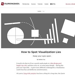
At some point though — during this past year especially — it grew more difficult to distinguish a visualization snafu from bias and deliberate misinformation. Of course, lying with statistics has been a thing for a long time, but charts tend to spread far and wide these days. There’s a lot of them. Some don’t tell the truth. Maybe you glance at it and that’s it, but a simple message sticks and builds. Leslie Roberts. Showcase. Numberpicture. The 25 Best Data Visualizations of 2018 - Global Investigative Journalism Network. Chart Combinations: Visualizing Data in Calendars - Dataviz Catalogue. - The Washington Post.
The list of 2018 visualization lists. Officially a yearly habit now: the the list of visualization lists.
So here is my list of visualisations, charts, graphics, maps, satellite journalism and science photography lists, version 2018. Stories, Charts and Maps @FlowingData: Best Data Visualization Projects of 2018 @ReutersGraphics: The Reuters graphics department takes a lookback at a year’s worth of work. Good enough to great. 100+ Years of Graphs of the Titanic Data. 2018: The Year in Visual Stories and Graphics. 20 Ways to Visualize KPIs.
Happy holidays! — storytelling with data. Earlier this month, I put forth a festive challenge: visualize data related to the holidays.
A few dozen people accepted, tracking down data, crafting and sharing creative visualizations on topics like holiday music, cookie calories and winter temperatures. There were snowflakes, ornaments and many real—and fake! —trees. Simulated Dendrochronology of U.S. immigration. Simulated Dendrochronology of U.S.
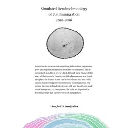
Immigration. The Winners of the Information Is Beautiful Awards for 2018. Dashboard Design: A study on eye tracking. Sound Artist Ryoji Ikeda Visualizes Big Data. PARIS — Situated within an art-historical/art-hysterical continuum that mines big data for thematic material, Centre Pompidou’s two-part “continuum” show is Paris-based Japanese sound artist Ryoji Ikeda’s latest audiovisual cornucopia.
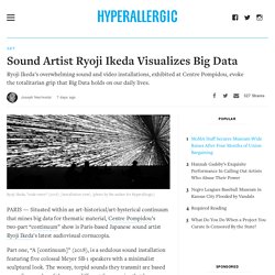
Part one, “A [continuum]” (2018), is a sedulous sound installation featuring five colossal Meyer SB-1 speakers with a minimalist sculptural look. The woozy, torpid sounds they transmit are based on audio samples of the many different frequencies that have defined concert pitch A over the centuries, from Bach’s era through the 1970s—thus obliquely referencing a huge swath of Western music. Moving through the white-walled room, one hears over the speakers an acoustic, abstract ocean of loud sine waves, similar to the sounds of tuning forks—very much in the vein of La Monte Young’s 1974 Theatre of Eternal Music recording “Drift Study 14 VII 73 9:27:27-10:06:41 PM NYC” (the basis of Young’s Dream House), but less bountiful.
OECD Better Life Index. Flights to Rome - moovel lab. DataVizChecklist. Figures in the Stars. No matter where you are on Earth, we all look up to the same sky during the dark nights.
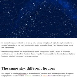
You might see a different section of it depending on your exact location, time & season, nevertheless the stars have fascinated humans across time and continents. Our own creativity combined with stories about local legends and myths have created a diverse set of different constellations. And even though the stars don't change, people have found many different shapes in the same sky. From humans, to animals, to objects, and even abstract concepts. Find the graphic you need. See 200 Years of Immigration in the United States as a Graphic of a Growing Tree. Blockchain explained. Interactive: Learning and Leadership Models Today’s Digital Business Environment. Advanced Analytics, Cyber Capabilities, Tactical Mobility Solutions for National Security. Let’s talk about six ways you might visualize graphs.
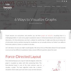
We will use the Les Miserables dataset for each example so we can see how different visualizations help us answer different questions about the novel. An example graph using a force-directed layout. Parts of the graph are hairballs, but we can see overall structure and trace which nodes are connected to the central characters. 10 Do’s and Don’ts of Infographic Chart Design. Evolution of the English Alphabet – UsefulCharts. April 06, 2018 Unfortunately, all of the limited edition signed & numbered prints are now gone and I will not be printing any more. However, you can download the chart and print it yourself using the below links. Or you can check out this related poster. Find out the environmental impact of your Google searches and internet usage. Every Google search comes at a cost to the planet. In processing 3.5 billion searches a day, the world’s most popular website accounts for about 40% of the internet’s carbon footprint.
Despite the notion that the internet is a “cloud,” it actually relies on millions of physical servers in data centers around the world, which are connected with miles of undersea cables, switches, and routers, all requiring a lot of energy to run. World of Mathematics. The “thinking” benefits of doodling. Follow me on Twitter @srinipillay Have you ever found yourself listening to something really boring, then wafting off into your own mind, your hand scribbling random things on a piece of paper in front of you? Whether it’s a conference call or a tedious lecture, being all ears can be a challenge when your hands want to be a part of the moment.
Nobody is immune to this either. Even American presidents have found themselves sketching away: 26 of 44 American Presidents doodled, from Theodore Roosevelt, who doodled animals and children, to Ronald Reagan, who doodled cowboys and football players, and John F. Shapes for Sounds: A Visual History of the Alphabet.
Xenographics – Weird but (sometimes) useful charts. How work has evolved for Switzerland’s women and men. × Close Copyright All rights reserved. The content of the website by swissinfo.ch is copyrighted. Observable. The Lives of 10 Famous Painters, Visualized as Minimalist Infographic Biographies. By Maria Popova For their latest masterpiece, my friend Giorgia Lupi and her team at Accurat — who have previously given us such gems as a timeline of the future based on famous fiction, a visualization of global brain drain, and visual histories of the Nobel Prize and the 100 geniuses of language — have teamed up with illustrator Michela Buttignol to visualize the lives of ten famous painters, using the visual metaphors of painting and the specific stylistic preferences — shapes, colors, proportions — of each artist.
Each visual biography depicts key biographical moments — births, deaths, love affairs, marriages, birth of children, travel — as well as notable and curious features like handedness (mostly righties, with the exception of Klee), astrological sign, and connections. Buckets: NBA Shot Visualization. To Build a Better Ballot. Vizzuality. Different languages: How cultures around the world draw shapes differently. Musical Hexagons. Lucify. OddityViz — a tribute to David Bowie with data. #ODDITYVIZ Space Oddity – a visual deconstruction. Showcase — Information is Beautiful Awards. Data ITEMS: Exploring the Power and Depth of Soft Data for the Museum of Modern Art. Lucify. Tibco – The Algorithmic Insurer.
Escapelab. Обійми Дощу - Разом (синґл, 2017) TopLink. An Interactive Visualization of Every Line in Hamilton. Work — giorgialupi. Happy Planet Index. Google News Lab: The Year in Language. Building, Exploring and Explaining Data. LEGO color themes as topic models // Nathanael Aff. Explorable Explanations. Occupation Matchmaker. The Evolution of a Scientific American Graphic: Solar Eclipses - Scientific American Blog Network. Coming Soon? A Solar Eclipse Near You. Gallery of Concept Visualization. A Dozen DataViz-Related Pinterest Profiles to Follow - Policy Viz. Seven More DataViz-Related Pinterest Profiles to Follow - Policy Viz. CodePen - Fenêtres. About - Open Knowledge Maps. Online Graphics. PatentsView. What's Really Warming the World? Climate deniers blame natural factors; NASA data proves otherwise.
Visual explanations from all over the web gathered in one big library. So You Think You Can Scroll. The Graph Is Dead. Emotions.periscopic. Top 15 Best Information Graphics and Data Viz from 2016. Projects.fivethirtyeight. The 52 Best — And Weirdest — Charts We Made In 2016. All of Donald Trump's Business Ties in One Overwhelming Visualization.
50 years of U.S. mass shootings: The victims, sites, killers and weapons - Washington Post. Top 17 Data Visualizations To Review 2017 - Visual Matters. Strategy&'s M&A - Interactive Tool. The State of Information Visualization, 2017. 2016: Our Favorite Codrops Resources. Announcing the Winners of the Student Viz Assignment Contest! Readers' Choice: Top 5 Vizzes of 2016. Jet Propulsion Laboratory - 80 Years of Reaching for the Stars. Passport Index 2016 - World's passports in one place. What I Wrote About In 2016 · Lisa Charlotte Rost. 10 significant visualisation developments: July to December 2016. 10 significant visualisation developments: January to June 2016. The charts of 2016. Damn, We Wish We’d Written These 11 Stories.
The Best And Worst Data Stories Of 2016. The Best WSJ Graphics and Visual Stories From 2016 - WSJ.com. The list of 2016 visualization lists. 2016 in Graphics.