

Drag and drop sur le web : exemples et bonnes pratiques. Le drag and drop (ou “glisser-déposer”) s’est immiscé progressivement sur le web.

Ce principe d'interaction est ludique et pratique pour l'utilisateur. S'appuyant sur la métaphore de l'interaction dans le monde réel, il est également facile à mémoriser. Cependant, il est parfois difficile d'indiquer la possibilité du drag and drop. Cet article présente les bonnes pratiques de l'interaction de drag and drop sur le web en suivant la chronologie de l’interaction : l'initiation, le déplacement et la validation. Nous verrons qu'un bon guidage est essentiel tout au long de l'interaction. Initier l'interaction Avant même de concevoir l'interaction de drag and drop, il faut faire comprendre à l’utilisateur qu’il peut faire glisser des éléments. Sur le site Netvibes, seule la modification du curseur indiquait le drag and drop. Depuis, Netvibes a intégré un tutoriel d’initiation qui apparaît lors de l’inscription au site. Adrian Sommeling, photographie. Photographe et photo-manipulateur hollandais, Adrian Sommeling travaille dans un registre relativement fun et décalé.

Découvrez un extrait de son portfolio dans la suite. Adrian reste assez discret sur sa carrière et sa biographie en général. C’est peut-être un choix, mais peux importe, ce qui nous intéresse principalement ici est son portfolio. Ses portraits mettent en scène très souvent des enfants, mis dans des situations originales et hors du commun. Le tout avec une bonne dose de photomanipulations. Making of. LAB! - 3D it! Using CSS 3d to make every website into 3d(kind of).

It is a bit buggy but you can bookmark the script to your bookmark bar and have some 3D fun on any websites by one single click! The get offset function is not accurate, it looks weird then the div is too large but it looks alright on most of the sites. Control Change the parameters and see the preview of your customized 3d script: 5 Really Useful Responsive Web Design Patterns. Responsive web design requires a very different way of thinking about layout that is both challenging and exciting.
The art of layout was already complex enough for the centuries that it was defined by fixed elements, now things are becoming exponentially more complicated as layouts become increasingly adaptive. To help reprogram your brain to consider layouts in new ways, we’re going to take a look at some interesting responsive design patterns that are being implemented by talented designers all over the web. Starting Small One of the most popular ways that I see responsive design being implemented is to simply assign a fluid width to the columns of content on the page, which become narrower and narrower as the page width decreases until the one major jump to a single column mobile layout. We can see this technique at work on the luxury hotel website 137 Pillars House. As you can see, the layout really only goes through a single major transformation.
Use Gridpak to Roll Your Own Responsive Grid. I love finding free tools that are capable of making my job (and yours) just a little bit easier.
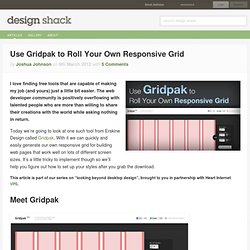
The web developer community is positively overflowing with talented people who are more than willing to share their creations with the world while asking nothing in return. Responsive Web Design: 5 Handy Tips. Tutorial by Matt Doyle | Level: Intermediate | Published on 17 February 2012 Categories: Learn how to improve your responsive website layouts with 5 useful techniques: Hiding content, collapsing content, scaling images, responsive images, and type resizing.
In my previous article Responsive Web Design Demystified, I explained the concepts behind responsive web design, and showed how to build a simple responsive layout from the ground up. In this article, you learn five additional techniques that will help you build great responsive layouts. You'll put each technique into practice as you build on the responsive layout created in the previous article. 10+ Testing Tools for Responsive Web Design. Finally, as we develop our responsive website, we’ll come to the point where our content clean and adaptive, our images are flexible and our layout is fluid.
Now we need to make sure that our site works in as many browsing environments as possible and test the website in different resolutions and how the media queries work. To get started with building a responsive site, having a strong toolkit (see also: 10 Free and Responsive jQuery Slide/Gallery Plugins and jQuery Plugins for Fluid Layouts/Responsive Web Design) can make a world of difference. Testing responsive web design could turn out to be a tough job, it’s not convenient resizing to a specific dimension (width and height) each time. Changing browser width and testing it across different browsers and devices is painful and adds loads of development time. Tester son site en responsive web design. BenjaminKeen.com. The ultimate responsive web design roundup.
Responsive design is the new darling of the web design world.
It seems that not a week goes by that there aren’t new resources for doing it, opinions about how to do it or even whether to do it at all, and new sites that make beautiful use of it. It can quickly get overwhelming trying to keep up with it all. Here we’ve compiled a list of more than seventy resources for creating responsive designs. Included are articles discussing responsive design and related theories, frameworks and boilerplates for responsive layouts, tools for testing your responsive designs, techniques for resizable images, and a whole lot more. Then, to top it all off, we’ve collected a hundred of the best responsive designs out there right now to inspire you and give you some real-world ideas. Articles and Publications. Loi de Fitts. Un article de Wikipédia, l'encyclopédie libre.

§Le modèle[modifier | modifier le code] Mathématiquement, la loi de Fitts a été formulée de plusieurs manières différentes. Une forme commune est la formulation de Shannon (proposée par Scott MacKenzie, et nommée d'après sa ressemblance avec le théorème de Shannon-Hartley (en)) pour le mouvement suivant une unique dimension : où. Goban Club – Responsive Web Design par Ethan Marcotte : une traduction française. Le Web Design Réactif par ETHAN MARCOTTE Le contrôle qu’exercent les designers au sein du média imprimé et qu’ils désirent souvent retrouver au sein du virtuel est simplement le produit d’une limitation de la page imprimée.
Nous devrions accepter le fait que le Web n’a pas les mêmes contraintes, et concevoir en fonction de cette flexibilité. Mais avant, nous devons « accepter le flux et le cours des choses. Css3-mediaqueries-js - css3-mediaqueries.js: make CSS3 Media Queries work in all browsers (JavaScript library) Css3-mediaqueries.js by Wouter van der Graaf is a JavaScript library to make IE 5+, Firefox 1+ and Safari 2 transparently parse, test and apply CSS3 Media Queries.
Firefox 3.5+, Opera 7+, Safari 3+ and Chrome already offer native support. UPDATE: Google discontinued the downloads section. Download newest version 1.0 from here: Usage: just include the script in your pages. Content Choreography. The concept of permanently placing content on a web page for a single browsing width or resolution is becoming a thing of the past. Media-queried responsive & adaptive sites afford us the ability to re-architect content on a page to fit its container, but with this exciting new potential come equally exciting challenges. Web designers will have to look beyond the layout in front of them to envision how its elements will reflow & lockup at various widths while maintaining form & hierarchy. Media queries can be used to do more than patch broken layouts: with proper planning, we can begin to choreograph content proportional to screen size, serving the best possible experience at any width.
As I step into my 3rd responsive project with Paravel, I’ve made a habit out of picking apart media-queried sites I happen across, noting how things get rearranged at various widths. At times, it seems as though all of the site architecture & planning goes out the window as content reflows. Responsive design : définition, fonctionnement, ressources et tutoriels. Code a Responsive Navigation Menu. Navigation menus used to be a fairly simple thing. Code up an unordered list, float it left and you’re good to go.
With responsive design being all the rage these days though you’re faced with some new challenges when creating a menu design. Follow along as we start from scratch and code a simple but effective responsive navigation menu that you can easily modify and reuse in your own projects. What We’re Building If you’re the kind of person who likes to skip ahead, here’s a sneak peek at what we’re building. Demo: Click here to see and tweak it on Dabblet.
The HTML Let’s jump right into this project without a bunch of unnecessary fluff. jQuery Mobile. Designing for Touch Screen. Now, this post was supposed to go out about two weeks ago, and since then it seems that every designer under the sun has written on the same subject – That’ll teach us for being lazy. Nonetheless, we decided to publish it anyway, just in case anyone missed any of the other great posts out there… By now you should all have heard of the iPad, and if not then you must have been living under a rock for the last few months! Touch screen devices are here to stay and you need to start thinking about how to design and develop to get the most out of them. Apple would like you to believe that the iPad is the only touch screen device that anyone should own (and to be honest it probably is the best), but there are already some strong competitors, and many more coming to the market this year.
So, you need to get your thinking caps on and start designing your websites to work with them, as well as updating your other sites, too. 1. CSS hover states (such as a:hover) are not supported. 2. 1024 x 768.