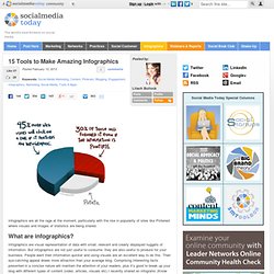

The Best Infographics on the Planet. 15 Tools to Make Amazing Infographics. Infographics are all the rage at the moment, particularly with the rise in popularity of sites like Pinterest where visuals and images of statistics are being shared.

Infographics are visual representation of data with small, relevant and clearly displayed nuggets of information. But infographics are not just useful to consume, they are also useful to produce for your business. People want their information quicker and using visuals are an excellent way to do this. Their eye-catching appeal draws more attraction than your average blog.
Comprising interesting facts presented in a concise nature will maintain the attention of your readers, plus it’s good to break up your blog with different types of content (video, articles, visuals etc) I recently shared an infograhic (Know Thy Internet Marketing Commandments) and found that generated a lot more shares than an average blog post. The Stats Behind Pinterest Users [INFOGRAPHIC] By Jason Keath on Feb 08, 2013 As Pinterest continues to grow, and looks to bring on more funding, more and more businesses are considering jumping in to the scrapbooking deep end.
![The Stats Behind Pinterest Users [INFOGRAPHIC]](http://cdn.pearltrees.com/s/pic/th/behind-pinterest-infographic-50963846)
Some clues also suggest that Pinterest ads could be coming soon. Wishpong put together the below infographic, pulling together some of the more useful stats about Pinterest and its users from the last year. At Social Fresh, we want to build tools that marketers need. If you have questions about Pinterest, please include them in the comments. Managing Millennials: Why Gen Y Will Be Running the Country by 2020 [INFOGRAPHIC]
In just eight short years, 46% of the U.S. workforce will be comprised of millennials.
![Managing Millennials: Why Gen Y Will Be Running the Country by 2020 [INFOGRAPHIC]](http://cdn.pearltrees.com/s/pic/th/millennials-infographic-33212705)
Whether you're frightened or excited by the prospect, the fact remains that young adults born between 1976 and 2001 will be running this country. Twitter Facts And Figures For Businesses And Brands [INFOGRAPHIC] An Engaged Audience [INFOGRAPHIC] Every web publisher — and especially content marketer — yearns for an engaged and loyal audience.
![an Engaged Audience [INFOGRAPHIC]](http://cdn.pearltrees.com/s/pic/th/engaged-audience-infographic-33131475)
But with the sheer volume of noise, clutter and — well, content — online it can be hard to figure out how to reach people and keep them coming back for more. The content marketing agency BlueGlass knows a lot about how to do this well. They've run successful campaigns for clients including eBay, Conde Nast and Greatist. Now BlueGlass is ready to share some of its secrets with Mashable readers. The company produced this exclusive infographic to run down some of the ways you too can build an engaged audience online. Korean Band 2NE1 Dominates Social at Cannes Lions [INFOGRAPHIC] Selena Gomez Tops Buzz at Cannes Lions [INFOGRAPHIC] The Cannes Lions International Festival of Creativity wrapped up in the south of France on Saturday, but people continue talking about the event's hot awards and high-profile guests.
![Selena Gomez Tops Buzz at Cannes Lions [INFOGRAPHIC]](http://cdn.pearltrees.com/s/pic/th/selena-cannes-infographic-33130171)
Cruising into the top spot was Selena Gomez, who attended the conference to speak on a panel called "Millennials and the Future of Creativity. " According to the infographic, created by SapientNitro, the actress and singer tweeted about her participation, earning over 2,600 additional tweets and conversations on Twitter alone. Twitter Dominates Day 2 of Cannes Lions [INFOGRAPHIC] The world's premier brand communications conference, Cannes Lions International Festival of Creativity, is well underway at its dazzling seaside location in the south of France.
![Twitter Dominates Day 2 of Cannes Lions [INFOGRAPHIC]](http://cdn.pearltrees.com/s/pic/th/twitter-dominates-infographic-32506182)
Perhaps due to the city's romantic charm, festival attendees have been checking in to the beach on Foursquare and documenting their morning croissants on Pinterest. But most of the Cannes Lions chatter is happening on Twitter. SEE ALSO: Cannes Lions: Ideas, People and Companies With Big Buzz Based on this infographic created by SapientNitro, the event has earned more than 56,000 Twitter mentions in its first three days. And the official @Cannes_Lions account has nearly equal the number of followers. Check out Cannes Lions' list of award winners thus far, and follow Cannes Lions online as more winners are announced. Who Are the Real Online Influencers? [INFOGRAPHIC] As the web's capacity for pageviews increases, marketers are becoming less interested in reaching as many people as possible, and more interested in reaching the right people.
![Who Are the Real Online Influencers? [INFOGRAPHIC]](http://cdn.pearltrees.com/s/pic/th/online-influencers-infographic-135574418)
According to Deanna Brown, the CEO of Federated Media, that's why context is so important — the ability serve high volumes of advertising continues to expand, but the real value for a brand is to surround its message with the right context so that it reaches the most influential people among customers. Yet, while most marketers agree that reaching influencers is important, they question how to measure influence and how to determine the most influential people online in the first place.
Are you influential if you reach a massive number of followers? Or is it more about reaching small groups of highly targeted individuals? The infographic below, from influence marketing firm Crowdtap, sheds some light on the current predominant thinking regarding how to reach influencers. Social Media Companies: A Cheat Sheet [INFOGRAPHIC] So you're new to this whole social media thing.
![Social Media Companies: A Cheat Sheet [INFOGRAPHIC]](http://cdn.pearltrees.com/s/pic/th/social-companies-infographic-31009654)
Maybe you're savvy enough to know your Facebook from your Twitter, your Pinterest from your Spotify. How Beer Saved the World. Beer and I are currently in a love/hate relationship.

There’s no doubt the beverage itself is delicious, but my senior design project involves designing a brewery, and it’s a pain. Luckily today’s infographic focuses mostly on the positive aspects of beer. Beer has been around for a long time, and there’s a simple reason: people love it. Another reason is that a long time ago, beer was safer to drink than water due to the presence of deadly bacterias in water. INFOGRAPHIC: Social recruiting: How to use social media to land a job. Mad Men in the modern tech world. Mad Men Infographic: Don Draper's Women. American students studying abroad. ‘Mad Men’ Infographic: The Cost of Being Don Draper (1962 vs Today) What Are The Next Big Things In Technology? #infographic. SXSW 2012: visualising its evolution. With New Tool, Visual.ly Wants To Replace PowerPoint With Infographics.
"Before PowerPoint, you had to go find a designer to create a custom presentation," says Stew Langille.

"Even though everyone hates PowerPoint now, it was really helpful when it first came out. " Now Langille’s startup, Visual.ly, is attempting to do for infographics what Microsoft did for presentations. Social Demographics: Who's Using Today's Biggest Networks [INFOGRAPHIC] More than 66% of adults are connected to one or more social media platforms, but who exactly are these people? The infographic below, created by Online MBA, breaks down the demographics, including education level, income, age and gender of social media users, along with other miscellaneous facts. Some sites' users are more demographically alike than others. One thing is the same for most social sites — college students, or those who have completed some college, represent the majority on social media sites like Facebook, Twitter, Pinterest, Digg and Reddit. Among Facebook users, 57% have completed some college, and 24% have earned a bachelor's or master's degree.
Although, people 45 and older make up 46% of Facebook users. Social Media Usage in the UK. Social Media Usage in the UK is a new infographic from Umpf.co.uk. We then analysed the results to bring what we believe is the most up-to-date snapshot of social media usage in the UK. If you like statistics, you can view them all here.Our infographic, created by Vapour, helps visualise statistics; it outlines the gender and age differences in social media usage. It needs a title. Portfolio. State Of The Social Media Agency [INFOGRAPHIC] By Jason Keath on Feb 13, 2012 We created a social media directory named InvestInSocial.com in February 2011. Google+ Most Popular With Male Users, Students [INFOGRAPHIC] The stereotypical Google+ user is a male engineer, but that's only half right. According to new research, Google+ is still definitely male-skewing, but students outnumber software engineers by a wide margin.
That's one of the most compelling bits of data compiled by Website-Monitoring. A little more than a half year after launch, Website-Monitoring took a look at the demographics behind Google+. One surprise is the number of students on the network — 20%. That compares to the next most-popular profession on the list, software engineers (2.65%). Meanwhile, the site seems to be popular in India. The Future of Sharing on Facebook, Twitter and Google+ Users of social networks are getting tired of sharing — but that doesn't mean sharing is on the decline. A new study analyzes sharing behaviors on Facebook, Twitter and Google+ and makes predictions for the future of sharing. Digital agency Beyond released the study for Social Media Week, along with the below infographic. Beyond makes six predictions about where sharing is headed based on the responses of 2,000 social media users in the U.S. and UK, between ages 16 and 40, who are active on either Twitter, Facebook or Google+.
Among those users, 98% were active on Facebook, 60% of whom log in several times daily. What If Social Media Sites Were Your Neighbors? What Are 10 Ways To Increase Sales In 2012. How To Get A Job In Social Media In 5 Minutes. Have you ever wondered what it takes to land a job in the social media space? The Social Media Salary Guide [INFOGRAPHIC] 2012 Future Of Marketing Blogging And Social Media Infographic. Stacy Green, Will You Marry Me? [INFOGRAPHIC] What If Social Media Sites Were Your Neighbors? With Infographic, Airbnb Turns Boring Facts Into Masterful Marketing. The 2012 Community Manager Report [INFOGRAPHIC] The Social Job Seeker: How Facebook, LinkedIn And Twitter Help People Find Work [INFOGRAPHIC] Measuring the Business Impact of Social Media [INFOGRAPHIC] Why Social Media Isn’t A Waste Of Time [INFOGRAPHIC] Alltop - Top Infographics News. The Social Media Lifecycle [Infographic]
The purpose of any piece of data you use in your business is to help you make better decisions. These decisions can be very simple, such as replying to someone’s tweet about your brand or to a comment a customer posts on your Facebook page. Or they can be very complex, such as launching a new product. Whatever the case, data is supposed to help you make those decisions faster while getting better results. Think Infographics are New? At London's Transport Museum, They Date Back to the 1920s. © London Transport Museum. Infographic World. Best Infographic of 2011. The Traveller’s Guide to Happiness – Infographic. 8 Great Marketing Infographics To Inspire Your 2012 Objectives. It’s the dawn of a New Year and maybe you are looking for some marketing inspiration as you set your 2012 objectives and plan for the year ahead.
And if you are trying to drive positive change in your organization, sometimes a picture is better than a thousand powerpoint decks. Social Media Statistics For 2012 The price of SEO: infographic. A world of tweets. The biggest logo makeovers of 2011. An Interactive Infographic – If This is the Future for All Infographics I Am Excited!