
Do Not Smile. Sans titre. Depuis cette nuit, la Terre vit sur ses réserves. Naziha Mestaoui, One Heart, One Tree. Global climate talks. Apollo programme for clean energy 'needed to tackle climate change' A plan to tackle climate change by emulating the race to put a man on the moon is launched on Tuesday, aiming to channel billions of dollars in research that will give renewable energy commercial lift off.
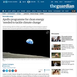
The Global Apollo Programme aims to make the cost of clean electricity lower than that from coal-fired power stations across the world within 10 years. It calls for £15bn a year of spending on research, development and demonstration of green energy and energy storage, the same funding in today’s money that the US Apollo programme spent in putting astronauts on the moon. The plan is the brainchild of a group of eminent UK scientists, economists and businessmen including Sir David King, currently the UK’s climate change envoy, Lord Nicholas Stern, Lord Adair Turner and ex-BP chief Lord John Browne. Clean Energy Info Portal - reegle. Country Energy Profile: Belgium - Clean Energy Information Portal - reegle. Meat consumption per capita. Between 1961 and 2002, meat consumption has seen a large increase virtually worldwide and a corresponding jump in its environmental impact.
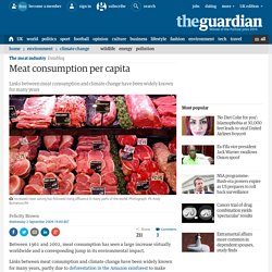
Links between meat consumption and climate change have been widely known for many years, partly due to deforestation in the Amazon rainforest to make room for the livestock. Clearing these forests is estimated to produce a staggering 17% of global greenhouse gas emissions, more than the entire transport sector. Increased meat-eating has followed rising affluence in many parts of the world. China's levels doubled between 1990 and 2002. The size of the hole in the ozone layer. The ozone layer is vital for the continuation of much of life on earth - its protective effect stops harmful UV-C radiation from reaching the surface.
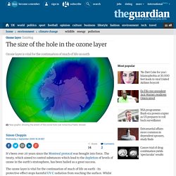
Whilst some of our efforts may have had unintended consequences , the struggle still remains to ensure that the existing hole does not continue to grow. The data below shows that since the Montreal protocol came into force, the size of the ozone hole has increased in size by 36%. Global surface temperatures. Carbon emissions data: can the Copenhagen climate summit bring these down? Full data, new viz. The Csummit is finally here - and Copenhagen is likely to be a historic moment, whatever the result.
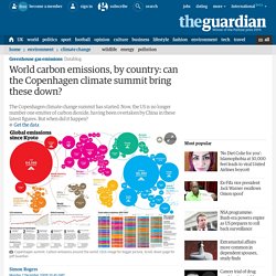
The background to the Copnehagen summit is the amount of carbon we're pumping out into the atmosphere. These are the figures, and the latest visualisation we've produced. Which country is number one in carbon emissions? Up until very recently, it was the US - now, it is indisputedly China, as shown by this data. The Copenhagen climate summit 'Danish' text - as a wordle. The UN Copenhagen climate talks are in disarray today after developing countries reacted furiously to leaked documents that show world leaders will next week be asked to sign an agreement that hands more power to rich countries and sidelines the UN's role in all future climate change negotiations.
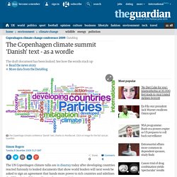
We wondered what this text looked like as a Wordle. The results are here - and the full word counts are below. Copenhagen confusion: Information is beautiful on the climate change sceptics. I'm fascinated by climate deniers and climate sceptics.
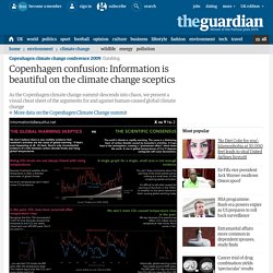
How could anyone refute that climate change is happening? What evidence is there? Surely it's unambiguous? In the aftermath of ClimateGate, and amid all the shouting and slammed doors in Copenhagen, it's difficult to be clear about the key scientific arguments. Confused and curious, I investigated the main statements made by climate sceptics and sought out the counter-views, as presented by climate research scientists at RealClimate.org and SkepticalScience.com.
Information is Beautiful: When Sea Levels Attack. Another day, another set of bewildering climate figures.
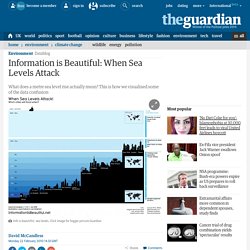
Today, key climate scientists withdrew their predictions. Of a metre sea-level rise by 2100. Carbon emissions in every local authority in the UK. See what they are where you live. The government has published carbon emisisons at a detailed level across the UK.
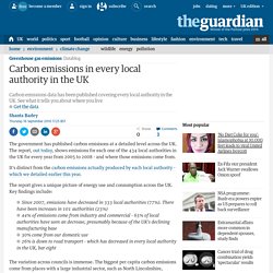
The report, out today, shows emissions for each one of the 434 local authorities in the UK for every year from 2005 to 2008 - and where those emissions come from. It's distinct from the carbon emissions actually produced by each local authority - which we detailed earlier this year. The report gives a unique picture of energy use and consumption across the UK.
Key findings include: • Since 2007, emissions have decreased in 333 local authorities (77%). Groundbreaking data tracks carbon emissions back to their source. Which of the following accounts for the largest share of the UK's carbon footprint?
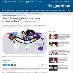
All our holiday flights, all the power used in our homes or … Russia? Okay, so it's kind of a trick question, but according to a scientific paper published this week, we might reasonably conclude that the answer is Russia – though to understand why it's necessary to go back a couple of steps. For the purposes of the Kyoto treaty, a nation's carbon footprint is considered to be a sum of all the greenhouse gas released within its borders. But as many people – myself included – have been pointing out for years, that approach ignores all the laptops, leggings, lampshades and other goods that rich countries import from China and elsewhere. Carbon map infographic: a new way to see the Earth move. How can you map the world to show global data in an immediately clear way?
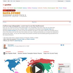
How can you show two datasets at once to see how they compare? Kiln, a partnership of Guardian writer Duncan Clark and developer Robin Houston has come up with this beautiful new take on the globe. Watch the animated intro or click on the topics and see the map move before your eyes. Adding shading lets you compare two datasets to see how they relate – so you can see clearly how poorest countries have the fastest growing populations but the lowest emissions • The map works best in newest versions of Chrome, Firefox or Safari• Who made this graphic?
Animated graphics show records broken in levels of Arctic and Antarctic sea ice. Financial specialists making carbon investment risk real today in the capital market. How Many Gigatons of Carbon Dioxide? The Information is Beautiful guide to Doha. The climate change talks in Doha are emitting a gigaton of graphs, statistics and numerical predictions. We've scooped all the numbers together and condensed them into a single diagram. It lays out the perils and potential effects of our global CO2 habit - and the urgency to balance our "carbon budget". The Data While simple, the graphic is based on tonnes of the latest research and calculations. Decades of temperature change where you live mapped. Compare global carbon emissions over time. The three most resilient cities? They're all in Canada. For perhaps the first time, someone has tried to qualify the resilience of cities. Grosvenor, the London-based property company led by the Duke of Westminster, analysed more than 100 independently verified data sets in order to determine two key elements of what makes a city resilient: its "vulnerability" on the one hand, and its "adaptive capacity" on the other.
Vulnerability was measured by looking at climate threats, environmental degradation (including pollution and overconsumption due to sprawl), resources (particularly access to energy), infrastructure and community cohesion. Weakness in any of those areas reduced a city's score. How the G20 subsidises exploration for fossil fuel – interactive.
L’espace dédié à la société civile Paris climat 2015 : un lieu de débats et de savoirs. COP21 - Conférence des Nations unies sur les changements climatiques. COP21 - Conférence des Nations unies sur les changements climatiques. Décryptage : Les contributions prévues déterminées au niveau national (INDC)