
How to design the perfect logo. ¿Debe un logo realizarse en blanco y negro en su etapa inicial? la respuesta corta es sí. Es cierto que el diseño gráfico es una ciencia social, esto implica que no todos los procesos creativos sean iguales, alguna gente prefiere trabajar con color desde las etapas más básicas de la creación de un logo.
¿Debe un logo realizarse en blanco y negro en su etapa inicial? la respuesta corta es sí. The 10 commandments of logo design. Moving Brands - an independent, global creative company. Design. Google Visual Assets Guidelines - Part 2 on Behance. Google’s brand is shaped in many ways; one of which is through maintaining the visual coherence of our visual assets.
In January 2012, expanding on the new iconography style started by Creative Lab, we began creating this solid, yet flexible, set of guidelines that have been helping Google’s designers and vendors to produce high quality work that helps strengthen Google’s identity. What you see here is a visual summary of the guidelines, divided into two Behance projects: Part 2: User interface icons and Illustrations Google design style: Executive Creative Director: Chris WigginsGraphic Designers: Jesse Kaczmarek, Nicholas Jitkoff, Jonathan Lee, Andy Gugel, Alex Griendling, Christopher Bettig, Jefferson Cheng, Roger Oddone, Yan Yan, Zachary Gibson.
Proyectos / Estudio Menta - diseño gráfico. Responsive Logos. Google Visual Assets Guidelines - Part 1 on Behance. 10 New Trends of Logo Design for 2015. When the foundation of a business firm is laid, the most cardinal aspect that can help in the development of a business’ stance is a logo, a trendy creative logo plays an important role in making up the impression and to display the perspective of the firm.
New and latest techniques come into the world of art and design so people can get the best outcome in the most possible ways. 13 fantastic logo fonts for 2015. Looking for the perfect font for a branding or logo project?
Online font foundry HypeForType has handpicked 50 of the very best fonts for tackling a new logo design – and complied them into a handy list: 'Top 50 best logo fonts for 2015'. Win clients & work smarter with our FREE ebook: get it now! Here are 13 of our favourite fonts from HypeForType's list – head over to the HypeForType site for the full list... Promotion 01. Negative space animal masterpieces on Behance. Logo design: 60 pro tips. Great logo design requires a complex mixture of design skills, creative theory and skilful application.
Any designer worth their salt can create a fit-for-purpose logo, but truly mastering all aspects of the craft takes time. Exclusive offer: Save 15% on Adobe Creative Cloud now. Logo design community. Logo book author Michael Evamy on what makes great logo design. If Pentagram’s Micheal Bierut reckons a book can “make better designers of all of us,” its likely to be a pretty useful tome.
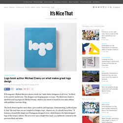
The designer was heaping praise on Logo: The Reference Guide to Symbols and Logotypes by Michael Evamy, which is just about to launch its new mini edition with publisher Laurence King. The book draws together more than 1,300 symbols and logotypes, demonstrating, as Bierut puts it, that “the next time you are tempted to design a logo…chances are, it’s already been done.” It features a beautifully simple new Pentagram-designed cover, which features the Spin-designed logo of the former edition. The new cover uses a bright blue mark, as a deliberate contrast to the previous black and white. All the big names are there in terms of both designers (Saul Bass, Paul Rand, Lance Wyman) and brands (Starbucks, Kodak, Disney), and there’s something compelling about leafing through such familiar visual cues and seeing them in the context of a broader design history. Why you should say yes more than no in design. In the opening talk of the last day of TYPO Berlin, Aaron James Draplin shared some ‘tall tales from a large man,’ covering the importance of saying yes more than no, and how working for friends led him to designing for the president.
The man behind Draplin Design Co. might have been jet-lagged, but this larger than life character showed no sign of flagging as he bolted through 130-odd slides, covering recent logo work, favourite Bauhaus archive material, and several photos of his sausage dog Gary. Subscription offer. Designer produces 60 logos in 60 days. With designers constantly seeking new ways to get inspired, it seems self-initiated projects are the way to go; one such example was typographer Alexander Wright, who created a new typeface every day for 36 days.
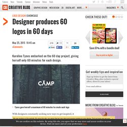
We've stumbled across another self-initiated project that sees designer Karoline Tynes create a logo a day, for 60 days. Discover six tips using grids in logo design Based in Oslo, Norway, Tynes graduated from the Norwegian School of Creative Studies in 2013, embarking on a freelance career, Tynes is now undertaking a Masters degree. Striving for uniqueness and originality throughout her work, the project was a way to inject further creativity into her work. Subscription offer "My goal for this challenge was to develop and promote myself as a designer," Tynes explains. Liked this? Words: Sammy Maine Sammy Maine is deputy commissioning editor at Creative Bloq. Create a geometric logo with Illustrator. Don't miss this 11.
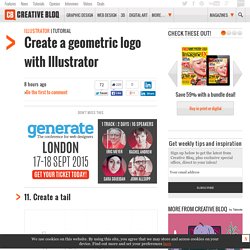
Create a tail Subtract the rectangle at the very bottom from the letter 'o'. This will create the gap necessary for the tail of the lower case 'e'. 12. The final step in creating this letter is to merge the top rectangle with what's left of the 'o' shape. 13. Creating the 'a' is even simpler. 14. Let's use the same shape we created for the letter 'l'. 15. The last letter to be created is, ironically, the first one. 16. Top 10 Impressive Medical and Pharmaceutical Logo Designs for Your Inspiration. Medical and pharmaceutical companies make for the most essential industry for mankind which is largely dependent on health and wellbeing.
Quite naturally, there’s a cutthroat competition in the industry and medical and pharmaceutical companies fight tooth and claw to serve the global market. Every company seeks to stand out of the crowd and get consumers’ attention. No wonder, branding remains so critical and complex for pharmaceutical and medical companies. This is where branding tools like logos come in. Logos serve as the symbol of a medical and pharmaceutical brand that consumers connect with.