
What The Highest Converting Websites Do Differently. Did you know that companies that take on a structured approach towards conversion optimization are twice as likely to see a large increase in sales?

Given this, you’d think more companies would test and run experiments. Yet 61% of companies do less than 5 tests per month. My gut tells me the reason for this is MOST companies are too caught up in the “business as usual syndrome”, and they rarely take a second to stop and think about really focusing on conversion optimization. In this post we’re going to go over what the highest converting websites do differently. But before we get into the details, we want to highlight a few points to get you thinking first: You have 0-8 seconds to make a compelling headline and landing page. Got that? 1. Visitors should clearly see on your homepage or landing page why they should do business with you and the benefit of it. A great example of this is MailChimp: If you think about it, whose usually tasked with sending out the email newsletter?
2. 3. (1) Online Retail: What color of Buy Now button gain higher click rate? Is there any convention. Call to Action Buttons: Examples and Best Practices. Advertisement Call to action in web design — and in user experience (UX) in particular — is a term used for elements in a web page that solicit an action from the user.
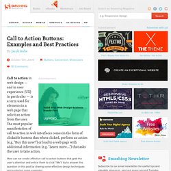
The most popular manifestation of call to action in web interfaces comes in the form of clickable buttons that when clicked, perform an action (e.g. "Buy this now! ") or lead to a web page with additional information (e.g. "Learn more…") that asks the user to take action. How can we create effective call to action buttons that grab the user’s attention and entice them to click? Best Practices for Effective Call to Action Buttons Designing call to action buttons into web interfaces requires some forethought and planning; it has to be part of your prototyping and information architecture processes in order for them to work well. Draw user attention with size In web pages, the size of an element relative to its surrounding elements indicates its importance: the larger the element is, the more important it is. Label Placement in Forms. By Matteo Penzo Published: July 12, 2006 “We were able to subject Luke’s theories to usability testing and enrich them through the power of numeric data.”
In using eyetracking to evaluate the usability of search forms for my previous article for UXmatters, “Evaluating the Usability of Search Forms Using Eyetracking: A Practical Approach,” we discovered much interesting data. I’ll provide an in-depth analysis of that data here. Please note that our ad-hoc test setup didn’t resemble real-world conditions. We based our test setup on Luke Wroblewski’s article “Web Application Form Design.” Luke provided valuable insights and feedback during both our test preparation and results analysis. During the process of building the forms that we would test, we tried to respect Luke’s suggestions regarding the relationship between label placement and formatting and the type of form content—well-known data versus unfamiliar data that requires thought.