
Architectural Shift in Web Applications. The application development landscape has been changing continuously over the past few years, both on the client side (frontend) as well as on the server side (backend).
On the client side, we have plenty of awesome new and updated JavaScript [and other scripting] frameworks; and on the server side, we have new architectural approaches such as single page applications, microservices, and serverless architectures. This is going to be a series of articles for full stack developers, especially those coming from a server side background, introducing trends and best practices in web application design and development.
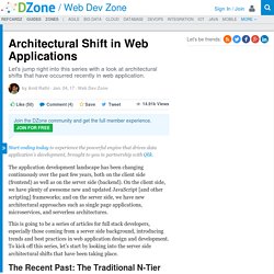
To kick off this series, let’s start by looking into the server side architectural shifts that have been taking place. The Recent Past: The Traditional N-Tier Architecture In the last decade, the web has dominated as the preferred platform for delivering content and services. The following diagram (1) depicts the traditional N-Tier Architecture. Getting Real. Here are the 16 chapters and 91 essays that make up the book.

Introduction chapter 1 What is Getting Real? A smaller, faster, better way to build software About 37signalsOur small team creates simple, focused software Caveats, disclaimers, and other preemptive strikesResponses to some complaints we hear The Starting Line chapter 2 Build LessUnderdo your competition What's Your Problem? Stay Lean chapter 3 Less MassThe leaner you are, the easier it is to change Lower Your Cost of ChangeStay flexible by reducing obstacles to change The Three MusketeersUse a team of three for version 1.0 Embrace ConstraintsLet limitations guide you to creative solutions Be YourselfDifferentiate yourself from bigger companies by being personal and friendly Priorities chapter 4 What's the big idea?
Feature Selection chapter 5 Process chapter 6 The Organization chapter 7 Staffing chapter 8 Interface Design chapter 9. Top 20 Every Day Tools For UX Designers. You-Dont-Know-JS/README.md at master · getify/You-Dont-Know-JS. Fundamentals of Web Design. 9 basic principles of responsive web design. Responsive web design is a great solution to our multi-screen problem, but getting into it from the print perspective is difficult.
No fixed page size, no millimetres or inches, no physical constraints to fight against. Designing in pixels for Desktop and Mobile only is also the past, as more and more gadgets can open up a website. Therefore, let's clarify some basic principles of responsive web design here to embrace the fluid web, instead of fighting it. To keep it simple we'll focus on layouts (yes, responsive goes way deeper than that and if you want to learn more this is a good start). Responsive vs Adaptive web design It might seem the same but it isn't. The flow As screen sizes become smaller, content starts to take up more vertical space and anything below will be pushed down, it's called the flow.
Relative units The canvas can be a desktop, mobile screen or anything in between. Breakpoints Max and Min values Nested objects Remember the relative position? Mobile or Desktop first. A brief history of web design for designers. Explained with animations. My interest in coding my designs was lost at the the moment I realized how much trickery had to be done to make it happen.
Seemingly simple issues could be solved in so many ways. Yet it still might not have worked on some browsers. One thing that always made me wonder is why there's a division between design and code. Why difficult things become more simpler, but simple things become more difficult? So instead of debating whether designers should learn code or developers should learn design, let's set some common ground on how design for the web evolved and how we could bridge the gap between code and design.
The dark ages of web design (1989) The very beginning of web design was pretty dark, as screens were literally black and only few monochrome pixels lived therein. Tables – The beginning (1995) The birth of browsers that could display images was the first step into web design as we know it. The Big List of JavaScript, CSS, and HTML Development Tools, Libraries, Projects, and Books. NOTE: I’ve moved the list to it’s own dedicated page so that I can manage it a little easier so for the most up-to-date list, go to the following page.
I’ve been meaning to do a roll-up of top JavaScript, CSS & HTML development tools that I use or have been recommended to me and after having lunch with my bud Brian Wilpon today, I realized I just needed to do it. He asked me what some of the newer tools are and I think this is the best way to help him (and the community in general). It’s definitely not an all-inclusive list so if you see some that you feel I should add or remove, let me know in the comments. Browser Fingerprinting and the Online-Tracking Arms Race. In July 1993, The New Yorker published a cartoon by Peter Steiner that depicted a Labrador retriever sitting on a chair in front of a computer, paw on the keyboard, as he turns to his beagle companion and says, “On the Internet, nobody knows you’re a dog.”
Two decades later, interested parties not only know you’re a dog, they also have a pretty good idea of the color of your fur, how often you visit the vet, and what your favorite doggy treat is. How do they get all that information? In a nutshell: Online advertisers collaborate with websites to gather your browsing data, eventually building up a detailed profile of your interests and activities. These browsing profiles can be so specific that they allow advertisers to target populations as narrow as mothers with teenage children or people who require allergy-relief products. Cookies are small pieces of text that websites cause the user’s browser to store. So you see, cookies can be very helpful. Here’s where things get sneaky. Raddish: Node.js Framework with Support for Threads and Sockets.
Jasper van Rijbroek has released Raddish, a new Node.js framework claiming "ridiculous speeds," that comes with out of the box support for threads and sockets.
According to its own notes, Raddish aims to be "amazingly fast. " Dutch web engineer van Rijbroek told InfoQ that he wants Raddish to be easy to use and fun for programming, and that by using a fallback system Raddish allows developers to write less code to reach their goals. The Raddish project started when van Rijbroek and his colleague were looking for a framework in Node.js that had a lot of support out-of-the-box, similar to PHP frameworks like Nooku.
Because such a framework didn’t exist at the time the idea to create Raddish was born. Teach Templates. Resources and Tutorials for Learning Responsive HTML Email. You’ve avoided it all these years, but you’ve been asked to create an HMTL email.

It needs to be responsive and work across web mail clients, desktop applications, and smartphone mail clients and applications. You’ve heard the stories about creating HTML emails: you need to go back in time and work with table-based code, ugh! CSS support is problematic and getting an HTML email to display correctly in Outlook may cause you to tear your hair out. It’s a craft to build a responsive HTML email that works across desktop applications and mobile devices. I’ve been creating HTML emails for over 14 years and there’s always something changed in how Gmail manages CSS (or not), what rendering engine Outlook uses, or how iOS devices display content. To make your job easier, I’ve compiled a list of some of my favorite resources and tutorials. Resources For Learning About HTML Email Tutorials. 101 Best Web Design and Development Blogs. Are you a web developer or looking to build a website?

Today we’d like to provide you a list of the top resources we follow on web design, HTML, CSS, JavaScript, PHP, WordPress, graphics, mobile development and much more. There are lots of great web development sites online, and finding the most useful one (not to mention examples of code) for any particular problem is a task that can itself take hours. Hopefully these “101 Best Web Design and Development Blogs” can quickly connect you with the sites that best meet your project needs. Feel free to browse the blog list or search for keywords (e.g. A Guide on Layout Types in Web Design. One of the most variable aspects of web design is the way in which we approach width and height in terms of measurements and flexibility.
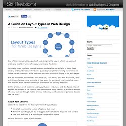
For many years, we have rotated between the benefits and pitfalls of using fixed, elastic, and liquid measurements in a quest to give optimal viewing experiences in highly varied situations, while balancing our need to control things in our web pages. But, as Bob Dylan proclaimed a long time ago, "The times, they are a-changin’," and with these changes come a variety of new ways for laying out your website’s pages and an even more variable landscape of methods for viewing websites.
In this article, we will examine web layout types — old, new, and the future. We will explore the subject in the context that websites are being viewed in a diverse amount of ways, such as through mobile phones, netbooks, and touchscreen personal devices like the iPad. About Your Options Let’s set our objectives for this exploration of layout types: Absolute Layouts Fixed Layout. WebDevEDU. Mission The learning curve for web programming is steep due to the sheer number of technologies and methods involved, but the number of free, comprehensive resources available today to help lessen this curve is surprisingly small.
This Site is our way of tackling this problem head on -- our goal is to make web development more approachable for everyone, because the more talented, creative, and skilled developers building for the Web, the better it is for everyone. All original, non-trademarked content on this site, including graphics as well as text, is licensed under a Creative Commons license, which permits you to freely copy the slide sets, exercises, and code labs presented on this site for your own use. You can tailor them to your liking and even redistribute them free of charge in line with the terms and conditions of the license. GlobIS: Global Information Systems Group. » Schedule & Slides Web Engineering.
COMP 120: Web Engineering. Course Description Web applications are complex systems that deliver a plethora of features to a large number of users (including developers), and also exhibit unique behaviors and demands in terms of performance, scalability, usability, and security. This course will discuss the limits of current web technologies, information and service architectures, caching, session and data management. Instructor Ming Chow, mchow@cs.tufts.eduOffice Hours: Tuesdays and Thursdays 2 - 3 PM, Wednesdays 2 - 4 PM, by appointment, in Halligan 228APlease send all class questions via Piazza. DO NOT E-MAIL ME! Class Time.