
How to Integrate “No CAPTCHA reCAPTCHA” in Your Website. Internet Curated: A collection of 100+ hand-picked curated resources & tools. How to make a Hamburger: A menu for mobile websites. Using media queries is great.
Every defined size of the viewport can be matched to a specific stylesheet for example. But most of the so called responsive websites are not getting the maximum out of this great possibility. In most cases it is a problem where to put the main navigation. It should be big enough to touch but small enough not to compete with the main content. The solution is pretty easy: Let’s make a hamburger. A hamburger menu has become the way to display a navigation menu on mobile devices.
A demo of this menu inside a website template can be viewed here. So let’s start with some markup… First of all, a simple HTML5 markup structure have to be generated. <! The hamburger button can be as simple as this: The rest of the markup needs nothing special, except a container element aurround the whole content. ... How to make a Hamburger: A menu for mobile websites. Best of SVG: Icons, Tools und andere Ressourcen.
Im Rahmen des Siegeszugs von mobilen Geräten in der gesamten Welt entsteht und entwickelt sich kontinuierlich neue Technologie für die schönere Gestaltung von Webseiten und Apps für eben diese Geräte.
Eine dieser fantastischen mobilen Technologien, welche sich in den letzten Jahren etabliert haben, ist SVG, die Scalable Vector Graphics. SVG erweitert das Konzept von Vektoren über das Niveau von bloßen skalierbaren Bildern hinaus. Tatsächlich ist ein SVG eigentlich XML-basiert, was heißt, dass ein SVG und seine Verhaltensweisen in Sachen Interaktion und Animation mittels CSS und/oder Javascript definierbar sind.
Eine weitere tolle Eigenschaft von SVG-Icons ist der Fakt, dass diese stets Quelldateien sind, wodurch es viel einfacher ist, sie zu bearbeiten. Darüber hinaus sieht SVG auf Retina-Displays brillant aus, was für helle Begeisterung bei Entwicklern und Designern für mobile Geräte gesorgt hat. Working with Shapes in Web Design. By Robin Rendle On When we make a new component on a website, we’re effectively creating rectangles of different sizes, whether we realise it or not.
But what happens if we want to experiment a little? How many different ways are there to make shapes? In this post I want to roughly outline some of the most common ways to make circles, triangles, and polygons, as well jot down the advantages and disadvantages for these methods so we can experiment with those that might be a little unfamiliar to us. Here are some of the ways in which you can make a shape on the web: border-radius The border-radius property is perhaps the easiest way to make a circle, for example: Graphisme : 200 sites indispensables / Graphic design : 200 Essential Websites - dubostbenoit.com.
15 Top Website Galleries for Your Design Inspiration. Inspiration We all need inspiration from time to time, and if you have hit a brick wall when trying to conjure up ideas for your next project, it is good to have an arsenal of places you can find a total bombardment of inspiring designs to jump-start your creative juices again.
Website design galleries are just the thing if you need such a boost, and it is always nice if the gallery itself is well presented. Today we are showcasing 15 of the best website galleries where you will find inspiration for any type of design you need. Some are ideal for aimlessly browsing, while others have very concise search criteria that will pinpoint your exact requirements. [Infographic] Google's 200 Ranking Factors. There’s no doubt that Google’s algorithm is more complex — and volatile — than ever.
![[Infographic] Google's 200 Ranking Factors](http://cdn.pearltrees.com/s/pic/th/infographic-ranking-factors-58784268)
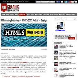
The days where SEO was all about meta tags and backlinks is long gone. Google now uses at least 200 ranking factors in their algorithm, including social signals, user-interaction signals, and trust. If you’d like a bird’s eye view of these factors, then this infographic by Entrepreneur.com and Backlinko may give you some much needed perspective. The piece covers all of the known 200 ranking signals that Google uses to rank sites and pages. However, it’s important to note that many of these aren’t proven or official ranking signals. Smartphone Auflösung Übersicht. Start » Bildschirmauflösung Übersicht » Smartphone Auflösung Übersicht Die Smartphone Auflösung nimmt immer mehr an Brillanz zu.
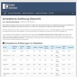
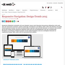
Dabei steht natürlich ganz besonders der Schärfegrad der Displays der Smartphones im Mittelpunkt des Geschehens. Nunmehr gibt es nämlich mit „Full-HD“ einen neuen Bereich, der gestochen scharfe Ansichten bietet. HTML5 CSS3 Websites Design. Here is the fresh list of award winning HTML5 and CSS3 websites design.
In this collection you can see the Graphic design, web design, portfolio and corporate web design examples for inspiration. HTML5 and CSS3 is making the web design more powerful in different areas. Fast, Secure, Responsive, Interactive, beautiful. We all know HTML5 and CSS3 become more popular in these days. So for your inspiration We are gathered 34 examples of HTML5 websites. You may be interested in the following modern trends related articles as well. Responsive Navigation: Design-Trends 2015. Responsive Webseiten entwickeln sich zum Standard.
Immer mehr Menschen konsumieren Webseiten nicht mehr über den heimischen Computer, sondern mobil über Smartphones und Tablets. Daher sollte jede Website auf mobile Ansicht optimiert werden, um nicht ins Hintertreffen zu geraten und wertvolle Besucher zu verlieren. Skeleton 1.2. Skeleton: Responsive CSS Boilerplate. Nivo Slider - Dev7studios Docs. Web Design Trends for 2013.