
Photoshop and Illustrator Design Tutorials.
Remove Background from Image – remove.bg. Photoshop. Illustrator. AutoDraw. Stephen Kroninger - HOW TO CREATE CARTOONS (complete) “According to Georges Sadoul, Frank Tashlin is a second-rank director has never done a remake of You Can’t Take It With You or The Awful Truth.
According to me, my colleague errs in mistaking a closed door for an open one. In fifteen years’ time, people will realize that The Girl Can’t Help It served then — that is, today – as a fountain of youth from which the cinema now — that is, in the future — has drawn fresh inspiration ….To sum up, Frank Tashlin has not renovated the Hollywood comedy. He has done better. There is not a difference in degree between Hollywood or Bust and It Happened One Night, between The Girl Can’t Help It and Design For Living, but a difference in kind. Tashlin, in other words, has not renewed but created.
"Canter through Coventry" original oil painting by Frank Tashlin. Google fonts in Photoshop & Sketch, plugin by madebysource. Éditions - Maison d'édition consacrée au design, à la création et à la culture visuelle. Le guide d'une bonne charte graphique - l'importance de la palette de couleurs. Une bonne charte graphique ?
De quoi s’agit-il vraiment ? Voici le début d’une trilogie sur des conseils et outils utiles pour choisir la bonne palette graphique pour votre projet vidéo. Commençons par le début pour notre première partie : le choix d’un style graphique, d’une identité visuelle… Apprendre le Pixel-Art : Quelques conseils pour débuter. Patience, motivation et assiduité.
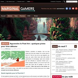
Voici les trois choses qu'il faut avoir lorsque l'on se lance dans le Pixel Art. C'est en tous cas ce que j'apprend, jour après jour, après m'être lancé dans cette activité passionnante et chronophage. Après avoir encaissé bien des difficultés en épluchant internet pour y trouver quelques tutoriels, je me suis dit qu'il vous serait sans doute utile de partager un peu mes trouvailles.
L'idée n'est pas de vous donner un cours, je n'en ai pas le niveau, mais plutôt de vous éviter de faire les mêmes erreurs que moi en vous envoyant vers les bonnes références. Quels logiciels pour le Pixel Art ? S'il est possible de s'amuser sur Paint, ce n'est clairement pas ce soft qui pourra vous faciliter la tâche. Liens de téléchargement pour : ASEsprite et Pyxel Edit (Windows & Mac) Premiers essais "Ne visez pas trop complexe !
" Des cours complets sur le Pixel Art chez Les Forges Partager et progresser. Adapting logos for small screens. The logo in the header of this site is a raster PNG file (portable network graphics).
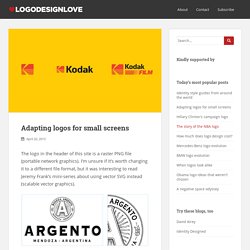
I’m unsure if it’s worth changing it to a different file format, but it was interesting to read Jeremy Frank’s mini-series about using vector SVG instead (scalable vector graphics). Detail reduction from the Argento style guide (PDF) “SVGs are a perfect fit for resolution-independent logos. Combined with CSS media queries, a touch of JavaScript, and SVG injection, you have a robust solution for implementing responsive logos.” You’re probably familiar with Joe Harrison’s responsive logos gallery where he showcased the concept (view in a browser you can resize for full effect). Some further reading in Smashing Magazine’s 2014 piece titled rethinking responsive SVG, and more on responsive images in general at ResponsiveImages.org.
Smashing Magazine — For Professional Web Designers and Developers.
IDIKOtv. 100 Principles for Designing Logos and Building Brands. ImageryColorDimensionContrastShapeSymbolsTypographyWritingStoryOrderVariationPersonalizationPsychologyProcessProductionDigital IdentityTrendsShortcutsSocial MediaMultiplesIntellectual PropertyDocumentationEvolutionCompetitionOriginalityWitIdealismAuthenticityCommitmentStrategyResearchTouchpointsInspirationSimplicity.
Texte et mise en page: assurer la lisibilité et l'esthétique d'un document. Dimension de l'image: distinguer la taille, la définition et la résolution. Designer's guide to DPI. DPI or Dots Per Inch is a measure of spatial dot density initially used in print.
It's the number of ink drops your printer can put in an inch . A smaller DPI yields a less-detailed image. This concept is applied to computer screens under the name PPI for Pixels Per Inch. Same principle: It counts the number of pixels your screen can display per inch. The name DPI is also used in screens. Windows computers have a default PPI of 96. Here’s an applied example: A Mac Cinema Display 27” has a PPI of 109, which means that it displays 109 pixels per inch of screen. *I know that 23.5*109 does not equal exactly 2560. Let’s say you design a blue square of 109*109px on the screen we just talked about above.
This square will have a physical size on the screen of 1*1 inch. TakeawayLeaving color and resolution differences aside, keep in mind that everybody will see your design differently. Screen resolution can have a huge impact on how the user perceives your design. 4K starts at 3840x2160 pixels. Tutoriels gratuits. Graphisme : 200 sites indispensables. Indesign - Table des matières. Gridelicious.