
Responsive Design Workflow by Stephen Hay. Golden Grid System. GGS was my next step after Less Framework.
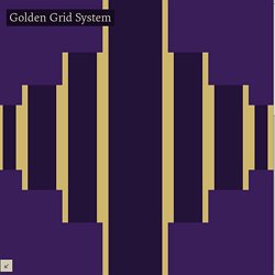
Instead of a fixed-width grid, it used a fully fluid-width one, without even a maximum width. The resources it was published with are still available on GitHub. The idea was to take a 18-column grid, use the outermost columns as margins, and use the remaining 16 to lay elements out. On smaller screens the 16 columns could be folded into 8, 4 and 2. This behaviour was inspired by Massimo Vignelli's Unigrid system.
While the grid's columns were fluid — proportional to the screen's width — the gutters (spaces between the columns) were proportional to the font-size being used. GGS also contained a set of typographic presets, strictly to a baseline grid. Correctly setting all of these measurements is difficult, of course. When published, GGS gained a lot of attention, as the web design community was searching ways to work with fluid-width grids, which have always been troublesome, running counter to many graphic design principles. Responsive Web Design Techniques, Tools and Design Strategies.
Advertisement Today, too many websites are still inaccessible.
In our new book Inclusive Design Patterns, we explore how to craft flexible front-end design patterns and make future-proof and accessible interfaces without extra effort. Hardcover, 312 pages. Get the book now! Back in January, we published an article on responsive design, Responsive Web Design: What It Is and How to Use It1. To that end, we’ve compiled this round-up of resources for creating responsive website designs. Further Reading on SmashingMag: Link Responsive Design Techniques Link CSS Transitions and Media Queries5 Elliot Jay Stocks provides insight into the combination of CSS media queries and CSS transitions. Responsive Data Tables7 Chris Coyier and Scott Jehl are experimenting with responsive design techniques for displaying data tables.
Responsive Images, Responsive Videos Link Responsive Image: Experimenting With Context-Aware Image Sizing15 An alternative approach to fluid images by Filament Group. 25 Beautiful Responsive Web Design Examples for Inspiration. Six Revisions Menu Main Categories CSS HTML JavaScript Web Design WordPress Web Development Design Inspiration UX Design UI Design Freebies Tutorials Tools Links About Contact Advertise RSS Twitter Facebook 25 Beautiful Responsive Web Design Examples for Inspiration By Jacob Gube Responsive web design is the practice of enhancing the experience of the user by adapting the web page layout to the device he or she is using when accessing the site.
Check out the beautiful responsive website layouts below for inspiration in your own responsive web design projects. 1. 2. Responsive Web Design just got Easier with the Responsive Grid System. Responsive Design with Mockups. We love responsive design # Responsive layouts on the web are exciting.

Many Mockups users are doing responsive layouts on their projects or are planning to. We've been talking with the Balsamiq community about how Mockups can work with responsive web design concepts, and we thought we'd explore some techniques that might help. Before diving in, here's how we see Mockups fitting in with responsive layout design scenarios. We believe wireframes can show how web content will flexibly adapt to different grid widths and indicate rules for presentation. Creating a responsive design wireframe system # We like systems for communicating ideas. 1. One thing you do when building a web app or site is establish templates and designate areas of content within them.
Let's say we're working on a news-style web site that includes an articles section, a gallery of photos, and a store. High Level Content Outline Home Articles Blog Entry Tag Listing Gallery Tag Listing Store Product Listing Search.