
Ivan Drinchev's Blog - CSS with only class names I wanted to make a note to myself and a reference for any co-working front-end colleagues about the good old problem of structuring your stylesheets. These days we anyway got rid of id selectors and attribute selectors, so the only common selector that left is the tag selector. First let me make some exceptions. If you use a front-end framework similar to React, Vue.js, etc. please use CSS Modules or whatever is the recommended way for styling with that framework.Although these days is controversial, I still use a css reset and on the contrary to the article, there should be mostly tag names selectors there.Styling markup which is not generated by you ( e.g. markdown parsed content or any plugin that adds HTML to your page ) should be an exception and should have a wrapper element around it .markdown h1, .markdown h2 { }. Now back to the point. What is "CSS with only class names" anyway? Structuring your CSS is a question as old as the job title "Front-end developer". Yep, this means that :
CSS-гриды пришли насовсем — CSS-LIVE Перевод статьи CSS Grid Layout is Here to Stay с сайта blogs.igalia.com, опубликовано на css-live.ru с разрешения автора — Мануэля Рего Касановаса. О том, что стояло за разработкой CSS Grid Layout в Chromium/Blink и Safari/WebKit, которую вела Igalia при поддержке Bloomberg. Мы долго шли к этому, но наконец CSS-гриды уже здесь! Возможно, после стольких лет работы над ними я пристрастен, но я убежден, что CSS-гриды станут важным этапом истории веба. Igalia играет ключевую роль в реализации CSS-гридов в Chromium/Blink и Safari/WebKit с 2013 г., а спонсирует это Bloomberg. Хорошо забытое старое Гриды — вовсе не что-то новое, ведь их упоминания можно найти в самых первых обсуждениях между создателями CSS. Сетки! С той поры веб не стоял на месте, и проблему дизайна по сетке в HTML/CSS пытались решить (и решали) множеством разным подходов. В начале этого десятилетия Microsoft начал работу над тем, что в итоге стало первой спецификацией CSS Grid Layout. Сотрудничество Igalia и Bloomberg P.S.
11 Shocking Designs Straight Out of the ‘90s | Webdesigner Depot The Internet has certainly been through a lot over the past 20+ years. We’ve watched web design change from the most basic of HTML markups to complex JavaScript, CSS and HTML5 coding. But remembering the past can be fun and that’s why, this Thursday, we’re throwing you back to the 90’s for a look at some of the worst (or best, depending on how you see it) website designs of the decade. Where to start with this site? 2. That nifty spotlight effect on the right-hand side of the page was a big deal back in the day, so we have to give this site props for that. 3. Forbes’ website from 1996 still conveys the sense of business-oriented professionalism the brand is known for today, just with a little less attention to fonts and more attention to print media, which was still hugely popular then. Who needs Google when you can, uh, find it? A sister site to IFINDIT, go to this page if you definitely want to have a seizure. 6. 7. 8. 9. 10. 11. Another classic. By Kayla Matthews
Less lesscss.org Приступая к работе с LESS Less это препроцессор CSS, а это значит: less (надстройка языка CSS) расширяет язык CSS, добавляет возможность использовать переменные, функции, примеси, и много других техник, которые, в свою очередь, позволяют сделать CSS управляемым и расширяемым. Less работает внутри Node, в браузере, и внутри Rhino. Например: Компилируется в: Использование на клиентской стороне Использование less.js в браузере отлично подойдет для разработки, но не рекомендуется для производства (релиза). Компиляция на стороне клиента это простой путь начать разрабатывать на Less, но в производстве, когда важны производительность и надежность, мы рекомендуем для пре-компиляции использовать node.js или другие инструменты. Свяжите ваш документ с .less файлом через атрибут rel со значением stylesheet/less. Затем, скачайте less.js и подключите его в тег script, который, в свою очередь, вставьте в тег head. Опции браузера Переменные Это довольно очевидно: Вывод: Примеси Примеси с параметрами
Fullscreen Background Image Slideshow with CSS3 Image 01re·lax·a·tion Image 02qui·e·tude Image 03bal·ance Image 04e·qua·nim·i·ty Image 05com·po·sure Image 06se·ren·i·ty « Previous Demo: Rocking Letters with CSS3 & jQuery Photography by Mark Sebastian CC BY-SA 2.0 Back to the Codrops Article grid-template-rows - CSS: Cascading Style Sheets The grid-template-rows CSS property defines the line names and track sizing functions of the grid rows. The source for this interactive example is stored in a GitHub repository. If you'd like to contribute to the interactive examples project, please clone and send us a pull request. Syntax This property may be specified as: either the keyword value none or a <track-list> value or an <auto-track-list> value. Values none Is a keyword meaning that there is no explicit grid. Is a non-negative length. Is a non-negative <percentage> value, relative to the block size of the grid container. Is a non-negative dimension with the unit fr specifying the track’s flex factor. max-content Is a keyword representing the largest maximal content contribution of the grid items occupying the grid track. min-content Is a keyword representing the largest minimal content contribution of the grid items occupying the grid track. minmax(min, max) auto Formal syntax Examples Result 1.
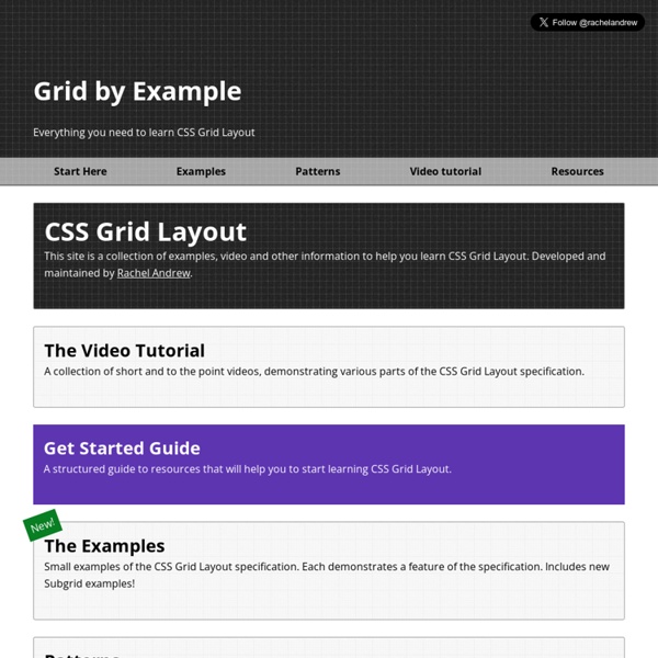
Practical CSS Grid: Adding Grid to an Existing Design · An A List Apart Article Understanding and using Grid is easier than you might expect. The day Grid support shipped in Firefox 52, I decided on the spur of the moment to convert the basic layout of my personal site to use Grid. And it was a fairly simple process—five minutes to write the grid styles, then 15-20 spent troubleshooting. Article Continues Below Grid allows us to literally define column and row grid lines, then attach elements to those lines in any order we choose. It’s been decades since CSS first emerged, but it’s never contained a system anything like this. The way things used to be#section1 Before we get to the Grid, allow me to take just a moment to explain the markup structure of meyerweb’s main pages, and the positioning-and-margins approach I’ve been using for, um, about 12 years now. <body><div id="sitemast">…</div><div id="search">…</div><div id="main">…</div><div id="extra">…</div><div id="navigate">…</div><div id="footer">…</div></body> Constructing the grid#section2 Ouch. Letdowns#section7
CSS анимации. 30 крутых примеров CSS Анимация загрузки от patrikhjelm Семь анимированных точек двигаются влево и вправо, показывая загрузку. See the Pen CSS loading animation by Patrik Hjelm (@patrikhjelm) on CodePen. Анимированные иконки корзин от jonitrythall Симпатичные анимированные эффекты, которые можно использовать на сайтах интернет- магазинов при добавлении товаров в корзину. See the Pen Animated Shopping Cart Icons by Joni Trythall (@jonitrythall) on CodePen. Анимация иконки «гамбургер» с помощью CSS3 анимаций от Dawid Krajewski Создан на чистом CSS, без использования каких либо скриптов на JS. See the Pen Hamburger Icon CSS3 ONLY Animation by Dawid Krajewski (@DawidKrajewski) on CodePen. Анимированный персонаж 404 от With An Es Классный пример для 404 страницы, где разработчик работает на ошибками. See the Pen 404 Animated Character by Mark Thomes (@WithAnEs) on CodePen. Высадка на марс от mgitch Приземление на Марс. See the Pen CSS Mars Landing by Mathew Gitchell (@mgitch) on CodePen. Бегущий петух от judag
10 Rock Solid Website Layout Examples | Design Shack Keeping It Simple Page layout is equal parts art and science. Creating something that’s visually attractive and unique takes an artist’s eye. Designers often stress out far too much about the layout process. In this article we’re going to take a look at ten very common layouts that you can find on countless sites across the web. If you’re a web designer, bookmark this page and come back the next time you get stuck laying out a page. Three Boxes This is probably the most simple layout on the list. The three boxes layout features one main graphic area followed by two smaller boxes underneath. The silhouetted shapes along the top are areas that can be used for logos, company names, navigation, search bars and any other informational and functional content typically on a website. This design is ideal for a portfolio page or anything that needs to show off a few sample graphics. In the Wild Below we see a beautiful implementation of the three box layout in Peter Verkuilen’s portfolio.
Учебник CSS 3. Статья "Анимация элементов в CSS. Часть 1" Ранее в статье учебника "Переходные эффекты в CSS" мы с Вами познакомились с эффектами, которые позволяют анимировать переход от одного набора CSS свойств к другому (transition ). CSS3 предоставляет нам еще один более мощный инструмент создания анимации, который не ограничивается выполнением одного перехода, а позволяет создавать неограниченное количество таких переходов. Другими словами, анимация позволяет нам переходить от одного состояния (набора свойств) ко второму, от второго к третьему, и даже при необходимости воспроизводить анимацию в обратном порядке, когда количество переходов завершено. Рис. 190 Пример покадровой анимации. По аналогии с переходными эффектами, для проигрывания анимации необходимо инициировать её воспроизведение, будь то первоначальная загрузка страницы, или получение фокуса элементом, наведение указателя мыши на элемент и так далее. Этапы создания анимации Давайте рассмотрим из чего же состоит процесс создания анимации в CSS. Определение ключевых кадров