
Fixing Six Mistakes Companies Make when Working with UXers So, you want to create a great user experience? The truth is, it doesn’t matter how great of a user experience design team you hire. The success of your UX project lies as much on your shoulders as it does on the team or person that you hire. I’ve worked internally at startups of all sizes, and have also consulted with a lot of companies through my freelance UX consulting practice. 1. Congratulations, you’ve decided to work with a UX team to help launch or improve your product. Your ability to be focused, present, and an active participant in the UX process is crucial to the success of your product. You can hire the best UX practitioners on the planet, but if you aren’t helping guide them in understanding your company’s goals and priorities, then the solution won’t have much impact on what matters to you and your business. 2. For some reason, people like to try and involve a lot of people in a UX project. So try to get the right people in the room at the right time. 3. 4. Why? 5. 6.
Why idiots succeed Several tweeters, such as Anna and Hopi, have expressed dismay at the fact that Iain Duncan Smith has kept his job in the cabinet (re)shuffle, despite his gross inadequacies. His survival, however, highlights an important fact - that, sometimes, organizations and markets can actually favour incompetence. There are (at least) eight mechanisms through which this can happen. 1. 2. 3. 4. 5. 6. 7. 8. Now, I stress that these mechanisms are not universal, although they are sufficiently widespread to explain the obvious fact that some idiots and charlatans survive and thrive in many organizations. Creating Outstanding Experiences for Digital Natives Digital Natives are people who have grown up using technology from early childhood. Their mother tongue is the digital language of computers, video games, and the Internet. These young people, usually between 15 and 25 years old, differ from Digital Immigrants (those born before 1985) in their perceptions of interactive products and the way they behave when using them. Their heavy use of interactive products makes them experienced and skilled users, but on balance the question arises: are Digital Natives as tech-savvy as they’ve been portrayed? And what do you need to consider when you want to design an excellent user experience for this target group? We conducted an online survey among 200 Digital Natives to better understand this increasingly important target group. Technology is Intertwined in Their Lives Technology plays a key role in the lives of Digital Natives. Some facts: The majority of Digital Natives feel disconnected and “off the radar” without their phones. Some notable quotes:
We can't let Derek Jeter be anything but perfect. MINNEAPOLIS -- This was the perfect final All-Star Game for Derek Jeter. Not because he had two hits, not because he received several massive ovations, not because his final sendoff was indulgent but still somehow understated. It was the perfect final All-Star Game for Derek Jeter because, in one moment, what Jeter is, and what we demand him to be, came into vivid focus. The moment came mid-game, off the field. The timing on this was unfortunate, though Wainwright, standing outside the National League clubhouse, couldn't have possibly known that. And then Wainwright said what he said. That doesn't mean you shouldn't be a little angry with Wainwright. But even more: It's actually sort of an insult to Jeter, isn't it? But that's not why Wainwright was criticized, or why he was forced to apologize to Erin Andrews during the game and act like he was kidding. I don't mean to pick on Diamond, who's an excellent Mets beat writer. And why did people want Wainwright to lie?
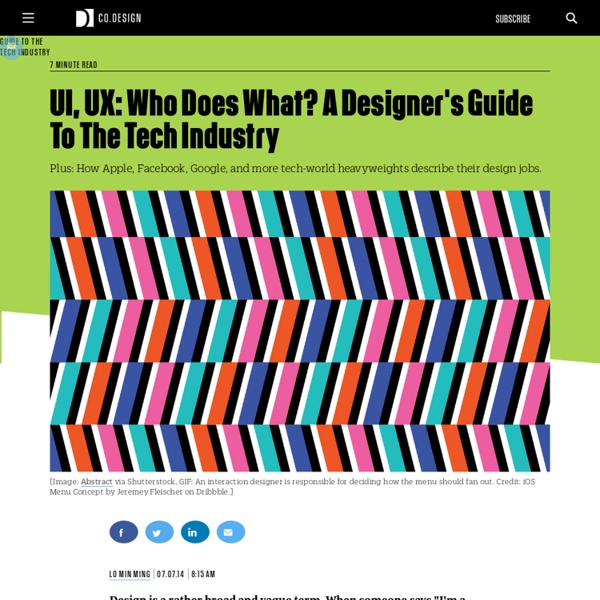
How We Made The Last of Us's Interface Work So Well I'm super-glad there's an article out there like this, especially hot on the heels of the Deux Ex menu showcase. I've gone through far too many programs, operating systems, and games that have had hilariously bad UI/UX design (I'M LOOKING AT YOU, EVERY SINGLE BETHESDA GAME), and things like this definitely help in getting people to appreciate when it's done well. I'm actually thinking of getting a career change to doing UX/UI design, and video games have been my primary interest. Should add that I have absolutely zero computer science/programming background. You don't need to know scripting and programming to do UI design/art though they are incredible assets. I can certainly understand that. Anyways, thanks so much for the advice! Who knows? (Also, gotta say, that comment about "nobody likes UI" really got to me, and I really feel ya.
Dave Hunter - Why Barclays lied: Thoughts from a dark pool operator As the former head of electronic trading product management and quantitative strategies at Deutsche Bank, responsible for their dark pool in Europe, I wanted to add my own 2 cents to the noise surrounding Barclays and their dark pool, LX. Eric Schneiderman, New York Attorney General, has some serious beef with Barclays because they filled their dark pool, Barclays LX, with high-frequency traders (HFTs) and then lied about the highly predatory nature of their trading strategies to their institutional clients. They erased key data from marketing material and gave private, sensitive information to HFTs about other participants in the pool. As us brits would say, 'a rather silly move'. What were their clients afraid of? Institutional investors have a regulatory duty to prove best execution to their clients.They don't understand, nor can they truly measure the effect of HFTs on their trading performance. Tradebot was (and possibly still is) one of the largest HFTs in LX. Reason 1: Money
Data vs Insight for UX Design Funny how things can pop into your head when you’re not thinking about them. I can’t remember why this occurred to me last week … but it was one of those thoughts I realized I should write down so I could use it later. So I tweeted it. Lots of people kindly “re-tweeted” the thought, which immediately made me self-conscious that it may not explain itself very well. So now I’m blogging about it. My tweet: User Experience Design is not data-driven, it’s insight-driven. I whipped up a little model to illustrate the larger point: insight comes from a synthesis between talent, expertise, and the fresh understanding we gain through research. I’ve seen a lot of talk lately about how we shouldn’t be letting data drive our design decisions — that we’re designers, so we should be designing based on best practices, ideas, expertise, and even “taste.” As for the word “data” — I’m referring to empirical data as well as the recorded results of something less numbers-based, like contextual research.
New Megacity to Include Beijing, Tianjin and Hebei With Population of 130 Million | TheNanfang A proposed megacity encapsulating parts of Beijing, Hebei and Tianjin moved closed to reality yesterday with the announcement of a so-called “Beijing Seventh Ring Road”, reported Sina News. Gao Jinhao, head of the Hebei Provincial Office of Traffic and Transport, announced the plans on the department’s official website. The ring road consists of two separate roads. One road is planned to be 940 kilometers in length, and goes through areas of Hebei including Langfang, Baoding, Zhuozhou, Chengde, and Pinggu. The announcement of the new ring road is part of a very complicated proposed transportation network concisely summarized with the numerically-significant name “28488″. Furthermore, Gao called for more light rail and subway lines to be extended to Hebei. The idea of a Beijing supercity is sure to bring dividends if successful. Photo: Caijing, Tianjin Diaries, China Daily
How Google Unified Its Products With A Humble Index Card If you hadn’t noticed, every Google service has been trending toward a certain understated elegance. The company’s infamous era of championing 41 shades of blue is long over, as the company has learned to embrace clean lines, airy typography, and liberal white space across their platforms. But amidst implementing these long-established good design practices, Google rediscovered an old idea: index cards. Just like index and business cards of yore (or at least the late '90s), Google’s cards are plain, white rectangles peppered with nothing more than a little bit of type and maybe a photo. We first saw cards returning results through Search’s Knowledge Graph, as Google began summarizing Wikipedia entries into condensed blurbs. Yes, Google is even developing cards on cards. Are Cards Good Design, Or A Foregone Conclusion? "It’s not like we’ve invented a new way to organize information," admits Matias Duarte, UX director for Android. Cards Spread Like A Virus Through Google