background preloader

Jobs Charted by State and Salary USA

Jobs Charted by State and Salary USA
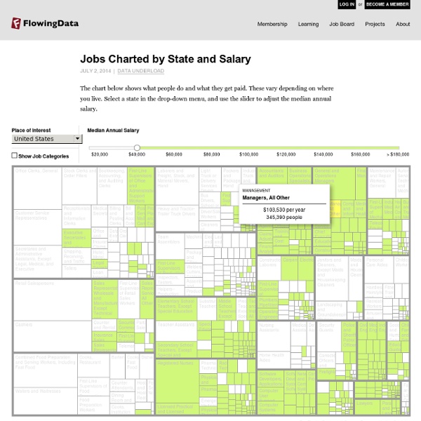
The industries that people work in can say a lot about an area. Is there a lot of farming? Is there a big technology market? Couple the jobs that people work with salary, and you also see where the money's at. For example, look at California. For a drastic change, switch to Washington, D.C., where people who work in the legal and business sectors are much more common. Move the median salary up a bit, and you get a sense of overall salaries (and a correlating cost of living, kind of) as you check out different states. Anyway, it's an interesting first look at employment data from the Bureau of Labor Statistics. Related:  SALARY GUIDES

Loon 226 Loonschaal - 'barema' Download het barema geldig vanaf 1 maart 2014 (indexaanpassing 1,4%) Download het barema geldig vanaf 1 december 2012 (indexaanpassing 1,4%) Download het barema van oktober 2012 Download het barema van april 2012 Index De indexering van lonen en sociale uitkeringen is een belangrijke realisatie van de vakbonden. De praktische modaliteiten van de indexering (tijdstip, berekeningswijze, percentages...) worden dan ook per sector vastgelegd. In pc 226 worden de lonen geïndexeerd als de spilindex met 1,014% overschreden wordt. Eindejaarspremie Woon-werkverkeer De werkgever is verplicht je een bepaalde vergoeding voor het woonwerkverkeer te betalen. Meer info bij je LBC-NVK-afgevaardigde of LBC-NVK-secretariaat. Where We Came From, State by State Foreign immigration is a hot topic these days, but the movement of people from one state to another can have an even bigger influence on the United States’ economy, politics and culture. Americans have already seen this with the Western expansion, the movement of Southern blacks to Northern cities and the migration from the Rust Belt. The patterns of migration continue to change. California, shown above, has long been the destination of American dreamers from other states. It no longer plays that role; residents are leaving for greener pastures out East. States in the South that have traditionally been dominated by people who were born there are seeing significant in-migration for the first time. The following charts document domestic migration since the turn of the last century, based on census data. Migration can reveal the dynamism of a state’s economy or a cultural renaissance.

Bereken hoeveel werkloosheidsuitkering jij krijgt Het bedrag van de werkloosheidsuitkeringen is gelijk aan een bepaald percentage van je laatst verdiende loon, maar er is wel een loongrens. Sinds 1 november 2012 is het stelsel van werkloosheidsuitkeringen hervormd. Wat verandert er? Als je vandaag uitkeringen aanvraagt, daalt het bedrag van deze uitkeringen in verschillende stappen, afhankelijk van het aantal jaren dat je gewerkt hebt. Heb je bijvoorbeeld slechts 2 jaar gewerkt, dan ontvang je na 1,5 jaar werkloosheid al het minimumbedrag. Heb je daarentegen 11 jaar gewerkt, krijg je pas na 3 jaar het minimumbedrag. Let op: de berekening geldt o.a. niet voor volgende personen: Werklozen die een inschakelingsuitkering krijgenWerklozen in het stelsel van werkloosheid met bedrijfstoeslagDeeltijdse werknemers Bedragen geldig vanaf 01.07.2015 Deze berekening geldt niet voor bepaalde uitzonderingen. Bruto of netto? Let op, je uitkering is nog onderworpen aan een bedrijfsvoorheffing van 10,09 procent. Voorbeeld De uitkering zakt niet altijd (dvh)

Urban Population Map Close Source United Nations, Department of Economic and Social Affairs (UNDESA), Population Division special updated estimates of urban population as of October 2011, consistent with World Population Prospects: The 2010 revision and World Urbanization Prospects: The 2009 revision. Graphic presentation of data based on The Guardian, 27 July 2007. This map is stylized and based on an approximate scale. Notes Because of the cession in July 2011 of the Republic of South Sudan by the Republic of the Sudan, and its subsequent admission to the United Nations on 14 July 2011, data for the Sudan and South Sudan as separate States are not yet available. Data for China do not include Hong Kong and Macao, Special Administrative Regions of China. Data for France do not include French Guiana, Guadeloupe, Martinique, Mayotte and Reunion. Data for the Netherlands do not include the Netherlands Antilles. Data for the United States of America do not include Puerto Rico and United States Virgin Islands.

Loonbarema's geïndexeerd op 01/07/2017 - FOV | federatie sociaal-cultureel werk - www.fov.be Door de stijging van de sociale gezondheidsindex werd in mei 2017 de spilindex overschreden. Dat betekent dat de lonen (barema’s en werkelijke lonen) in onze sector in juli 2017 met 2% verhogen. Maar let op: dit heeft ook consequenties voor het dubbel vakantiegeld! In het Paritair Comité van de socioculturele sector (PC 329.01) wordt onderhandeld over de sectorale CAO’s. Met de collectieve arbeidsovereenkomst van 30 januari 2003 werden de loonvoorwaarden in het sociaal-cultureel volwassenenwerk vastgelegd. Twee indexen bepalen of de barema’s worden verhoogd: de sociale gezondheidsindex en de spilindex. Dit was in mei van dit jaar dus het geval. Dubbel vakantiegeld Maak afspraken met je sociaal secretariaat over wie de nodige aanpassingen doet in het kader van de indexering. Algemeen principe is namelijk dat een bediende dubbel vakantiegeld moet krijgen op basis van het loon van de maand waarin zijn hoofdvakantie aanvangt. Volgende indexering

Map of Most Common Race It's been a challenge for me to fully understand what's been going on lately, so I find myself looking at a lot of data and maps. It kind of feels like grasping at straws, but at least it's something. The map above shows the most prevalent race in each county, based on data from the 2013 American Community Survey 5-year estimates. Select and deselect to make various comparisons. Or, select just one race to see distribution. Low, medium, and high saturation indicates whether the prevalent race percentage is below or about the same, higher (greater than the national average plus-minus interval), or much higher than the national average (at least 50% higher), respectively. For reference, the national estimates from the 5-year 2013 estimates where 63.3% white, 16.6% percent Hispanic, 12.2% black, 4.8% Asian, 0.7% Native American or Alaskan, and 0.2% Pacific Islander. Click, drag, and zoom for details. Here's St. Similarly, below is Baltimore, Maryland. So yeah, there that is.

Loonkloof | Statbel De gender loonkloof geeft het verschil weer tussen het gemiddelde bruto uurloon van vrouwen en mannen, uitgedrukt als een percentage van het gemiddelde mannenloon. In een formule geeft dit de volgende uitdrukking: Gender loonkloof = (uurloon mannen – uurloon vrouwen) / uurloon mannen De gender loonkloof wordt berekend op basis van: de loonenquête voor het referentiejaar 2014; RSZ-gegevens, voor de jaren na 2014. Alle lidstaten van de EU hanteren geharmoniseerde concepten en methoden bij de berekening van de gender loonkloof. Naast de geaggregeerde loonkloofcijfers, werkt Statbel ook mee aan het Belgische Loonkloofrapport, dat door het Instituut voor de Gelijkheid van vrouwen en mannen wordt uitgebracht.

The Best and Worst Places to Grow Up: How Your Area Compares How much extra money a county causes children in poor families to make, compared with children in poor families nationwide. Manhattan is very bad for income mobility for children in poor families. It is better than only about 7 percent of counties. Location matters – enormously. But even Putnam County is below the national average. These findings, particularly those that show how much each additional year matters, are from a new study by Raj Chetty and Nathaniel Hendren that has huge consequences on how we think about poverty and mobility in the United States. Consider Manhattan, the focus of this articleour best guess for where you might be reading this article. It’s among the worst counties in the U.S. in helping poor children up the income ladder. Here are the estimates for how much 20 years of childhood in Manhattan adds or takes away from a child’s income (compared with an average county), along with the national percentile ranking for each. For poor kids For average-income kids

Infographic: Is Your State's Highest-Paid Employee A Coach? (Probably) You may have heard that the highest-paid employee in each state is usually the football coach at the largest state school. This is actually a gross mischaracterization: Sometimes it is the basketball coach. Based on data drawn from media reports and state salary databases, the ranks of the highest-paid active public employees include 27 football coaches, 13 basketball coaches, and 11 dorks who aren't even in charge of a team. So are my hard-earned tax dollars paying these coaches? Probably not. So what's the problem then? There are at least three problems. Coaches don't generate revenue on their own; you could make the exact same case for the student-athletes who actually play the game and score the points and fracture their legs.It can be tough to attribute this revenue directly to the performance of the head coach. But wait. Most of these databases include only the coaches' base salaries, which are drawn directly from the state fund. Regarding the asterisks on the map:

For the Elderly, Diseases That Overlap - Interactive Feature Alzheimer’s disease, high blood pressure and heart disease are the three most common chronic conditions in assisted living facilities: 82 percent of residents have at least one of them, according to a new government study. But what is alarming is how these ailments overlap. A Venn diagram based on data from the study, by the National Center for Health Statistics in 2010, shows just how often these three conditions coincide in patients, and why this overlap is becoming an important new field of study. There are more than 733,000 people in American assisted living facilities. The study found that more than half the residents are 85 or older. Forty-two percent of assisted living residents had dementia. Many studies have suggested a link between vascular disease and dementia, particularly Alzheimer’s, and researchers are focusing on possible interconnections. But treating patients with multiple conditions can be very difficult. Hannah Fairfield

Mapping America’s Futures What will America look like in 2030? We can already see that the population is aging and becoming more diverse, but how will those trends play out at the local and regional levels? And what if, in the future, we live longer or have more babies? How would those trends affect the population in different cities and states? These demographic shifts matter a great deal to states and local communities. Las Vegas is scrambling to build enough schools to accommodate the city’s recent population boom. To help visualize the future, the Urban Institute developed a tool as part of the “Mapping America’s Futures” series that projects local-level population trends out to 2030 (the button on the right will take you there). The rates are all reasonable assumptions, based on historical trends. A future with more births and longer lives looks very different from one with fewer births and high mortality. Top: Atanta, Shutterstock. Planning for growth and for decline:The futures of Atlanta and Youngstown

Related: