
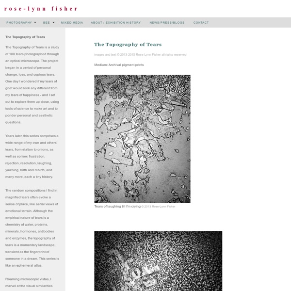
#CITYLOVINK #CITYLOVINK presenta: Scott Campbell (y el fin de una temporada) // Written on Feb 28 , 2012 // Arte, Tatuajes La colonia Roma tiene sus historias muy bien grabadas, de alguna manera podríamos decir que esas historias se encuentran marcadas como un tatuaje en la memoria de cada uno de sus habitantes. Una de esas historias comienza en Lower Haight, San Francisco, dónde hace 32 años nació un rebelde llamado Scott Campbell. Scott era el tipo que se juntaba con “los chicos malos” del barrio, y desde ese momento, su trabajo como diseñador comenzó de una extraña forma. No fue si no hasta en el 2005 que su talento lo llevó, después de cuatro años, a abrir su estudio en Nueva York (Saved Tattoo), haciéndolo uno de esos artistas de los que todos quisiéramos tener su arte en nuestro cuerpo. Como parte de la serie #CITYLOVINK realizada por el equipo de NOTTV, este episodio corresponde a la última entrega relacionada con el tema de los tatuajes. #CITYLOVINK presenta: Scrappy Uno
The OS Canvas – The Ready – Medium Organization design is hard. Whether you’re the CEO of a global corporation, the founder of a venture-backed startup, or a team leader inside one of the tens of thousands of companies that make our world turn, you’re up against one of the greatest puzzles ever conceived. We see evidence of this everywhere. Leaders in every industry tell us about the myriad problems they’re trying to solve in their organizations: We need to go faster. And we all know how you get these things. The trouble stems (at least in part) from the fact that we still look at organizations mechanistically. When faced with that level of complexity and uncertainty, we tend to oversimplify. But, here’s the good news: The problem isn’t your leaders or your people. The organizational operating system. In technology, we think of an operating system (OS) as the foundational layer between the hardware (e.g. your phone) and the software (e.g. your apps). Like our technology, organizations run on code. Everyone needs a boss.
Ces visages révélés derrière les photographies historiques “Behind Photographs”, l’ouvrage de Tim Mantoani, dévoile pour la première fois les photographes professionnels cachés derrière les clichés de presse les plus populaires que l’on connaisse. Une occasion unique de découvrir des femmes et des hommes de talent dont le visage reste le plus souvent derrière l’objectif. Des artistes qui, parfois au péril de leur vie, ont immortalisé des moments d’histoire que nous connaissons tous. Tim Mantoani s’est d’abord spécialisé dans la photographie publicitaire et a ouvert son propre studio à San Diego en 1995. À ses yeux, photographier est plus une mission d’intérêt collectif qu’un travail. Alors que les gens sont familiers avec la plupart des images qui suivent, y compris de nombreuses photographies auréolées du prix Pulitzer, la majorité ne connaît pas les photographes qui les ont réalisées. Parce que derrière chaque photographie c’est aussi le regard d’une femme ou d’un homme qui s’exprime, le regard d’un humain sur son histoire. En voir plus ?
fork and flower: wild herb gathering remember the crazy chai pear and chocolate pudding tart...? that's when the collaboration (though, in all honesty, we stick to calling it 'playing around', actually) between photographer extraordinaire christine benz and my humble (aspiring food stylist, ahem) self started. by now, we're already two days, several hours of hard, sweaty work and a couple more insights on working together on food into this project. it's been fun, and continues to be. but let me explain what it is that you're seeing here. for now, no recipes (obviously). but some pictures of me (utterly unglamorous, in mornign manière, with a totes naked face, ugh, why do i never manage to jump out of bed earlier when i'm having my picture taken...? what you're still going to see from christine and i: a wild herb foam soup with lady's smock (color blocking in a soup, literally. i'm positive my fashion forward styler friend ki will adore this), a fancy rustic nettle bread (yeah, ouch!) for now, though, happy easter!
Hierarchy of Opportunity Reactionary Solution Humans employ many subconscious techniques to avoid acknowledgement of problems. When issues materialize, our subconscious jumps to solutions to pacify our unease. Simply thinking of a solution isn’t necessarily a bad thing. If you think you have an answer, think of its consequences. Take time to let the solution sink into your mind. Emotions: prideful, skeptical, insecure
10 règles de composition à connaitre absolument Vos photos sont nettes et correctement exposées mais vous sentez qu’il manque quelque chose pour qu’elles soient uniques. Et si vous vous penchiez sur la composition de vos images ? Si vous n’avez jamais entendu parler de cette notion, la composition se définit comme l’organisation des éléments à l’intérieur du cadre. La composition est parfois négligée par certains photographes alors que c’est un paramètre déterminant : une photo réussie est bien souvent une photo avec une composition soignée ! Même s’il existe de multiples façons de composer un photo, il est intéressant de s’appuyer sur certains principes ou règles de composition. Dans cet article, je vous présente les principales règles de composition à connaître pour donner de la force à vos photos. 1. Imaginez que le cadre est divisé en 9 segments égaux par 2 lignes verticales et 2 lignes horizontales. C’est certainement le principe de composition le plus célèbre et le plus simple à mettre en œuvre. 2. 3. 4. 5. 6. 7. 8. 9. 10.
When Edward Gorey Illustrated Dracula: Two Masters of the Macabre, Together by Maria Popova “No man knows till he has suffered from the night how sweet and dear to his heart and eye the morning can be.” As if knowing that the great Edward Gorey illustrated a small stable of little-known and wonderful paperback covers for literary classics weren’t enough of a treat, how thrilling it is to know that he also illustrated the occasional entire volume, from classic fairy tales to H. G. Mina Murray Jonathan Harker Lucy Westenra Dr. R. Dr. Count Dracula The gorgeously Gorey endpapers are particularly marvelous: The book also includes some pages from Bram Stoker’s original Dracula manuscript: Manuscript notes and outlines, p. 35 verso b. Manuscript notes and outlines, p. 2 (Courtesy of the Rosenbach Museum & Library, Philadelphia) But the greatest Gorey-goodie of all is the toy theater set: Complement Edward Gorey’s Dracula with a look back at this gallery of the beloved illustrator’s other literary masterpieces. Donating = Loving Brain Pickings has a free weekly newsletter.
Donald Trump tries out a new campaign tactic: saying sorry | US news Donald Trump marked the relaunch of his struggling presidential campaign with a shock new tactic: an apology. “Sometimes in the heat of debate and speaking on a multitude of issues, you don’t choose the right words or you say the wrong thing,” he told a rally in North Carolina on Thursday night. “I have done that. And, believe it or not, I regret it. I do regret it. Particularly where it may have caused personal pain.” The remarks, during Trump’s first public appearance since the appointment of a new campaign manager, are a sharp reversal of an approach that seemed to follow the adage “never retract, never explain, never apologise”. “I like not to regret anything,” the candidate previously told radio host Don Imus in May after controversy over comments that questioned senator John McCain’s war record. “Too much is at stake for us to be consumed by these issues,” he told the unusually subdued crowd at the Charlotte convention center. Random quotes of “lock her up!”
Photographie « Les Irréguliers Duane Michals, Renaissance © DR Comme le songe d’une nuit d’été mais ce peut-être un conte de toutes les saisons. Le photographe américain Duane Michals fait l’objet d’une rétrospective aux Rencontres d’Arles. L’exposition est de toute beauté et vous embarque, en deux images, dans le monde bien singulier de Duane Michals, 78 ans, connu comme portraitiste – il a travaillé pour le « New York Times », « Vogue », « Esquire » – de Magritte, Warhol, Clouzot, Robert Duvall, Jeanne Moreau, et surtout le « virtuose de la narration séquentielle ». Duane Michals, The once and always now, Rencontres internationales de la photographie d’Arles (Palais de l’Archevêché), jusqu’au 13 septembre 2009. Duane Michals, Ce que j’ai écrit, Delpire. Duane Michals, Photo Poche (Actes Sud), avec une préface de Renaud Camus.