
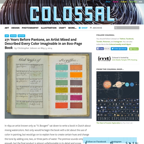
'Humanae' Portraits Match People of Different Ethnicities With Their Pantone Color Brazilian fine art photographer Angelica Dass‘ series Humanae identifies portrait subjects from around the world using the Pantone color system. Using an 11×11 pixel swatch from her subjects’ faces, Dass matches them to corresponding Pantone colors, creating an abundant and unique catalog of skin tones that reflects the world’s diversity beyond the categorizations we have long been confined to. We recently asked her more about the ongoing project. What was your inspiration for using Pantone colors to represent humans? “If what I wanted was to destroy the concepts of colors associated with race, such as red, yellow, white and black, it would not be logical to use a color scale that works with percentages of these colors. That’s why I chose not to use CMYK or RGB. How do you go about finding subjects for your work and what are the criteria you are looking for? Since the Pantone system is a highly structured and ordered system, how does your display of the work relate to this system?
The Dark Mountain Project 4 Tips On Creativity From The Creator Of Calvin & Hobbes Bill Watterson, the creator of the comic strip Calvin & Hobbes, is famously media-averse. He's given two interviews, total since he retired his strip in 1995. Reporters have staked out his home in Ohio to no avail. The man just prefers not to be a public figure. But in the documentary Stripped (which you can buy or rent on iTunes), Watterson not only gives an interview, he drew the art for the poster—the first Watterson cartoon to be published in nearly 20 years. Stripped features interviews with just about every major cartoonist still alive, including Cathy Guisewite (Cathy), Bill Amend (Foxtrot), Stephan Pastis (Pearls Before Swine), Jim Davis (Garfield), Mort Walker (Beetle Bailey), and a host of web comic artists, including Kate Beaton (Hark, A Vagrant!) Watterson is the creator of one of the most beloved pieces of comic art, and most of his fans have probably never heard him speak before. Here are four tips about the creative process that Watterson reveals in the film: 1. 2. 3. 4.
Colorblind People Experiencing Colors Dans le cadre de la campagne « Color for all » de Valspar, cette marque de peinture et le fabriquant de lunettes EnChroma se sont associés pour créer un documentaire extrêmement émouvant. Grâce à une paire de lunettes spécialement conçue par EnChroma, ils ont permis à des daltoniens de voir en couleurs pour la première fois de leur vie.
So What’s the Big Deal with Horizontal & Vertical Bezier Handles Anyway? | The Australian Graphic Supply Co 17 Apr Have you ever seen Illustrator progress shots from your favourite designers and wondered how and why their bezier handles are so obsessively arranged? We’re hoping to shed a little light on this seemingly unnecessary process. Note: this tutorial assumes a solid grasp of Illustrator & the pen tool. Until recently, I definitely belonged to the What’s the point of that? Here’s a piece of lettering we created to play around with for this tutorial: Here’s an outline preview ( ⌘Y) in Illustrator: Note: To preview your own beziers like this you may need to turn on the “Show handles…” option highlighted below in Illustrators’ Preferences ( ⌘K). Notice all the bezier handles (save for a few strays; we’ll get to those later) are neatly locked to the horizontal or vertical plane. It reduces your node placement options That may kinda sound like a bad thing, but it’s really handy. Node placement That’s the secret sauce right there. See an overly simplified diagram below in Fig. 04. …and others.
Shape of eye's 'light pipes' is key to colour sorting Physicists have pinned down precisely how pipe-shaped cells in our retina filter the incoming colours. These cells, which sit in front of the ones that actually sense light, play a major role in our colour vision that was only recently confirmed. They funnel crucial red and green light into cone cells, leaving blue to spill over and be sensed by rod cells - which are responsible for our night vision. Key to this process, researchers now say, is the exact shape of the pipes. The long, thin cells are known as "Muller glia" and they were originally thought to play more of a supporting role in the retina. They clear debris, store energy and generally keep the conditions right for other cells - like the rods and cones behind them - to turn light into electrical signals for the brain. But a study published last year confirmed the idea, proposed in earlier simulations, that Muller cells also function rather like optical fibres. 'Centuries-old puzzle' "This kind of clinched it," he said. Light guides
Bezier Curves and Type Design: A Tutorial | Learn - Scannerlicker! When I am asked to calibrate a typeface or logo, or when someone asks me for help with their typefaces, one of the most common problems I find is bad Bézier curve design. And every single time this happens, it’s not people’s fault: they just don’t know better. And there’s that heart-stabbing situation when someone pings and says “Hey, I just finished this font, can you have a look and see if something’s missing?” and I feel obliged to say, with grief, “You have to redesign it all over: it’s poorly designed, bézier-wise”. So, in order to save some people from this hassle, in advance, read along. 1. First of all, we should understand that each desktop publishing software is going to compile the font files in it’s own way. Flash IDE, for example, is notorious for wrecking curves. Some programs, like 3D applications, simply break the curve into several facets. 2. I know, I know, geek stuff. And for the visual type of guy, here’s an image: Let’s count the number of points needed for each circle:
9 great color resources | Design Colour is an integral element of design. And the web is full of endless resources and tutorials covering it. But, sometimes too much choice can be confusing. So we've picked this selection of the best resources that will really help you to get to grips with the subject. 01. The Mudcube Colour Sphere is a handy little colour resource for designers in that it not only provides the hex numbers for each colour; it also helps you to build up a colour scheme from one chosen shade. 02. Color by HaliPixel is a handy little web app if you're a bit of a perfectionist when it comes to getting the colour just right. 03. This web designer's tool Check my Colours is designed to check foreground and background colour combinations of all DOM elements, to determine if they provide sufficient contrast when viewed by someone having colour deficits. 04. Although Color Hunter may not look like much at first glance, it's actually a really useful colour tool if you can't find a particular colour. 05. 06. 07.
Design Principles: Space And The Figure-Ground Relationship Advertisement If you see graphic design as a process of arranging shapes on a canvas, then you’re only seeing half of what you work with. The negative space of the canvas is just as important as the positive elements that we place on the canvas. Design is an arrangement of both shapes and space. To work more effectively with space, you must first become aware of it and learn to see it — learn to see the shapes that space forms and how space communicates. The Figure-Ground Relationship The gestalt principle that applies most to space is that of figure-ground. The figure-ground relationship is also complementary. “White space is to be regarded as an active element, not a passive background.”— Jan Tschichold Figure-Ground Relationship. Consider the three panels in the image above. In the third panel, two of the black lines have been removed. Stable, reversible and ambiguous figure-ground relationships. There are three types of figure-ground relationships: Closure. Space As A Design Element
Risorse creative per i webdesigners Il mestiere del web designer è evoluto molto negli ultimi tempi. Da che questa figura professionale doveva saper fare ogni cosa, dal design alla programmazione, oggi, fortunatamente, il web designer ha il privilegio di potersi concentrare sopratutto sull'aspetto creativo e quindi sul design vero e proprio delle pagine web. Tante risorse a pagamento o gratuite possono aiutare il web designer in questo compito e oggi vi segnaliamo alcune di queste, ovviamente free. 1. Paletton Generatore di schemi di colore motlo facile da usare. 2. Non è la prima volta che parliamo nei nostri corsi di web design di questo sito-community,dove potete trovare migliaia di schemi di colore per i vostri progetti di web design, realizzati da altri creativi di talento. 3. Ti piace un'immagine e vuoi estrarne i colori? 4. Verifica se stai usando il giusto grado di contrasto nei tuoi progetti di web design. 5. Non ha bisogno di spiegazioni l'app ufficiale dell'Adobe per creare palette dei colori
Color Inspiration from the Masters of Painting by COLOURlovers The world has seen thousands of artists and millions of great pieces of art, but we chose just a handful of pieces of art from some of greatest masters of painting to show a little of how they were inspired by color... or perhaps, how they inspire us with color. What colors inspire you? Check out Creative Market to find your color palette now. Lezioni di fotografia | Profilo Colore Profilo Colore Così come la scelta del formato di file che andremo a creare può avere un impatto anche notevole sul risultato finale che otterremo, per completare il capitolo delle impostazioni pre-scatto è bene che si comprenda anche il concetto di "spazio colore". Senza entrare troppo nello scientifico, possiamo definire lo Spazio Colore come la mappatura di un determinato modello di colori astratto. Un modello colore non è nient'altro che un modo per rappresentare i colori tramite una combinazione di numeri, detti componenti colore. I modelli colore più utilizzati nell'ambito fotografico e informatico sono i modelli RGB e CMYK. Poichè il modello quadricromatico CMYK è un modello utilizzato principalmente in ambito di stampa, ci concentreremo ora solo sul modello RGB. Uno Spazio Colore è quindi un "sottoinsieme" di un determinato modello di colore, che permette di identificarne una porzione ben definita che viene definita gamma (gamut). sRGB Adobe RGB
Calibrare il monitor per vedere le tue foto senza alterazioni Il monitor è ormai il riferimento esclusivo che tutti noi utilizziamo per valutare i nostri scatti, decidere se sono troppo chiari o troppo scuri o se hanno dominanti. E’, quindi, naturale correggerli utilizzando il nostro software di foto ritocco preferito regolando curve, livelli e colore. Ma siamo sicuri che il monitor ci stia mostrando veramente l’immagine che abbiamo scattato? Chi ci garantisce che il nostro monitor “non menta” e non introduca nessun’altra variante nella visualizzazione delle nostre immagini? In realtà è proprio così: il monitor inevitabilmente altera la nostra immagine “interpretandola a modo suo”. I calibratori, i nostri super eroi in grado di calibrare il monitor Immagine in evidenza via BenQ brochure