
City Of Melbourne : Pedestrian Counting System Wednesday 22 March 2017 Trend over last 3 hours Note: If a sensor returns a series of zero readings it may be temporally inoperable 8am Wednesday 22 March 2017 Yellow Above average by 10% or moreGrey Average Green Below Average by 10% or more * Average calculated from same day & hour over the previous 4 weeks Pedestrian Counting The City of Melbourne's 24-hour pedestrian counting system measures pedestrian activity in the city each day. The system counts pedestrian movements to give the City of Melbourne a better understanding of how people use the city so we can manage the way they function and plan for future needs. The online visualisation tool is an interactive map of these sensor locations, which enables users to see pedestrian counts on particular dates and times and compare data. Interact Click on the screenshots below to understand the interactive elements of the visualisation, and how the data is represented on a selected date. Events in the city Share or Download data files
Gephi, an open source graph visualization and manipulation software Tools - Misleading axes on graphs The purpose of a publication-stage data visualization is to tell a story. Subtle choices on the part of the author about how to represent a dataset graphically can have a substantial influence on the story that a visualization tells. Good visualization can bring out important aspects of data, but visualization can also be used to conceal or mislead. In this discussion, we'll look at some of the subtleties surrounding the seemingly straightforward issue of how to choose the range and scale for the axes of a graph. Bar chart axes should include zero We begin with a well-known issue: drawing bar charts with a measurement (dependent variable) axis that does not go to zero. It looks like Germany has a big edge over other nations such as Sweden, let alone France, right? (You might notice that in the redrawn graph we've removed the horizontal gridlines separating the countries. Line graph axes need not include zero What is the difference? When line graphs ought not include zero Well, not really.
Cytoscape: An Open Source Platform for Complex-Network Analysis and Visualization Tools - Proportional Ink In this article we explore a basic rule for the design of data graphics, the principle of proportional ink. The rule is very simple: when a shaded region is used to represent a numerical value, the area of that shaded region should be directly proportional to the corresponding value. In other words, the amount of ink used to indicate a value should be proportional to the value itself. This rule derives from a more general principle that Edward Tufte set out in his classic book The Visual Display of Quantitative Information. The principle of proportional ink makes sense of, and extends, the arguments in our article about misleading axes. Bar charts We can see right away that the principle of proportional ink is violated by bar charts with axes that fail to reach zero. In this chart the value for 2014 is approximately 1.08 times the value for 2010, but because the vertical axis has been truncated, the bar for 2014 uses approximately 2.7 times as much ink as the bar for 2010. Line graphs
Your Random Numbers – Getting Started with Processing and Data Visualization Over the last year or so, I’ve spent almost as much time thinking about how to teach data visualization as I’ve spent working with data. I’ve been a teacher for 10 years – for better or for worse this means that as I learn new techniques and concepts, I’m usually thinking about pedagogy at the same time. Lately, I’ve also become convinced that this massive ‘open data’ movement that we are currently in the midst of is sorely lacking in educational components. The amount of available data, I think, is quickly outpacing our ability to use it in useful and novel ways. This post, then, is a first sketch of what a lesson plan for teaching Processing and data visualization might look like. Let’s Start With the Data We’re not going to work with an old, dusty data set here. Even on a Saturday, a lot of helpful folks pitched in, and I ended up with about 225 numbers. I wrote a quick Processing sketch to scrape out the numbers from the post, and then to put them into a Google Spreadsheet. Got it?
The Joy of Stats About the video Hans Rosling says there’s nothing boring about stats, and then goes on to prove it. A one-hour long documentary produced by Wingspan Productions and broadcast by BBC, 2010. The change from large to small families reflects dramatic changes in peoples lives. Hans Rosling asks: Has the UN gone mad? Hans Rosling explains a very common misunderstanding about the world: That saving the poor children leads to overpopulation.
Sketchnotes: Tools and tactics for visual notetaking About the presenter: Matt Miller has taught for more than a decade, integrating technology to engage students and create unique learning experiences. He created the Ditch That Textbook blog, is a Google Certified Teacher and co-hosts a podcast on the BAM Radio Network. Matt’s book, Ditch That Textbook, was recently published. Buy a copy of Ditch That Textbook on Amazon, or don’t wait — get a copy from Matt for $20, cheaper than the Amazon price. Matt travels around Indiana and the United States to present at schools, workshops, conferences or any other professional development event. Great sketchnoting resources: Matt’s posts on sketchnoting and sketchnote-related ideas: Carrie Baughcum’s sketchnoting for beginners video: Other visual notetaking resources:
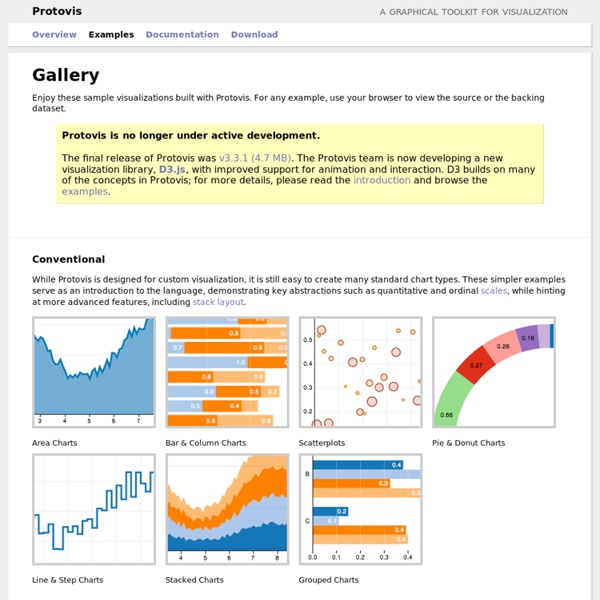
The five keys to a great infographic Great infographics don't happen by accident; rather a carefully crafted infographic displays various attributes that contribute to its overall success. I've come up with a simple way to summarize these attributes into what I call CHART: the five keys to a great infographic. The first key is Contrast; Contrast in a design creates tension and displays a clear distinction or difference offering no ambiguity. For example, a splash of color amidst the grayscale image, but it's equally important when displaying data. Making it difficult to either use the data or to make a decision or even to help a viewer understand the point hat you're trying to make. You must lead the eyes from the most important elements to the least important. Illustrator also allows you to be as precise as you need, so don't resort to eyeballing it. A good way to protect yourself here is to have someone else review your designs.
Evaluating Information - Citing and Writing Help - SJSU Research Guides at San José State University Library When you search for information, you're going to find lots of it . . . but is it good information? You will have to determine that for yourself, and the CRAAP Test can help. The CRAAP Test is a list of questions to help you evaluate the information you find. Key: An asterisk (*) indicates that criterion is for Web sources only Currency: The timeliness of the information. When was the information published or posted? Relevance: The importance of the information for your needs. Does the information relate to your topic or answer your question? Authority: The source of the information. Who is the author/publisher/source/sponsor? Accuracy: The reliability, truthfulness, and correctness of the informational content. Where does the information come from? Purpose: The reason the information exists. What is the purpose of the information? Adapted from The CRAAP Test by Sarah Blakeslee at Chico State's Meriam Library.