D3js
Voici le premier d’une longue lignée (je l’espère) de tutoriaux en français portant sur la librarie d3.js. Pour en savoir plus sur cette librairie reportez vous à la présentation que j’en ai faite sur ce post. L’objectif de ce premier tutoriel est de faire quelques exemples d’utilisation très simple de la librairie. A l’instart de Jquery, d3.js est une librarie qui permet de manipuler le DOM. Mais là où d3.js est très efficace est dans la manipulation de SVG. Manipuler ou créer une div avec d3.js Ajouter et manipuler un rectangle SVG Dessiner plusieurs éléments dans un groupe svg Gérer des données au format JSON et dessiner en fonction de ces données Dans ce dernier exemple, nous allons construire des nodes qui sont en fait des groupes svg ayant la class “node”. Le dernier exemple introduit plusieurs nouveaux concepts : selectAll(), data(), et enter(). selectAll() data() La methode data() permet de “binder” (attacher) des données à des éléments sélectionnés par la methode selectAll(). enter()
Tutorials · mbostock/d3 Wiki
Wiki ▸ Tutorials Please feel free to add links to your work!! Tutorials may not be up-to-date with the latest version 4.0 of D3; consider reading them alongside the latest release notes, the 4.0 summary, and the 4.0 changes. Introductions & Core Concepts Specific Techniques D3 v4 Blogs Books Courses D3.js in Motion (Video Course)Curran Kelleher, Manning Publications, September 2017D3 4.x: Mastering Data Visualization Nick Zhu & Matt Dionis, Packt. Talks and Videos Meetups Research Papers D3: Data-Driven DocumentsMichael Bostock, Vadim Ogievetsky, Jeffrey HeerIEEE Trans.
Creating Animated Bubble Charts in D3 - Jim Vallandingham
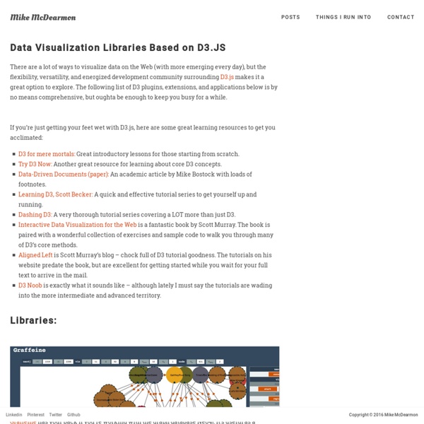
Update: I moved the code to its own github repo - to make it easier to consume and maintain. Update #2 I’ve rewritten this tutorial in straight JavaScript. So if you aren’t that in to CoffeeScript, check the new one out! Recently, the New York Times featured a bubble chart of the proposed budget for 2013 by Shan Carter . It features some nice, organic, animations, and smooth transitions that add a lot of visual appeal to the graphic. As FlowingData commenters point out , the use of bubbles may or may not be the best way to display this dataset. In this post, we attempt to tease out some of the details of how this graphic works. #Simple Animated Bubble Chart In order to better understand the budget visualization, I’ve created a similar bubble chart that displays information about what education-based donations the Gates Foundation has made. You can see the full visualization here And the visualization code is on github The data for this visualization comes from the Washington Posts DataPost .
Data Visualization 101: Pie Charts
In our Data Visualization 101 series, we cover each chart type to help you sharpen your data visualization skills. Pie charts are one of the oldest and most popular ways to visualize data. This classic chart is the perfect example of the power of data visualization: a simple, easy-to-understand presentation that helps readers instantly identify the parts of a whole. Without further ado, here’s everything you need to know about the pie chart. What It Is The typical pie chart is divided into sections that illustrate a numerical proportion. Where It Came From Scottish engineer William Playfair is generally credited with creating the world’s first pie charts back in 1801. Playfair’s pie chart showed the proportion of land held by the Turkish Empire in Asia, Europe and Africa. Although he invented the form, Playfair never called his invention a “pie chart.” Another series of Playfair’s pie charts in “Chart Representing the Extent, Population & Revenue of the Principal Nations in Europe in 1804.”
Comptes des ménages - Revenu disponible des ménages
Le revenu net réel disponible des ménages est défini comme la somme de leurs dépenses de consommation finale et de leur épargne, diminuée de la variation de leurs droits nets sur les fonds de pension. Cet indicateur correspond également à la somme des salaires et traitements, du revenu mixte, des revenus nets de la propriété, des transferts courants nets et des prestations sociales autres que les transferts sociaux en nature, moins les impôts sur le revenu et le patrimoine et les cotisations de sécurité sociale payées par les salariés, les travailleurs indépendants et les chômeurs. Le revenu disponible ajusté brut des ménages y ajoute les « revenus » des administrations publiques et des institutions sans but lucratif au service des ménages (ISBLSM) pour refléter les transferts sociaux en nature. Ces transferts reflètent les dépenses des administrations publiques ou des ISBSLM sur les biens et services individuels, tels que la santé et l’éducation, au profit des ménages individuels.
wwsd/README.md at master · enjalot/wwsd
Textures.js
Textures are useful for theselective perception of different categories View on Github Getting started -- from the top of d3.js -- var svg = d3.select("#example") .append("svg"); var t = textures.lines() .thicker(); svg.call(t); svg.append("circle") .style("fill", t.url()); Lines textures.lines(); textures.lines() .heavier(); textures.lines() .lighter(); textures.lines() .thicker(); textures.lines() .thinner(); textures.lines() .heavier(10) .thinner(1.5); textures.lines() .size(4) .strokeWidth(1); textures.lines() .size(8) .strokeWidth(2); textures.lines() .orientation("vertical") .strokeWidth(1) .shapeRendering("crispEdges"); textures.lines() .orientation("3/8") .stroke("darkorange"); textures.lines() .orientation("3/8", "7/8") .stroke("darkorange"); textures.lines() .orientation("vertical", "horizontal") .size(4) .strokeWidth(1) .shapeRendering("crispEdges") .stroke("darkorange"); textures.lines() .orientation("diagonal") .size(40) .strokeWidth(26) .stroke("darkorange") .background("firebrick"); Paths
Cartographie des métiers du digital en 2016
Comme l’an dernier, l’IAB a présenté son étude sur les “métiers et compétences du marketing et de la communication dans un contexte de transition digitale” lors de l’événement Experiences de Microsoft. Les spécificités du marketing digital L’IAB indique que les spécificités du marketing digital identifiées en 2015 s’affinent : Technicité : technologies variées, renouvellement des outils de travail…Temporalité courte : ancrage dans le présent, temps réel, pas de best practices pérennes, optimisation permanente, cycles de travail courts…Précision / Ciblage : multiplicité des canaux et touchpoints, variété de publics, personnalisation des stratégies, outils techniques… À ces spécificités principales s’ajoutent des spécificités additionnelles : L’évolution des métiers du marketing digital On assiste également à une mutation profonde des métiers. Progressivement, certains métiers disparaissent. Les nouveaux métiers du marketing digital L’étude complète est disponible sur le site de l’IAB.
From data to Viz | Find the graphic you need