
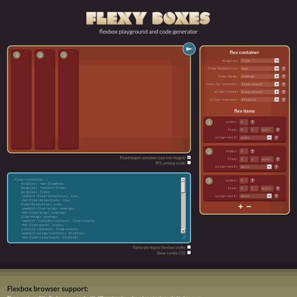
Working with flexbox Flexible layouts. Equal height columns. Presentation independence from your HTML source order. These things haven't been so easy to achieve with CSS—until now. The flexible box layout, the new flexbox specification, makes creating any of these layouts easy, and much more. In this article I'll walk you through the latest flexbox specification and use a simple demo to show you how to create a layout that's flexible, and has equal height columns and elements that you can arrange in any order, regardless of their order in the HTML source. There is some bad news with regard to flexbox and browser support. Opera (12.1) - Supports the latest specification without the need for vendor prefixes.Chrome (23.0) - Supports the latest specification, but requires the -webkit vendor prefix.Safari (5.1) - Supports an older version of the specification with the -webkit vendor prefix.Internet Explorer (10) - Supports an older version of the specification with the -ms vendor prefix. Figure 1. Figure 2.
Crafty Responsive Tables Why We Built This When we looked around at the various implementations of responsive tables on the web, we saw lots of interesting ideas but nothing we thought was a really great implementation. Chris Coyier on css-tricks.net did a great round up of responsive data tables and while there's some fascinating ideas in there, nothing seemed to meet the criteria we had for a great implementation: Doesn't break responsive layouts Doesn't unnecessarily hide data Still lets you compare rows With those existing tricks in mind, we set out to develop this, a CSS/JS combo that takes existing tables and modifies them for small devices so they meet our criteria. We built these specifically to work with Foundation, our open source front-end framework for responsive sites, but it would work just fine with any responsive site. How to Make Your Tables Responsive We wanted this to be incredibly easy to implement. Example Page Download the Code Attach to Your Markup <table class="responsive"><tr> … Ready to Rock
Advanced Cross-Browser Flexbox Introduction The CSS Flexible box module level 3 — or Flexbox for short — brings with it a lot of power and some very exciting possibilities for web development, allowing us to put together complex site layouts easily and rapidly, and dispensing with some of the illogical hacks and kludges that we’ve traditionally used. I dealt with the basics of Flexbox in my article Flexbox: fast track to layout nirvana? In this article I will go a bit further, looking at a more advanced example, and using Modernizr to serve different styles to browsers with differing levels of Flexbox support, providing the best level of cross browser support currently available. Introducing the example The example I have built for this article looks like Figure 1: This has multiple levels of Flexboxes contained within it. The overall layout The basic layout of the site is like this: The <section> is set to display as a flexible box like so: Child flexboxes Next comes the magic moment. Intelligent fallbacks for Flexbox
JQuery Corner Demo It's important to understand that this corner plugin is pulling off its magic by adding more elements to the page. Specifically, it adds div "strips" to the item to be cornered and sets a solid background color on these strips in order to hide the actual corners of the real item. So if you step back and look at the cornered element, think of there being solid colored divs hiding the true squared off corners of the item you wish to be changed. This helps you understand the inherent limitations of this small plugin. Recently I added support for native border-radius rounding in browsers that support it (Opera 10.5+, Firefox, Safari, and Chrome). Auto-Ready! The default pattern is round $(this).corner("wicked"); $(this).corner("sculpt"); $(this).corner("dogfold"); $(this).corner("bevelfold"); $(this).corner("invsteep"); Use top, bottom, left, right, tl, tr, bl, br to identify which corner to style $(this).corner("bevel top"); $(this).corner("bite tl"); $(this).corner("bottom"); // script used ...
GitHub - 10up/flexibility: Use flexbox while supporting older Internet Explorers 72 Free PSD Web Design Elements PSD files Subscribe by RSS or Email 72 Free PSD Web Design Elements PSD files Posted In: Freebies, Photoshop roundups, By WAD, 15 Comments advertisement Adobe Photoshop PSD files can be used to create good-looking and eye-catching web design layouts, icons, buttons, any web design elements and much more. We appreciate the work of all those talented Photoshop Designers who designed and share their Creative design stuffs with their efforts. Here’s a collection of free web design elements layered PSD files, easy to use and customize with some adjustment as per your need and can be turned into ready web element 1. 2. 3D Web page Display by artbees 3. 4. 5. 300 Lifetime Social Network Icons 6. 7. 111 Free Ecommerce Icons 8. 7 3D Arrow Icons 9. 10. 11. 12. 13. 14. 15. 16. 4 step process panel in 2 colors (PSD) 17. 18. 4 excellent content sliders (Download PSD) 19. 20. 21. 22. 23. 24. 25. 26. 27. 28. 29. 30. 31. 32. 33. 34. 35. 36. advertisement 37. 24 glossy social media icons (PSD & PNG) 38. 39. 404 Error Template
GitHub - philipwalton/flexbugs: A community-curated list of flexbox issues and cross-browser workarounds for them. Flexslider by WooThemes namespace: "flex-", //{NEW} String: Prefix string attached to the class of every element generated by the plugin animation: "fade", //String: Select your animation type, "fade" or "slide" easing: "swing", //{NEW} String: Determines the easing method used in jQuery transitions. jQuery easing plugin is supported! direction: "horizontal", //String: Select the sliding direction, "horizontal" or "vertical" reverse: false, //{NEW} Boolean: Reverse the animation direction animationLoop: true, //Boolean: Should the animation loop? smoothHeight: false, //{NEW} Boolean: Allow height of the slider to animate smoothly in horizontal mode startAt: 0, //Integer: The slide that the slider should start on. slideshow: true, //Boolean: Animate slider automatically slideshowSpeed: 7000, //Integer: Set the speed of the slideshow cycling, in milliseconds animationSpeed: 600, //Integer: Set the speed of animations, in milliseconds initDelay: 0, //{NEW} Integer: Set an initialization delay, in milliseconds
GitHub - vadimyer/Ecligrid: Flexible Mobile First Grid System Based on Flexbox. jQuery Lightbox Generator. Mobile-ready, Responsive Lightbox Gallery Solved by Flexbox — Cleaner, hack-free CSS All of the code samples on this site show how to solve a particular design problem with Flexbox. They show just the code that's needed to make the demos work in a spec-compliant browser. Some browsers do not fully comply with the latest version of the spec, so sadly, a few workarounds were necessary. Workarounds for non-compliant browsers are not shown in the code samples, but if you're curious about those implementation details, you can check out the source files. The vendor prefixing and translating of current flex properties to their legacy equivalents is all handled by autoprefixer. The class naming convention used in the code samples and source files is taken from SUIT CSS, which is based on BEM methodologies. If you find a mistake or would like to suggest an additional example, feel free to open an issue or submit a pull request on Github.
Edit Icon | Mono General 2 Iconset | Custom Icon Design Recently viewed icons Share this link Sponsored links Follow us edit Search tag Good (6) Bad (0) Report abuse new Search tag Good (1) Bad (0) Report abuse kawaii Search tag Good (1) Bad (0) Report abuse list Search tag Good (1) Bad (0) Report abuse Icon Rating Stats Views: 3604Downloads: 700Posted: Mar 10, 2014 Browse this Iconset Advertisement Artist:Custom Icon Design (Available for custom work)Iconset:Mono General 2 Icons (15 icons)License: Free for non-commercial use.Commercial usage: Buy commercial license here: PNG | 512pxDownload ICODownload ICNSDonate to artist Download other sizes of this icon: Similar icons with these tags: editnewkawaiilist More icons from the "Mono General 2 Icons" icon set. (15 icons)
CSS3 Flexbox Layout module Vous connaissez certainement le modèle de boîte classique en CSS et ses dispositions de type “block” ou “inline”, sachez que Flexbox CSS3 a été conçu pour étendre ce périmètre en introduisant un nouveau modèle de boîte distinct, que l’on appellera “le Modèle de boîte flexible”. En février 2016 est sorti mon livre entièrement dédié à Flexbox. Il se nomme "CSS3 Flexbox : plongez dans les CSS modernes" et je vous recommande bien évidemment sa lecture afin de comprendre tous les rouages de ce positionnement révolutionnaire, et d'en maîtriser tous les aspects. Au sein de ce schéma, on ne raisonne plus en “block” ou “inline”, ni même en float ou autres types de boîtes “classiques” CSS, mais en “Modèle de boîte flexible”, dont les quatre possibilités principales sont : Note : ce tutoriel a été initialement rédigé en octobre 2010. En action ! Flexbox (le modèle de boîte flexible) se fonde schématiquement sur une architecture de ce type : Démonstration display: flex Compatibilité Standardisation