
Brand as Context in Interaction Design I’m sure I was swearing allegiance to one brand over another as soon as I began to develop the capacity for critical thought. Reebok vs. Nike, Coke vs. Because people assign meaning to brands, brands stand for something; they have both value and a set of values. While there are tremendous differences in how people react to these brand names—based on countless cultural and social parameters—whether consumers view them in a positive or negative light, they likely find it hard to remain neutral. Even though brand and product design teams typically approach their work as distinct teams with different measurements for success, it is essential to work across organizational silos and ensure each team is aware of how to complement the other. When interaction designers focus solely on matters such as flow and consistency, they miss opportunities to imbue products and services with a sense of connection, ownership, and emotion. Corporation Out People In Be mindful of the story
Principles of Flat Design Flat design – the design community just can’t stop talking about it. And feelings are strong. Most designers either can’t get enough of this trend, or absolutely hate it. I am somewhere in the middle. So let’s examine what makes something flat. No Added Effects Flat design gets its name from the shapes used. The concept works without embellishment – drop shadows, bevels, embossing, gradients or other tools that add depth. Nothing is added to make elements look more realistic, such as tricks designed to make items appear 3D in skeuomorphic design projects. So what makes it work? Simple Elements Flat design uses many simple user interface elements, such as buttons and icons. Each UI element should be simple and easy to click or tap. In addition to simple styling, go bold with color on clickable buttons to encourage use. Need help getting started? Focus on Typography Because of the simple nature of element in flat design, typography is extremely important. Focus on Color Minimalist Approach
Usable yet Useless: Why Every Business Needs Product Discovery Brasília is a remarkable, bizarre city. The vision of architect Oscar Niemeyer, it was built in just four years, from 1956 to 1960. More than 50 years later, its beauty and elegance are renowned. But Brazil’s capital city is known for something else as well: how difficult it is to live there. A “shiny citadel” from far away, as The Guardian once wrote, up close Brasília has “degraded into a violent, crime-ridden sprawl of cacophonous traffic jams. This problem echoes across today’s web landscape as well, where the needs of ordinary users spill constantly into designers’ utopian vision. Why can’t some interactive products find enough users to be sustainable? Most importantly, what can we do about it? The rise of usable, useless products#section1 We’ve long accepted that for a product to be useful, it needs to have acceptable levels of both utility (“whether it provides the features you need”) and usability (“how easy & pleasant these features are to use”). Why products fail to fit#section2
Your Facebook Account has Three Passwords Flat Design: Can You Benefit from the Trend? Flat design – a concept popular many years ago in design – is making a comeback. With many redesigns and new websites employing a flat design scheme, the trend is appearing almost everywhere, both on websites and in app design. Its popularity has been made even more popular by the releases of Windows 8 and the new Google design, which includes a completely flat aesthetic. And other popular sites use this theme as well. Can you make it work for your project? Flat design can be both beautiful and charming. What is Flat Design? Flat design is a method that does not use any extra effects to create a scheme that does not include any three-dimensional attributes. Flat design is just that – flat. Flat design is not completely without effects, it just lacks added extras to create “artificial” depth and dimension. Techniques Forget all the decorations. Focus on the color. Focus on typography. Focus on the words. Simple user interface and UI elements. Create hierarchy. Naming Flat Design Conclusion
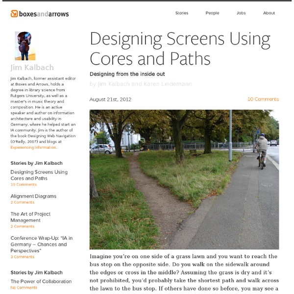
» Experience Design Models: Minding the Gap Between Ideas and Interfaces Johnny Holland I have never, ever, had an original song or melody pop into my head. I frankly think it would take me a lifetime to become a one-hit maker; let alone a one-hit wonder. I have however, had numerous occasions when I’ve heard a song and then imagined a movie scene play out. For me, the inspiration needs to first come in the way of a soundtrack. I can then fill in the blanks with a storyline. In becoming mindful of my own personal nature, I’ve recently started paying more attention to how others around me think as well; and more specifically, how they approach design problems. In thinking about the differences between these types of personal attributes, I’ve also started noticing that we designers sometimes leap from nascent ideas to interfaces far too quickly when faced with a design problem. So what can we do to better communicate experience design vision during that window of opportunity between raw ideas and design deliverables? What? What exactly is an experience model? Why? When?
10 UI Ideas to Learn from Gumroad) 10 UI Ideas to Learn from Gumroad Gumroad is an exciting new startup that lets anyone sell digital content with just a link. It was founded by the prolific Sahil Lavingia. Sahil has designed a number of useful apps, ranging from Pinterest in the early days, to Turntable, to Crate, to Caltrainer, etc. This is how the Gumroad home page looks, un-dissected. And here is the dissected version, with the 10 things we’ll learn - Let’s get started - 1. This top bar has become increasingly common. When we visit sites, a split second is used to subconsciously say “Oh, these are the colors we’re using here. Note that Sahil has picked energetic colors. 2. A lot of logos have very little to do with the name or product of a company. But others have plenty to do with the name of the company/product. Until you have a brand and you own blue birds the way that Twitter does, ensuring your logo and the favicon are as good as possible at reminding a user of your company name is key. 3. 4. 5. 6. 7. 8. 9. 10.
Making it Work: Flat Design and Color Trends We’ve talked a lot here about the flat design trend here at Designmodo. We’ve raved about it, showed you plenty of cool examples and even developed a free user interface kit for you to download and use for projects. But what if you want to do it yourself? One of the most important parts of the trend is color. Flat Design Refresher Flat design is a technique that uses simple effects – or lack thereof – to create a design scheme that does not include three-dimensional attributes. Some call the look of flat design simple, although it can be quite complex. Learn more about the flat design trend in a previous Designmodo article. Defining a Color Palette When it comes to color, flat design works with a variety of colors, but most commonly designers are choosing to go bold and bright. The other thing that makes flat design different in terms of color? What we are seeing more of with flat design and color though is the matching of tone and saturation. Bright Colors So where do you start? Retro Colors
Post-Artifact Books and Publishing — by Craig Mod — Craig Mod, June 2011 "Roger Bacon held that three classes of substance were capable of magic: the herbal, the mineral, and the verbal. With their leaves of fiber, their inks of copperas and soot, and their words, books are an amalgam of the three." — Matthew Battles, Library: An Unquiet History1 What is a book, anymore, anyway? We will always debate: the quality of the paper, the pixel density of the display; the cloth used on covers, the interface for highlighting; location by page, location by paragraph. Stop there.3 Hunting surface analogs between the printed and the digital book is a dangerous honeypot. In reality, the book worth considering consists only of relationships. The future book — the digital book — is no longer an immutable brick. The book of the past reveals its individual experience uniquely. For those of us looking to shape the future of books and publishing, where do we begin? The way books are written has changed. We have an opportunity now to shape these systems. 1.
Why most UX is shite I was invited to speak at the event this week where getting a little sweary and ranty is kind of encouraged (it goes well with the craft beer consumption that is an integral part of the conference mix). This was my contribution. Slides: When I checked the agenda to see what I was supposed to be talking about at Monkigras, I saw that I was down to talk for 15 mins about ‘Crafting Good UX’. Where to start. An elegant UIBeing AddictiveA Fast Startbeing Seamless, andIt Changes You I hate these kinds of lists. If only that were true, we’d be overwhelmed by UX amazingness. It’s not that simple right. Now, there are plenty of ways you can make a user’s experience of your product rubbish, but in my experience, there are a handful of serial offenders. 1. So, this one I see ALL the time. From a start up who doesn’t want to rule anything out of its value proposition so doesn’t really know what it is so, as a consequence, no one knows what problems it’s solving so they don’t engage. 2. 3. 4.
LevelEleven redesigns & rebrands its Salesforce app that cleverly gamifies sales Sales people are an incredibly important resource, but how do you motivate them to close more deals without being an aggressive, insulting prig? LevelEleven believes its flagship app that gamifies the sales process is the answer to that problem. Detroit-based LevelEleven recently caught our eye when it raised $500,000 in additional seed funding from Detroit Venture Partners and others. The company’s flagship application encourages sales people to meet certain goals like following up on leads, increasing numbers of face-to-face meetings, making calls, and logging events. Now the company has rebranded the flagship app from the name Contest Builder to (fittingly) Compete. “One of the most frustrating things of sales is having so much data but still finding it hard to motivate sales people,” Marsh said. On top of the name change, the app has been redesigned to simplify the user experience and modernize the look. Photo via LevelEleven
5 Essential Product Design Books That Aren’t About Product Design "What are some good books about product management?" is a frequent question for designers and engineers, especially those who are first-time founders. While there are any number of volumes you can peruse about agile development, team building, roadmaps or whatever skill you want to acquire, the art of product design is more elusive. Here are five of my essential product design books that have nothing to do with product design: 1. If you don't own this book don't even read further. Breathless praise aside, Cialdini identifies key principles of persuasion such as social proof, reciprocity, subservience to authority figures, desire to act in a consistent manner and perceived scarcity. Free bonus content! 2. If you want to quickly remove the romanticism from your relationships, just tell your partner that the only reason you're monogamous is that humans have long gestation cycles and babies have high mortality rates if left unattended. That shit cray, right? 3. 4. 5.
is not available Android UX and interaction design leads Helena Roeber and Rachel Garb gave a talk at Google I/O this year about the Android Design Principles (ADP) they helped create and introduced back in 2012 with the launch of Android 4.0 Ice Cream Sandwich. The ADP foll three simple principles, essentially “enchat, simplify and amaze,” but there’s much more to those principles that that relatively slippery and non-scientific language might lead you to believe. In fact, Garb and Roeber have based the ADP on compelling recent research that suggests eliciting negative emotional responses have an outsized effect on user experience, and require lots more counterbalance in terms of positive experiences to achieve a net positive, or even net zero lasting impression. The Math Of Joy They cited a John Gottman study that found successful marriages maintain around a 5:1 ration of pleasant feelings to bad, whereas those with more like a 1:1 ration have a far greater chance of ending in divorce.
Why Users Fill Out Forms Faster with Top Aligned Labels by anthony on 09/01/10 at 3:48 pm Imagine a user who is really excited about your product or service. They’re ready to sign up, so they go to your form page and start filling out their information. The way you align your labels with your form fields can affect how easy it is for users to fill out the form. Top aligned labels are faster and easier to fill out than left or right aligned labels. The only drawback with top aligned labels is that they can make the form long. The difference is clear.