
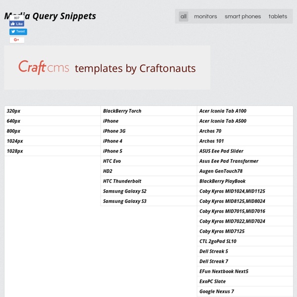
Media Queries for Standard Devices If you think responsive’s simple, I feel bad for you son. We got 99 viewports, but the iPhone’s just one.—Josh Brewer, March 10, 2010 A major component of responsive design is creating the right experience for the right device. If you’re looking for a comprehensive list of media queries, this repository is a good resource. If you’re reaction to this is: you should never base your breakpoints on devices!! Taille des écrans, responsive design, et point de rupture | Mekalab Très régulièrement, on me pose des questions sur les tailles des écrans pour faire un design « responsive ». Pour ceux qui connaisse le terme, mais qui ne savent pas vraiment ce que cela veut dire, sachez qu’on appelle « design responsive » (ou responsive design ) la capacité d’un site web à s’adapter au terminal de lecture. Mais pourquoi faire ? Eh bien avec le nombre d’appareils différents capables d’afficher une page web, il a fallut réfléchir à un moyen pour afficher proprement un site (et de façon légèrement différentes) quelque soit le support: écran d’ordinateur, tablette, smartphone, ou télévision. Pour cela, on s’appuie sur la technologie des feuilles de style (CSS), qui permet de modifier l’affichage d’un élément d’une page web en fonction de la taille de l’écran (ou du navigateur ). Exemple de mise en page responsive Tailles des écrans Ecran d’ordinateur (que l’on appelle « Desktop » ) – 1024px – 1600px Tablette Smartphone Les points de ruptures Un point de rupture, c’est quoi?
Responsive design – harnessing the power of media queries Webmaster Level: Intermediate / Advanced We love data, and spend a lot of time monitoring the analytics on our websites. Any web developer doing the same will have noticed the increase in traffic from mobile devices of late. Over the past year we’ve seen many key sites garner a significant percentage of pageviews from smartphones and tablets. These represent large numbers of visitors, with sophisticated browsers which support the latest HTML, CSS, and JavaScript, but which also have limited screen space with widths as narrow as 320 pixels. Stacked content, tweaked navigation and rescaled images – Chromebooks Implementation As a starting point, simple, semantic markup gives us pages which are more flexible and easier to reflow if the layout needs to be changed. Liquid layout is a good start, but can lack a certain finesse. Viewports When is a pixel not a pixel? In reality you may find you need to use different breakpoints depending on how your site flows and looks on various devices.
media queries for common device breakpoints | Responsive Web Design The @media query is 1/3 of the recipe for responsive design. It is the key ingredient that, in it’s simplest form, allows specified CSS to be applied depending on the device and whether it matches the media query criteria. Before you start copying and pasting below, read why you don’t need device specific viewports. CSS3 Media Queries CSS2 allows you to specify stylesheet for specific media type such as screen or print. Now CSS3 makes it even more efficient by adding media queries. You can add expressions to media type to check for certain conditions and apply different stylesheets. For example, you can have one stylesheet for large displays and a different stylesheet specifically for mobile devices. CSS3 Media Queries (demo) Check my demo and resize your browser window to see it in action. Max Width The following CSS will apply if the viewing area is smaller than 600px. If you want to link to a separate stylesheet, put the following line of code in between the <head> tag. Min Width The following CSS will apply if the viewing area is greater than 900px. Multiple Media Queries You can combine multiple media queries. Device Width The following code will apply if the max-device-width is 480px (eg. iPhone display). For iPhone 4 The following stylesheet is specifically for iPhone 4 (credits: Thomas Maier). For iPad Sample Sites Colly
Awesome Media Queries in JavaScript - enquire.js The Lowdown What is it? enquire.js is a lightweight, pure JavaScript library for responding to CSS media queries. JavaScript callbacks for media queries matching and unmatching. Clean & intuitive API Absolutely tiny - around 0.8kb minified & gzipped! Why should I use it? In responsive design, CSS media queries can only take you so far. enquire.js allows you to harness media queries in JavaScript, giving you the tools to create advanced responsive sites. Dependencies? None! The most you will need to do is provide a matchMedia polyfill if you wish to support old/incapable browsers. Downloads & All That Jazz Latest Build Grab the latest code, ready to go, from one of the locations below: Development — unminified Production — minified If you wish to browse/fork the source, you can do so on GitHub. Install via Bower To install via bower, enter the following at the command line: bower install enquire Install via npm To install via npm, enter the following at the command line: npm install enquire.js Match
Defining Breakpoints | Responsive Web Design Breakpoints are the point a which your sites content will respond to provide the user with the best possible layout to consume the information. When you first begin to work with Responsive Design you will define your breakpoints at the exact device widths that you are looking to target. Most often these are the smart phone (usually the iPhone at 320px and 480px), the tablet (usually the iPad at 768px and 1024px) and finally anything above 1024px. I hope I didn’t hurt your feelings but seriously, you’re approaching this in the wrong way. Instead of being concerned with device breakpoints the best practice is to design for your smallest viewport first. Mobile First Approaching the design mobile first is the best approach for a responsive design. It is at this point that the majority of your branding and style work is done as well with larger layout overrides included in increasing media query widths. Which devices should I target? The purest answer is none of them. SUPER wide resolutions
Reponsive design : les Media Queries Avant, créer un webdesign, c’était simplement créer l’interface pour les écrans d’ordinateurs. Il y avait plusieurs contraintes, notamment la gestion des différents navigateurs, mais on devait aussi faire avec les différentes résolutions existantes. Aujourd’hui, c’est toujours le cas, mais le problème des résolutions est devenu encore plus important avec l’avènement de la navigation mobile. C’est pourquoi on parle maintenant de responsive design, un terme qui regroupe diverses choses et qui signifie en gros qu’un design peut s’adapter aux différentes tailles d’écran. Et si avant on pouvait facilement s’en sortir avec de simples pourcentages, la petite taille des écrans des terminaux mobiles a cassé cette facilité. Les Media Queries Passée cette longue introduction qui vous aura, je l’espère, convaincu, il faut passer à l’action et ça passe par la réponse à la question que vous vous posez sûrement : qu’est-ce qui peut bien remplacer les pourcentages ? Constuire une Media Query
scottjehl/Respond: A fast & lightweight polyfill for min/max-width CSS3 Media Queries (for IE 6-8, and more) How To Use CSS3 Media Queries To Create a Mobile Version of Your Website Media Queries: An illustrated introduction What are media queries? Media queries are CSS instructions essential to building modern websites and blogs They allow different css instructions to be used for different sized screens Media queries allow you to present the same content differently on different size screens. What do media queries do? Media queries provide different instructions (css) for different size screens. So in human terms we can say something like... "When someone is on a desktop computer I want my webpage text to be red, when someone is on a mobile phone I want my webpage text to be green." Pretty much everything you can do with CSS, you can do with media queries. How do media queries work? In a nutshell, they do two things. They find out how big a screen is They apply CSS for the size of the screen found Working with media queries Media queries are part of your CSS file. Here is an example of CSS that will do that... Let's translate that now by looking at each piece and describing it in a way that doesn't melt our brains.
How To Write Mobile-first CSS | Zell Liew 17th Dec 2014 Building responsive websites is a must-have skill for front-end developers today. When we speak about responsive websites, the term mobile-first pops into mind immediately. We know the importance of designing from a mobile-first perspective. Unfortunately, much less was said about coding from a mobile-first approach. Today, I’d like to share with you about the mobile-first approach to styling, why it is much better, and how to work its magic. Note: This article will be immensely helpful if you are learning to build responsive layouts with Susy. What are Mobile-first and Desktop-first approaches? Let’s understand the differences between mobile-first and desktop-first before we dive into why the mobile-first approach is better. A mobile-first approach to styling means that styles are applied first to mobile devices. This approach uses min-width media queries. Here’s a quick example: In the example above, <body> will have a red background below 600px. Why Code Mobile-first? A Video!
Responsive Web Design · An A List Apart Article The English architect Christopher Wren once quipped that his chosen field “aims for Eternity,” and there’s something appealing about that formula: Unlike the web, which often feels like aiming for next week, architecture is a discipline very much defined by its permanence. Article Continues Below A building’s foundation defines its footprint, which defines its frame, which shapes the facade. Working on the web, however, is a wholly different matter. But the landscape is shifting, perhaps more quickly than we might like. In recent years, I’ve been meeting with more companies that request “an iPhone website” as part of their project. A flexible foundation#section1 Let’s consider an example design. But no design, fixed or fluid, scales seamlessly beyond the context for which it was originally intended. In short, our flexible design works well enough in the desktop-centric context for which it was designed, but isn’t optimized to extend far beyond that. Becoming responsive#section2 media types