30 Simple Tools For Data Visualization
There have never been more technologies available to collect, examine, and render data. Here are 30 different notable pieces of data visualization software good for any designer's repertoire. They're not just powerful; they're easy to use. In fact, most of these tools feature simple, point-and-click interfaces, and don’t require that you possess any particular coding knowledge or invest in any significant training. Let the software do the hard work for you. Your client will never know. 1. iCharts 2. FusionCharts Suite XT is a professional and premium JavaScript chart library that enables us to create any type of chart. 3. Modest Maps is a small, extensible, and free library for designers and developers who want to use interactive maps in their own projects. 4. Pizza Pie Charts is a responsive pie chart based on the Snap SVG framework from Adobe. 5. Raw is a free and open-source web application for visualizing data flexibly and as easy as possible. 6. 7. 8. 9. 10. 11. 12. jsDraw2DX 13.
Adobe lance une suite d'outils de développement HTML5
Vous ne vous en rendez sans doute pas compte, mais le web est dans une étape de transformation cruciale en ce moment. Nous ne parlons pas ici des usages, mais plutôt des technologies, et plus particulièrement de HTML. La dernière évolution en date des standards (HTML5) devait mettre tout le monde d’accord et permettre à l’industrie d’appréhender cette nouvelle itération avec calme et sérénité. Sauf que le torchon brûle entre le W3C (l’organisme de normalisation des standards web) et le WHATWG (le consortium qui pousse pour faire évoluer plus rapidement les standards). Vous serez ainsi surpris d’apprendre que HTML5 n’existe pas, du moins que HTML5 n’existe pas en tant que standard web stabilisé et normalisé par le W3C. Ces derniers avaient initialement prévu de le stabiliser en 2022 (véridique), mais sous la pression des grands éditeurs ont ramené l’échéance à 2014 (W3C announces plan to deliver HTML 5 by 2014, HTML 5.1 in 2016).
Visualising Data » Resources
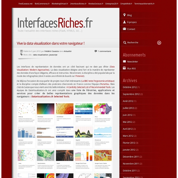
Here is a collection of some of the most important, effective, useful and practical data visualisation tools. The content covers the many different resources used to create and publish visualisations, tools for working with colour, packages for handling data, places to obtain data, the most influential books and educational programmes and qualifications in visualisation itself. * Please note there are another 40-50 items to add to these collections but they are going to be saved for now and launched alongside the new version of this website around April * Data and visualisation tools Resources and learning references
10 open source e-learning projects to watch - Collaboration - Open Source
As corporate and government organizations embrace the Web for delivering more education and training programs, a wealth of free and open source e-learning applications will help lower the barrier to entry. TechWorld looks at the options. ATutor ATutor is a Web-based learning content management system (LCMS) designed for accessibility and adaptability by the Adaptive Technology Resource Centre at the University of Toronto. Like Moodle, ATutor is a PHP application with some 25,000 registered installations. Web site: Licence: GPL Commercial support: Project home Developed with: PHP Claroline Claroline is an e-learning and "e-working" platform allowing teachers to build online courses and to manage learning and collaborative activities on the Web. Claroline is organized around the concept of "spaces" related to a course or a pedagogical activity. Web site: Licence: GPL Commercial support: Developed with: PHP Dokeos eFront
50 Great Examples of Data Visualization
Wrapping your brain around data online can be challenging, especially when dealing with huge volumes of information. And trying to find related content can also be difficult, depending on what data you’re looking for. But data visualizations can make all of that much easier, allowing you to see the concepts that you’re learning about in a more interesting, and often more useful manner. Below are 50 of the best data visualizations and tools for creating your own visualizations out there, covering everything from Digg activity to network connectivity to what’s currently happening on Twitter. Music, Movies and Other Media Narratives 2.0 visualizes music. Liveplasma is a music and movie visualization app that aims to help you discover other musicians or movies you might enjoy. Tuneglue is another music visualization service. MusicMap is similar to TuneGlue in its interface, but seems slightly more intuitive. Digg, Twitter, Delicious, and Flickr Internet Visualizations
Code smells in CSS
20 November, 2012 Chris Coyier recently answered someone’s question: How can you tell if your CSS code smells? What are the signs that the code is sub-optional, or that the developer hasn’t done a good job? I thought I would extend Chris’ great answer with my own, additional take on things… My day-to-day life is spent working in-house at BSkyB… I work on big websites, the last of which took me over a year to build the front-end for (and it’s still ongoing). I’m going to share just a few things (there will, no doubt, be things that I have missed) that I look out for in CSS that will give you and idea as to its quality, its maintainability and its integrity… Undoing styles Any CSS that unsets styles (apart from in a reset) should start ringing alarm bells right away. Any CSS declarations like these: border-bottom:none; padding:0; float:none; margin-left:0; …are typically bad news. Here we have ten lines of CSS and one ugly class name. Magic numbers These are a particular bugbear of mine. ! ! IDs
Gephi
Using fullscreen mode - Document Object Model (DOM)
This is an experimental technologyBecause this technology's specification has not stabilized, check the compatibility table for the proper prefixes to use in various browsers. Also note that the syntax and behavior of an experimental technology is subject to change in future versions of browsers as the spec changes. The fullscreen API provides an easy way for web content to be presented using the user's entire screen. This article provides information about using this API. Note: This API is early in the standardization process. Although both Gecko and Google Chrome have implementations, they are not currently mutually-compatible, and neither implements the current draft of the specification. The API lets you easily direct the browser to make an element and its children, if any, occupy the fullscreen, eliminating all browser user interface and other applications from the screen for the duration. Activating fullscreen mode Let's consider this <video> element: Presentation differences Example
Graphviz