
CoRT 1: Breadth | CoRTthinking Each of the lessons in CoRT 1 is designed to encourage students to broaden their thinking. In the thinking of both children and adults, the dominant fault is often the tendency to take too narrow a view. An example of this would be to take up an instant judgment position on an issue without examining all the factors involved, before you reach, or make a decision. The lessons in CoRT 1 define attention areas into which thinking can be directed: Looking for plus and minus points Considering all factors Consequences Aims and objectives Assessing priorities Taking other people's views into account. By making the deliberate effort during the lessons to direct their thinking towards these areas, students can develop the habit of broadening their thinking. Research has shown that the use of these lessons can have a considerable effect in increasing the number of aspects of a situation that are considered.
What Makes A Good Data Visualization? Hi there. I’m David McCandless, creator of this site and author of two infographic mega-tomes, Information is Beautiful (2009) and Knowledge is Beautiful (2014). I’ve created a lot of data and information visualizations. Around 540 over six years. (An eye-bleeding, marriage-crumpling average of 1.7 per week). There are 196 in my new book, Knowledge is Beautiful (out now). This graphic visualises the four elements I think are necessary for a successful “good” visualization. i.e. one that works. All four elements in his graphic seem essential. See how, interestingly, if you combine information & function & visual form without story, you get “boring”. Similarly, if you combine visuals, information & story without considering functionality and your goal, you get something useless. These elements form the backbone of my process and also what I teach in my dataviz workshops. I’m not really a follow-this-system type of person. Thanks, David
CoRT Thinking Programme | de Bono The CoRT Thinking Programme (CoRT) is a simple and practical tool based framework specifically designed to teach thinking as a basic skill. The CoRT Thinking Programme is divided into six sections, each of which deals with one aspect of thinking. Each section contains ten lessons. The six sections of the CoRT Thinking Programme do not need to be used or taught in sequence. Each section is specifically designed to develop different skills in Thinking. As a whole the CoRT Thinking Programme offers 60 powerful tools to direct and support thinking and to broaden the cognitive map in any situation. CoRT 1 – Breadth – Directional Thinking / Broadening Perception Broadens perception by demonstrating a number of different directions thinking can follow. CoRT 2 – Organisation – Organising Thinking Shows users how they can organize their thinking so that it can be used in a deliberate and productive manner. CoRT 6 – Action – Operative Thinking Thinking in action.
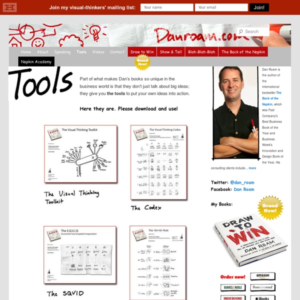
Visual Thinking What is Visual Thinking? Visual thinking is a way to organize your thoughts and improve your ability to think and communicate. It’s a great way to convey complex or potentially confusing information. It’s also about using tools — like pen and paper, index cards and software tools — to externalize your internal thinking processes, making them more clear, explicit and actionable. Why is Visual Thinking important? There’s more information at your fingertips than ever before, and yet people are overwhelmed by it. But can I do this? Drawing is a natural process for thinking, exploring ideas and learning. “I’m no artist” “I can’t draw a straight line” “I can’t draw a stick figure” This is a fallacy. Don’t believe me? Visual Thinking basics In this 20-minute video I share some basics of visual thinking that will get you up and running in about 20 minutes. How to know what to draw Visual thinking reading list.
untitled AnalyticsZone Blog Guest post by Noah Iliinsky, IBM visualization luminary. This is a continuation of a series of posts covering the Four Pillars of Visualization. If you haven't done so already, please read the introductory post and the post, "Purpose: the bedrock of an effective visualization." Now that we have determined our purpose (the why of this visualization) we can start thinking about what we want to visualize. To figure out what to include, we look to our purpose to tell us the most important data points and relationships. We want this visualization to enable the following actions/decisions: _____ To do this, it needs to be able to answer these questions: _____ To answer those questions, we need to display these data types: _____ As you're selecting data to display, resist the urge to show everything all at once: remember that extra information is the same thing as noise. Here are two examples of why focus is often better. Instead, let's consider a more focused view.
VISTA's Year in Health Sciences Our mission is to revolutionize the way people think about learning. “People learn best when they are pursuing goals that they really care about and when what they learn helps them attain their goals. The best means of learning has always been experience.” -- Roger Schank Engines for Education, a non-profit founded by Roger Schank, was formed in 2002 to create new learning environments to replace out-dated and wrong-headed educational notions. At Engines for Education, we believe that we can replace boring and increasingly irrelevant schools with new exciting learning environments. The Problem: What and how schools teach Why is it that children in the United States go to school for six-plus hours a day for twelve years and the result of the experience is: Why is it that students ultimately get themselves trained and employed in a wide range of jobs and careers, but for the twelve years they are formally educated, they all study the same set of courses (or very close to it)? The answer
AnalyticsZone Blog Guest post by Noah Iliinsky, IBM visualization luminary. This is a continuation of a series of posts covering the Four Pillars of Visualization. Please read my previous article , which describes these pillars as: purpose, content, structure and formatting. What is your purpose? *This posts addresses creating visualizations for presentation. There's a reason the purpose phase comes before the other three phases. A useful purpose must take into account questions like: The more you know about your customer and how they will consume your visualization, the more clear and accurate your can make your purpose, and the greater your odds of success. So what does a good purpose look like? To be most successful, different uses (purposes!) The route from Seattle to Baltimore (above) is very similar to the route from Seattle to New York City (below), except at the critical point -- the arrival. Luckily for us, there are a few very common general purposes, when it comes to graphing data.
Using Labs | NOVA Labs When you join NOVA Labs, you'll be actively participating in science. The data are real. The questions are real. The challenges you'll encounter are the same challenges that scientists and engineers are grappling with today. Getting Started The best way to start is to jump right into one of the Labs. If you're new to these topics or want to learn more about the science behind them, each Lab provides a number of short, informative videos that cover the basics—key concepts, explanations of the technologies involved, and an overview of some of the most important questions and challenges in each field. Join NOVA Labs Creating an account will enhance your NOVA Labs experience. Sign up now to get the most out of NOVA Labs. Our Experts As a member of the NOVA Labs community, you’ll have the opportunity to ask experts questions, propose your own ideas, and share your discoveries. Learn about careers on our Meet the Experts page Follow the conversation on our Social Feed
AnalyticsZone Blog Guest post from Noah Iliinsky, Advanced Visualization Expert, IBM Center for Advanced Visualization This is the first of a series of five posts discussing the four pillars of successful visualizations. In this article I’ll introduce the four pillars and discuss why they’re in the order they’re in; and then in subsequent posts I’ll examine each pillar in depth and explain how to think about and use the concepts when building an effective data visualization. A successful visualization: > has a clear purpose and focus > contains (only) the right content > is structured correctly > has useful formatting Therefore, the pillars are, in this order: 1. purpose 2. content 3. structure 4. formatting Purpose is the specification for your entire effort. Content is pretty straight forward. Structure is the physical layout of your visualization. **By definition, if you’re visualizing knowledge, you’re placing it in space. That’s the overview of the four pillars. For more information:
Modeling Introduction Abstract. Mathematics has been described as the science of patterns. Natural science can be characterized as the investigation ofpatterns in nature. Central to both domains is the notion of model as a unit of coherently structured knowledge. Modeling Theory is concerned with models as basic structures in cognition as well as scientific knowledge. D. AnalyticsZone Presents: Creating Effective Visualization Series with Noah Iliinsky The world produces more than 2.5 exabytes of data every day. Visualization is one key approach to gaining insight from this flood of big data. Visualization makes data accessible, and is one of the best ways to analyze and understand the huge volumes that we're accumulating. Visualization gives us fast access to actionable insight. And visualizations are compelling, often much more so than isolated facts or text.But, just as visualization is key to unlocking answers buried deep within our data, an ineffective or poorly designed or chosen visualization can hide the insight needed to make more informed business decisions.This five part IBM Analytics Zone webcast series will teach you how to design effective visualizations, so you will be able to understand your data, see what's important, and make the right decisions. The world produces more than 2.5 exabytes of data every day.
What Smart Students Know: Maximum Grades. Optimum Learning. Minimum Time.: Adam Robinson: 9780517880852: Books - Amazon.ca Perceptual Edge