
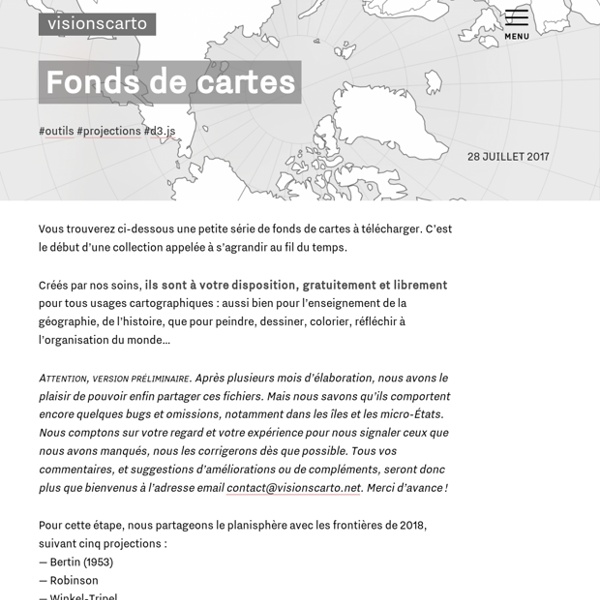
https://visionscarto.net/fonds-de-cartes
Related: CARTES • Cartographie • Carto • Cartographie • Cartes (réaliser, utiliser, jouer, localiser...)Earth and Moon Viewer Welcome to Earth and Moon Viewer. Viewing the Earth You can view either a map of the Earth showing the day and night regions at this moment, or view the Earth from the Sun, the Moon, the night side of the Earth, above any location on the planet specified by latitude, longitude and altitude, from a satellite in Earth orbit, or above various cities around the globe. Images can be generated based on a full-colour image of the Earth by day and night, a topographical map of the Earth, up-to-date weather satellite imagery, or a composite image of cloud cover superimposed on a map of the Earth, a colour composite which shows clouds, land and sea temperatures, and ice, or the global distribution of water vapour. Expert mode allows you additional control over the generation of the image.
Manhattan Skyscraper Explorer Loading... Manhattan Skyscraper Explorer ArcGIS API for JavaScript The problem with maps. Mandatory Accompanying Playlist The World The world is round. An Animated Atlas of the Historical Geography of the United States The Digital Scholarship Lab at the University of Richmond recently released a new feature called the Atlas of the Historical Geography of the United States. This new atlas contains more than 700 historical maps of the United States. The maps within the atlas are arranged into eighteen sections. As a student and teacher of history I was drawn to the sections devoted to population, territorial expansion, political parties and elections, and military history. Many of the maps within the Atlas of the Historical Geography of the United States can be animated to show changes over time. For example, in the section on States, Territories, and Cities you can view individual maps for each decade from 1790 to 1930 or you can click the "animate" button to see the maps put together in a time lapse animation.
Making a commute time visualization map A commute time visualisation is a map that shows you where you can get to within a certain travel time - for example, a map of all areas that are within a 45-minute commute from home by public transport. This travel time perimeter creates a unique shape called an isochrone. Commuting is a big part of most people’s weekly routine. Whether it’s on foot, by bike, car or using public transport, we all have travel preferences that impact decision making. It dictates where we work, live or where children can go to school. Relief Map i Hans Braxmeier, Donaustraße 13, 89231 Neu-Ulm, mail@braxmeier.de Intention The vision of Maps-For-Free is to offer free worldwide relief maps and other layers which can easily be integrated into existing map projects.
Medieval and Tudor Ships of England Origins and destinations of voyages in the database. The voyages shown here largely cover the period c.1565-c.1580. There are a few documents that record voyage details for the period before 1565 (a few Bristol accounts, a few ships leaving Hull for Calais loaded with wool, and a few east coast coastal records), but most pre-1565 documents only reveal if a ship entered or left a particular port, not where it came from or where it was going to. The Bordeaux wine trade voyages are equally difficult to map. While we know the ships left Bordeaux we can never be sure of where they sailed from to get to Bordeaux or where they sailed to after leaving Bordeaux.
World Migration Map - Data Visualization by Metrocosm This map shows the estimated net immigration (inflows minus outflows) by origin and destination country between 2010 and 2015. Blue circles = positive net migration (more inflows). Red circles = negative net migration (more outflows). Each yellow dot represents 1,000 people. Hover over a circle to see that country’s total net migration between 2010 and 2015.
21 Map Creation Tools for Students and Teachers Yesterday, I published a review of MapFab which is a fabulous, free, and simple tool for creating maps online. Writing that post got me thinking about all of the other free map creation tools that I've reviewed over the years. Google Maps and Google Earth are my favorite tools for creating maps, but not every school allows teachers and students to download it. And creating Google Maps does require you to have a Google account which is an obstacle to use in some schools too. In the list below you will find some map creation tools that don't require registration. And, of course, all of the tools on this list are free for teachers and students to use.
Map Collections Home Page The Library of Congress Search by Keyword | Browse by Geographic Location Index | Subject Index | Creator Index | Title Index The Geography and Map Division of the Library of Congress holds more than 4.5 million items, of which Map Collections represents only a small fraction, those that have been converted to digital form. The focus of Map Collections is Americana and Cartographic Treasures of the Library of Congress. These images were created from maps and atlases and, in general, are restricted to items that are not covered by copyright protection. Mapping the Flow of International Trade According the UN’s Comtrade database, the global market for imported goods totaled $15.6 trillion in 2015. This map shows where those goods came from and where they went, each dot representing $1 billion in value. Select a country to see the flow of goods in and out of that country.