
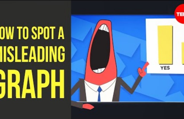
http://www.youtube.com/watch?v=E91bGT9BjYk
Related: Week 10: Data, numeracy, infographics (*=Key reading) • Support Readings • CurriculumVirtual Conference on Data Literacy “Thank you for the excellent virtual conference as well as all the extraordinary work you are doing. I am looking forward to sharing your site with our faculty.” – 2018 participant Our three-year conference has come to a close. [click to download as PDF] Looking for sessions from the 2016 and 2017 conferences? You can find them here.
Why Kids Need Data Literacy, and How You Can Teach It Samantha Viotty’s activity for visualizing data networks has gummy bears representing people and toothpicks signifying their relationships. Photo courtesy of Samatha Viotty Data is all around us, from the output of your Fitbit to interactive maps that track voters to the latest visualization of the New York Times front page. To Test Your Fake News Judgment, Play This Game : NPR Ed Fake news has been on Maggie Farley's mind further back than 2016 when President Trump brought the term into the vernacular. Farley, a veteran journalist, says we've had fake news forever and that "people have always been trying to manipulate information for their own ends," but she calls what we're seeing now "Fake news with a capital F." In other words, extreme in its ambition for financial gain or political power. "Before, the biggest concern was, 'Are people being confused by opinion; are people being tricked by spin?' " Now, Farley says, the stakes are much higher.
Data Literacy for High School Librarians We’ve been busy tapping away on Creating Data Literate Students, a guide to integrate the “reading” and “writing” of data. How do students learn to “read” and “write” data with accuracy?Given how jam-packed high school curriculum is, it isn’t practical for teachers to add a unit or course on data or statistical literacy to the curriculum. What are the tips, rules of thumb, and guidelines that would make the greatest impact in the limited time available?
The beauty of data visualization - David McCandless To create his infographic about nutritional supplements, it took McCandless a month to review about 1,000 medical studies and design the visual. Is that level of effort surprising, and do you think it’s worth it? Try out the interactive version that’s available on McCandless’s website. 12 Strategies For Teaching Literature In The 21st Century - 12 Strategies For Teaching Literature In The 21st Century by Terry Heick How can you teach Shakespeare to students accustomed to tiny screens with brief flashes of communication that instantly fade away (both in meaning endurance and visible text)? Begin by focusing on the macro. The context and need here is clear enough I think to jump right in to the strategies. 1.
Blog Wired has a fascinating article out about a newly-released and free facial recognition tool that, coupled with existing video monitoring, claims to keep schools safer. From the article by Issie Lapowski: “RealNetworks has developed a facial recognition tool that it hopes will help schools more accurately monitor who gets past their front doors. Today, the company launched a website where school administrators can download the tool, called SAFR, for free and integrate it with their own camera systems … [F]acial recognition technology often misidentifies black people and women at higher rates than white men. “The use of facial recognition in schools creates an unprecedented level of surveillance and scrutiny,” says John Cusick, a fellow at the Legal Defense Fund.
*Write a report. This is no time to be suggesting more work for any exhausted educator. Nevertheless, this is the perfect time to suggest going just one step further. Please write an annual report. Now, more than ever, it matters. For some of you, this is a regular, end-of-year ritual from which you pull on notes, photos, and videos collected over the months.