
This map of Earth is the most accurate ever produced, and it looks completely different | indy100 Japanese architect Hajime Narukawa claims to have tackled a centuries-old problem - how to draw an oblate spheroid Earth on a flat plane. He claims the above map, called the AuthaGraph World Map, achieves this task. The projection, first created in 1999, frames the world's physical components in a 2D rectangle, attempting to represent their relative sizes as accurately as possible. It does so by dividing the world into 96 triangles, making it a tetrahedron, then unfolding it to become a rectangle. Unlike the traditional Mercator map, made in the 16th century, which overstates the size of northern areas like Greenland and minimizes that of central areas like Africa, the AuthaGraph World Map retains parity of area to a 3D projection. The projection recently won the 2016 good design grand award in Japan, an awards evening founded in 1957 by the Japanese ministry of international trade and industry. Narukawa also gave a Ted talk on his projection in 2011:
Teaching Ideas - Free lesson ideas, plans, activities and resources for use in the primary classroom. Britain From Above Maa järisi yöllä Lumijoella: "Lattia tärähteli voimakkaasti" Maanjäristys oli voimakkuudeltaan 3,5. Pohjois-Pohjanmaalla, Lumijoella on tapahtunut maanjäristys. Järistys oli voimakkuudeltaan 3,5 ja sen keskus sijaitsi Liminganlahden rannan tuntumassa eli viisi kilometriä itään Lumijoelta, kertoo Yhdysvaltain geologian tutkimuskeskus. Maanjäristyksen keskus oli noin 10 kilometrin syvyydessä. Järistys vavisutti rakennuksia Oulun seudulla noin kello 00.30 aikoihin. Alueen asukkaat ovat kertoneet kokemuksiaan yöllisestä maan vavahtelusta Twitterissä. Oulu-Koillismaan pelastuslaitokselle tuli tapahtuneen jälkeen useita soittoja asukkailta, mutta tehtäviä pelastuslaitokselle ei järistyksestä ainakaan toistaiseksi ole koitunut. – Maa järisi selkeästi pari kertaa muutaman sekunnin välein, kertoo päivystävvä palomestari Marko Hottinen. Pelastuslaitos sijaitsee Oulun keskustassa eli noin 20 kilometrin päässä järistyksen keskuksesta. – Olin työpisteeni ääressä ja tunsin, kuinka jalkojeni alla lattia tärähti voimakkaammin.
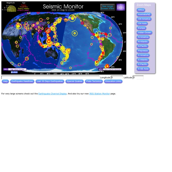
40 maps that explain the world By Max Fisher By Max Fisher August 12, 2013 Maps can be a remarkably powerful tool for understanding the world and how it works, but they show only what you ask them to. So when we saw a post sweeping the Web titled "40 maps they didn't teach you in school," one of which happens to be a WorldViews original, I thought we might be able to contribute our own collection. [Additional read: How Ukraine became Ukraine and 40 more maps that explain the world] Click to enlarge. Volcanoes! Tornadoes! Earthquakes! Get Ready for Spring with These 7 Natural Science Lessons from Scholastic Classroom Magazines Key Takeaways: Spring is the perfect time of year to teach students about natural science and prepare for Earth Day.Studying extreme weather and natural disasters is an effective and engaging way to introduce students to the exciting world of natural science.Scholastic Classroom Magazines feature fascinating, authentic articles about natural science, as well inspiring stories about students making a difference in the field. Spring is the perfect time to teach students about natural science. With Earth Day right around the corner, we know you’re looking for engaging lessons to inspire the next generation of scientists, too! From extreme weather events to inspiring stories about young people making a difference in the field of natural science, these fascinating articles and free classroom resources from Scholastic Classroom Magazines will help you create high-interest lessons to engage your students and enrich your curriculum. Volcanoes! Hurricanes! Tornadoes! Storms! Student Scientists
Pohjois-Pohjanmaan maanjäristyksen voimakkuus oli kolme – "Ehdottomasti harvinainen" Vaikka suurta tuhoa aiheuttavat maanjäristykset ovat epätodennäköisiä, voi Suomessakin tapahtua rakennusvaurioita aiheuttavia järistyksiä. Seismologian instituutin mukaan Limingan ja Lumijoen alueella torstain ja perjantain välisenä yönä sattuneen maanjäristyksen voimakkuus oli 3.0. Yhdysvaltain geologian tutkimuskeskuksen ensitietojen perusteella voimakkuus (siirryt toiseen palveluun) olisi ollut 3.5. Joka tapauksessa vastaavia järistyksiä (siirryt toiseen palveluun) ei satu Suomessa läheskään joka vuosi: edellinen kolmosella alkava järistys oli syyskuussa 2000, tuolloin Kuusamossa. – En käyttäisi sanaa poikkeuksellinen, mutta harvinaisia nämä ovat ehdottomasti, kuvailee seismologi Jari Kortström. Korströmin mukaan Perämeri on seismologisesti aktiivista aluetta, joskin isot järistykset painottuvat tyypillisesti merelle ja Ruotsin puolelle. Vaikka tilastoista piirtyy kuva todennäköisyyksistä, on mahdotonta sanoa etukäteen, missä ja milloin järistyksiä sattuu.
Tülays IKT-sida: Visualiserade kartor Visual Storytelling i skolan Projektet syftar till att på ett mer systematiskt sätt tillgängliggöra den kraft som visual storytelling och interaktiva statistikvisualiseringar kan skapa för elever och deras lärare. If it were my home Jämför Sverige med andra länder Länders area Här kan du se visualisering av den "sanna" storleken av olika länder. Worldmapper Världen som du aldrig sett den förut. The True Size of Här kan du se olika länders riktiga storlekar. Atlas for a Changing Planet