
Visualizing Graphs in 3D with WebGL – neo4j I was already aware of and impressed by three.js, especially the 3d and WebGL capabilities. I had seen and done some graph visualization using it years ago, but 3d-force-graph packages three.js nicely with a Graph API and adds useful options to quickly get good looking results. If you want to try the different approaches directly, I put them into a GitHub Repository with live examples using the RawGit Service to serve HTML pages and assets directly from the repository. Datasets I started by using the Game of Thrones interaction graph, that my colleague Will Lyon wrote about here and which you can create yourself by running :play got in your Neo4j Browser. Besides the basic graph of characters, it also has interaction “weights” on the relationships and the guide adds some additonal metrics like a pageRank property that we want to use in the visualization. But let’s get started. Accessing the Data Basic Loading Load relationship list We need one array with links from a source id to a target id.
100,000 Stars Here Are the Real Boundaries of American Metropolises, Decided by an Algorithm When we think about where we live, usually our ideas start with political boundaries—we’d say we live in a particular state, city, or town. Ask about a neighborhood, sports team loyalties, or regions not defined by borders, though, and it might get a little fuzzier. In densely settled places like the East Coast, sprawl can make it hard to draw lines around places, too. These larger urban areas are sometimes called “megaregions,” and in a new paper, published in PLOS ONE, Garrett Dash Nelson, a historical geographer from Dartmouth, and Alasdair Rae, an urban analyst from the University of Sheffield, teamed up to identify them across the United States, using commuting data and a computational algorithm. Essentially, they used data describing more than 4 million commutes to look at how small units of place—census tracts—are connected into much larger units of place. There are limits to what an algorithm can do, though, the researchers argue.
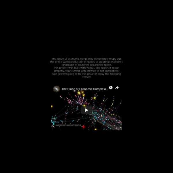
Flightradar24.com - Live flight tracker! Gapminder: Gapminder Foundation is fighting devastating ignorance with a fact-based worldview that everyone can understand. The $80 Trillion World Economy in One Chart The latest estimate from the World Bank puts global GDP at roughly $80 trillion in nominal terms for 2017. Today’s chart from HowMuch.net uses this data to show all major economies in a visualization called a Voronoi diagram – let’s dive into the stats to learn more. The World’s Top 10 Economies Here are the world’s top 10 economies, which together combine for a whopping two-thirds of global GDP. In nominal terms, the U.S. still has the largest GDP at $19.4 trillion, making up 24.4% of the world economy. While China’s economy is far behind in nominal terms at $12.2 trillion, you may recall that the Chinese economy has been the world’s largest when adjusted for purchasing power parity (PPP) since 2016. The next two largest economies are Japan ($4.9 trillion) and Germany ($4.6 trillion) – and when added to the U.S. and China, the top four economies combined account for over 50% of the world economy. Movers and Shakers Here are some of the most important movements: Thank you! Oops.
Power BI | Interactive Data Visualization BI Tools Quid Introduction to Circos, Features and Uses Datavisualization.ch Selected Tools