
Butterfly Chart – Excel Chart with Dual Converging Scales A Butterfly chart is a chart where two entities are compared side by side using scales meeting at the center. Due to its shape, the chart resembles a butterfly and hence the name. These charts are sometimes also known as Funnel or Tornado Charts though I find “butterfly” to be a better description as it allows for a greater variation in shape than a funnel or a tornado does ! So let’s jump straight into creating a beautiful looking butterfly chart. Getting the Data for the chart Although a simple looking butterfly chart is as easy to create as a bar chart, there is some value in adding labels, converging scales and the other embellishments. The first three columns essentially contain all the data related to the business. Making the basic Chart Let’s create a basic chart with five series. Adding the XY series for the dummy scales Once we’ve inserted the XY-Series the chart looks like this: Aligning the XY points to the X axis If you noticed, the points are not aligned to the X-Axis.
ExcelRibbon.Tips.Net - Powerful tips on using Microsoft Excel The Daily Graph "The Daily Graph" re-creates charts from The Economist's Graphic Detail blog using standard run-of-the-mill Excel techniques without macros. We do try to milk Excel for all it's worth and apply techniques that may not have been intended in the way we use them. In the end, it's the result that counts. "The Daily Graph" is published whenever we spot an interesting chart on The Economists's blog that looks like it cannot be done in Excel. Typically once or twice a week if we can find the time.The Daily Graph blog comes with a dowloadable version of an Excel workbook so that you can follow what we did... or you can "borrow" our work and use it for something entirely different. "The Economist" is a trademark of The Economist Newspaper Limited.
Filled Histograms Using Excel XY-Area Charts I recently showed how to create Histograms Using Excel XY Charts. This technique produces a human-friendly numerical X axis scale, which is easier to read and harder to be deceived by than the bin labels used by column chart histograms. The drawback of that technique is that it produces histogram bars in outline only, without a fill color. In this post I will show how to extend that technique to fill the bars, using the protocol from Fill Below an XY Chart Series with an XY-Area Combination Chart. I started with the data from Histograms Using Excel XY Charts. The calculated values in the middle column are based on the small table to the right. Area Value = Area Scale Min + (Time - Time Min) / (Time Max - Time Min) * (Area Scale Max - Area Scale Min) or something like this, depending on where the tables are in the worksheet: We need to use both XY and Area chart types. So let’s make the chart. Copy the Area and Counts in the second and third columns, including the first and last row.
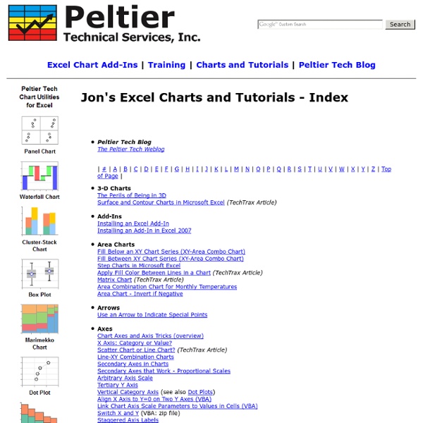
How to Create a Panel Chart in Excel To show a concise, clear summary of data for several departments or cities, you can create a panel chart in Excel. It shows all the data in a single chart, with vertical lines separating the groups. My chart shows sales for bars and cookies, in four cities, over the first 7 months of the current year. I learned this technique from Jon Peltier's website, where he also sells a Panel Chart Utility, that creates dot plot and bar panel charts. Panel Chart Steps The instructions for making a panel chart look long and complicated, and I've avoided learning this technique, because it was a daunting process. Last week, I finally took the plunge, and it's not so bad, once you get the big picture in your head. Add a separator field to the source data Summarize the data in a pivot table Copy the pivot table data as values Create a line chart from the copied data Add another series to create vertical dividing lines Add final formatting to clean up the chart Add a separator field Summarize the data
Excel Pivot Table Tutorial -- Running Totals With a running total in a pivot table, you can see how amounts accumulate over a period of time, or through a range of products. To create a running total, use the Custom Calculation feature in a pivot table. In this pivot table tutorial, we'll focus on the Running Total custom calculation. In Excel 2010 and later versions, you can also use the % Running Total calculation, to show the current running total amount, divided by the grand total. Video: Create Running Totals To show running totals, you'll u se the Custom Calculation feature in Excel's pivot tables, as shown in this video tutorial.
How to Find the Right Chart Type to Represent your Numeric Data 22 Feb 2016 Charts help you visualize numeric data in a graphical format but the problem is there are just too many types of charts to choose from. This diagram will help you pick the right chart for your data type. couch mode print story Charts help you visualize numeric data in a graphical format but the problem is there are just too many types of charts to choose from. If you are finding it hard to pick the right chart type for your type of data, refer to chart chooser diagram. The poster, designed by Andrew Abela, is also available as a PDF. Related: Create Graphs Online with Google Charts You may also want to check out Chart Chooser – an online tools that lets you shortlist charts visually. Comments are closed but if you want to respond, please send me an email or tweet.
Cosmograph in Excel - World migration with bilateral flow chart - E90E50fx Igor: What is this?Freddy: Schwarzwalder KirschtorteMonster (OS): MmmFreddy: Oh, do you like it? I'm not partial to desserts myself, but this is excellentIgor: Who are you talking to?Freddy: To you. You just made a yummy sound, so I thought you liked the dessertIgor: I didn't make a yummy sound. Monster (OS): Mmm. by The FrankensTeam Initially I was inspired byPeoplemovinCarlo Zapponi's chart. It is a very nice job that I wanted to reproduce in Excel ...and I created a file but did not get a satisfactory result (if you want I can send the file) ... sometimes we have to know how to lose ... or maybe we just need to change strategy. I had to fix the formulas in values (where it was possible) to lighten the file ... and probably could do much lighter and without all of that data ... but it came out so and maybe will improve it later :-) Click here to download the Excel file. See also here:Life Expectancy by Nathan Yau's chart with ExcelEdward Tufte's Slopegraphs in Excel
Build a Dynamic Chart There are many instances when one wants to create a chart that reflects a growing data set or a chart that shows only part of a data set. These are easily accomplished in Excel by creating named formulas and using these named formulas in charts. Download the zipped workbook containing the examples below Once the basic concepts illustrated below are well understood, Advanced Examples contains solutions to more complex requirements. An extension to the above ideas so that the user can specify the data to be shown using business terminology. Keywords: Named formula, dynamic formula, dynamic chart, name in chart, grow, self adjusting, auto adjust, graph partial range, select column or row, name, form control drop-down dropdown list box combo