
Fisheries & Aquaculture - Sharks | FAO | Ca... Dare-d'Art: DAVID "Sacre de l'empereur Napoléon 1er et couronnement de l'impératrice Joséphine dans la cathédrale Notre Dame de Paris, le 2 décembre 1804" Huile sur toile peinte de 1805 à 1807 6m10 x 9m70 Musée du Louvre, aile Denon. courant artistique : peinture historique au style pictural appartenant au néoclassicisme. Le peintre: Jacques-Louis David (1748-1825) est un artiste français: il naît à Paris et après une formation artistique, il se rend à Rome, où il reste 5 années. Ses œuvres témoignent des 3 périodes historiques contrastées de la fin de ce XVIIIème siècle : la fin de la Monarchie, la Révolution et l'Empire. Après l'apogée de l'Empire et la défaite de Napoléon à Waterloo en 1815, David est condamné à l'exil sous Louis XVIII, pour avoir signé la condamnation à mort de Louis XVI. Le néoclassicisme: Le néoclassicisme apparait vers la fin du 18ème siècle . La peinture néoclassique se caractérise par une organisation rigoureuse, l'absence de toute sensibilité au bénéfice d'une réalité soulignant les vertus civiques. Les peintres David, Ingres et Gros sont les principaux peintres de ce mouvement. Contexte historique: l’empereur.
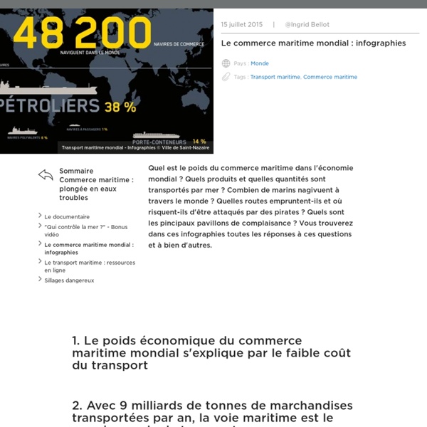
INA - Jalons - Fiche Média Les échanges de marchandises dans le monde n'ont cessé d'augmenter avec la mondialisation. C'est le transport maritime qui assure l'essentiel de ces échanges, principalement entre les trois grands pôles de la Triade : l'Asie de l'Est, l'Amérique du Nord et l'Europe. Certains points de passage constituent ainsi des lieux stratégiques du trafic maritime : il s'agit des canaux (ceux de Suez et Panama) et des détroits (ceux de Gibraltar, Malacca ou Ormuz). Ils permettent tous de relier par le plus court chemin deux océans ou mers et par conséquent de réduire considérablement la durée d'un trajet. Le canal de Panama est l'un de ces points de passage stratégiques. Le canal de Panama continue aujourd'hui d'occuper une place centrale au sein du commerce maritime mondial. Toutefois, les capacités du canal de Panama ne permettent plus de répondre à la croissance du trafic maritime mondial et à l'agrandissement de la taille des bateaux.
Somalia y el golfo de Guinea: las dos caras de la piratería en África La piratería marítima es un crimen ancestral que sigue muy presente en pleno siglo XXI y que presenta una gran amenaza para la seguridad marítima internacional. A pesar de que en Occidente es un fenómeno prácticamente inexistente, y que suele evocar a personajes de leyenda de otras épocas, muchos países en vías de desarrollo la padecen de forma muy real y persistente. En África, esta amenaza se ha hecho notoria en las últimas décadas y alcanzó su culmen con el auge de los ataques piratas en las costas somalíes hace apenas cuatro años. Si bien el número de incidentes relacionados con piratas en el Cuerno de África se ha reducido drásticamente, en la costa opuesta, la que baña África occidental, se dio un repunte de la piratería que hacía temer un posible efecto desplazamiento de la actividad pirata al golfo de Guinea. El descenso de la piratería en el Cuerno de África: cuando querer significa poder Con el auge de la piratería hace unos años se multiplicaron los secuestros de buques.
Fondation pour la Mémoire de la Shoah Grâce à la collection Témoignages de la Shoah publiée avec les éditions Le Manuscrit, la Fondation souhaite conserver et transmettre vers un large public la mémoire des victimes des années noires des persécutions antisémites, de 1933 à 1945. Présentation de la collection Catalogue (mai 2015 - pdf) Catalogue thématique Témoignages de déportés Témoignages d’enfants cachés Témoignages d’internés en France Parcours de militants en France Ouvrages historiques basés sur des témoignagesListe des titres parus par ordre chronologique
Fiche-notion - Les façades maritimes Afin d’accompagner les professeurs dans l’enseignement de la géographie, en collège comme en lycée, les professeurs du groupe de travail académique "géographie" produisent des fiches. Synthétiques, elles ne prétendent pas remplacer la lecture d’ouvrages universitaires, mais elles permettent en quelques minutes d’actualiser ses connaissances sur différents concepts, récurrents dans nos programmes.Elles sont donc destinées aux professeurs et n’ont pas vocation à être transposées telles quelles en classe. Vous trouverez en document joint la fiche-notion qui traite des façades maritimes, en deux formats. Vous pouvez aussi utilement consulter la fiche suivante, en relation avec les façades maritimes (problématique de la mondialisation), en cliquant sur le lien : fiche sur la métropole
groupe fmr (flux, matrices, réseaux) Mesdames & Messieurs « Mesdames & Messieurs », un webdocumentaire pédagogique propose un voyage dans la vie des femmes sur quatre générations. Pour les enfants du numérique, née dans les années 90, l’égalité homme-femme est un acquis. Que connaissent les jeunes de vingt ans de cette conquête pourtant récente ? Voir la bande-annonce Cinq thématiques composent « Mesdames & Messieurs » pour permettre à l’internaute de naviguer dans des fresques chronologiques d’hier à aujourd’hui ou de passer de l’une à l’autre, au hasard de sa curiosité : la vie publique, La vie familiale , La vie professionnelle, La vie à l’école et La vie intime. Des intervenants et experts décryptent et conceptualisent les situations (historiens, sociologues, psychiatres..).
Océan Cet article lié à la géographie doit être recyclé (août 2019). Un océan est souvent défini, en géographie, comme une vaste étendue d'eau salée comprise entre deux continents. En fait, il s'agit plutôt d'un volume dont l'eau est en permanence brassée par des courants marins. Approximativement 70,8 % de la surface de la Terre est recouverte par l'océan mondial. Celui-ci est historiquement divisé en quatre océans — Pacifique, Atlantique, Arctique et Indien — ou en cinq pour les gouvernements ou organismes qui reconnaissent l'existence de l'océan Austral[1]. L'océan mondial, qui abrite la majorité des espèces vivantes sur Terre (50 à 80 % selon les estimations)[4],[5], génère plus de 60 % des services écosystémiques qui nous permettent de vivre, à commencer par la production de la majeure partie de l'oxygène que nous respirons[6]. L'océan mondial régule à plus de 80 % le climat de la Terre. Longtemps, pour les Européens, toute étendue d'eau salée s'appelait « mer ».
[Infographie] Programme Métro 2030 : le métro parisien comme vous ne l'avez jamais vu ! Depuis l’année 1900, le métro de Paris fait partie intégrante de la vie de la cité, accompagnant ses changements comme la vie de ses habitants. Au 21ème siècle, la RATP est confrontée à plusieurs défis qui sont matérialisés notamment par l’ouverture à la concurrence des lignes de métro en 2039 et le développement de la jurisprudence relative aux responsabilités des entreprises de transports en commun. Pour faire face à un contexte en pleine évolution, l’entreprise a lancé, depuis le début des années 2000, le plus important programme de modernisation du réseau parisien depuis sa création : Métro 2030. Il repose sur trois axes : la modernisation de l’information voyageurs, des transports et des stations.
The ocean at the heart of climate change Cousteau Society The world’s oceans absorb heat For any given rise in temperature, the world’s oceans store ten times more heat that the atmosphere. Taking into account the oceans’ considerable volume (300 times that of the atmosphere) the oceans trap more thermal energy that any other part of the planet. If the heat stored was released into the atmosphere, global temperatures would rise by 18 °C. An uneven distribution of heat Two thirds of the heat absorbed by the oceans is distributed within the first 700 meters of depth. A strengthening of the thermocline There’s naturally a marked difference in temperature between the oceans’ surface water and the greater depths. Can warm water rise back up from the deep ocean? After having reached a heat record in 1998 following an El Nino* event, surface temperatures have decreased in the Pacific Ocean contrasting with the evolution recorded in the rest of the world.
A map of all the underwater cables that connect the internet Cables lying on the seafloor bring the internet to the world. They transmit 99 percent of international data, make transoceanic communication possible in an instant, and serve as a loose proxy for the international trade that connects advanced economies. Their importance and proliferation inspired Telegeography to make this vintage-inspired map of the cables that connect the internet. It depicts the 299 cables that are active, under construction, or will be funded by the end of this year. In addition to seeing the cables, you'll find information about "latency" at the bottom of the map (how long it takes for information to transmit) and "lit capacity" in the corners (which shows how much traffic a system can send, usually measured in terabytes). The cables are so widely used, as opposed to satellite transmission, because they're so reliable and fast: with high speeds and backup routes available, they rarely fail. Connections in the South Atlantic are scarce. Submarine cables in Asia.