background preloader

50 Meticulous Style Guides Every Startup Should See Before Launching

50 Meticulous Style Guides Every Startup Should See Before Launching
All good brands have a great style guide. Creating a simple booklet that catalogues the specific colors, type, logos, imagery, patterns, taglines, etc. of a brand makes sure the brand machine runs smoothly. To prove why you shouldn’t let your style guide go by the wayside, we’re going to take a look at 50 stunning and detailed examples of style guides that are sure to encourage you to begin compiling your own. And when you’re ready to put that style guide to work, trial it the fun way, by designing a branded social media graphic in Canva (click here). 01. Check out this brand manual for Foursquare that gives detailed rundowns for the rules and guides to each of the design elements a brand needs to be consistent. What better way for a designer to prove how detail-oriented they are than by compiling a detail-dense style guide for their own personal branding. 03. A brand manual is a really great chance for a brand’s design team to explain the specific choices made for a brand. 04. 05. 06. Related:  Graphismebranding & idLoghi

12 tools every graphic designer should have in 2017 Whether you're just getting into graphic design or you're a seasoned pro looking to expand your existing creative kit, here are the essential tools you need to work smarter and more creatively. Get Adobe Creative Cloud now Remember, being a good designer isn't about having the latest hardware or software: ideas and execution are far more important than shiny new equipment. But it's worth investing in the best kit you can afford. Here are 12 must-have tools to get you started... 01. iMac 21.5-inch Retina (2017) The 21.5-inch Apple iMac is a brilliant midrange all-in-one. Processor: 3.0GHz quad‑core Intel Core i5 | Display: 21.5-inch Retina 4K display | Resolution: 4096x2304 | Memory: 8GB of 2400MHz DDR4 onboard memory | Storage: 1TB (5400-rpm) hard drive | Graphics: Radeon Pro 555 with 2GB of VRAM | Ports: Four USB 3 ports and two Thunderbolt 3 (USB‑C) ports Stunning 4k screen Powerful processor Great graphics options Only 8GB of RAM Ports and SD slot on rear So what's so good about it? 02. 03.

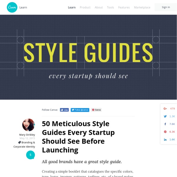
12 magically meticulous design style guides | Branding This is heading directly into geek territory. But we are self-confessed geeks, particularly when it comes to logo design, typography and pictograms. And that leads us to the meticulously regulated world of brand style manuals... A style manual, or style guide, is a set of standards for the design of documents, signage, and any other form of other brand identifier. The reason for their existence is to ensure complete uniformity in style and formatting wherever the brand is used to ensure no dilution of that brand. We love the obsessive nature of these, and so here we've gathered 12 of the best to inspire you when you create your own brand style guides... The National Aeronautics and Space Administration's Graphics Standards Manual was created by Danne & Blackburn in 1974 when NASA changed from its original crest-based logo to the 'worm' logotype that we are now familar with. The manual has recently been revived thanks to a Kickstarter campaign to fund its reissue. 02. 03. 04. 05. 06. 07.

TRÜF Does Beautiful Branding Like Nobody’s Business [Natasha Jen: designer, thinker, maker, educator, partner at Pentagram— and your HOW Logo Design Awards judge this year!] The creatives at TRÜF say that they’re obsessed with designing better brands—and with decades of marketing expertise from New York and LA’s top ad agencies, these award-winning designers know how to deliver. A couple of years back, we quoted TRÜF cofounder and creative director Adam Goldberg as saying that unicorn clients don’t come around all that often. But after hearing about the team’s latest work, we’re not so convinced that’s the case when you’re as talented as the folks at TRÜF. The creatives recently completed a branding project for the team at the University of California Humanities Research Institute (UCHRI), who asked the studio to brand their new “Horizons of the Humanities” (HoH) initiative. “We were a little wary that an institution would really want to push the boundaries of design,” Goldberg says. That said, Goldberg does have some tips to share:

Ci siamo sbagliati sul logo di Hillary? Lo scorso aprile Hillary Clinton si è candidata a presidente degli Stati Uniti e ha presentato il logo della sua campagna elettorale: è una “H” semplice, piatta e massiccia in cui la linea orizzontale è una freccia rossa. Nelle ore e nei giorni successivi alla sua diffusione il logo è stato molto criticato (e preso in giro) per essere troppo stilizzato, poco elegante e moderno. Alcuni tweet l’hanno paragonato al simbolo usato per gli ospedali, altri ne hanno notato le affinità con la bandiera islandese, altri ancora avevano criticato il predominante uso del rosso, il colore che negli Stati Uniti si associa al partito Repubblicano, e il fatto che la freccia puntasse verso destra. I pochi che avevano apprezzato il logo scelto per la campagna di Hillary Clinton lo avevano invece paragonato alla “O” usata da Barack Obama per la sua campagna presidenziale del 2008. La principale qualità del logo, scrive Quartz, è il suo essere strategicamente predisposto alla flessibilità.

Brand identity style guides This is great! The University of Connecticut has a nice one designed by Peter Good. Web and link to PDF version. Peter did a great job of differentiating the three identities a university typically has. – The academic and marketing identity (what most would think of as the main identity). – The athletics or mascot identity. UConn has a pretty simple color palette but, many academic systems also include extra Pantone colors to be used for marketing or just for the presidential or university seal (gold, etc.). Stanford University just redid their system too! I also like Vanderbilt University’s. The UK's best design studios revealed Earlier this year, the Computer Arts team polled almost 80 top designers, creative directors and studio founders from all across the UK to discover which industry peers they most revere, respect and in some cases envy, to produce the third-annual UK Studio Rankings. As per last year, this is all about peer reputation – regardless of number of staff, operating budget or awards won. In short, the 30 world-class studios that made the list are there because their fellow designers think they should be. Starting in reverse order, here are the studios that secured positions 30-11. 30. Founded: 2005Location: Shoreditch, LondonNumber of staff: 45 SomeOne has had a busy year. Simon Manchipp, co-founder of SomeOne, believes there’s a reason behind this success. The studio is very welcoming to interns, and many of the current team started out that way. To those looking to break into the sector, Manchipp has some words of advice. 29. Founded: 2012Location: Angel, North LondonNumber of staff: 4 28. 27.

The new Adobe CS6 branding CS6 has just shipped & just like we did in 2010 we'll take a closer look at the design goals of this Creative Suite release. An inside look at how it is to do design work for a big company like Adobe. Each Creative Suite release starts with a list of technical requirements and design goals. Our host is Shawn Cheris, he will guide us through the process just as he did with the CS5 branding. Goals & Requirements Below you'll find what Adobe wanted to accomplish from an experience standpoint: Expressive. Shawn Cheris explains further: Our work is functional and must be optimized for the contexts in which it will be consumed. Legible. Start With Color Below I'll let Shawn Cheris take us through the process of the creation of the new Creative Suite release. Whenever we start thinking about a new Creative Suite release, we like to start with the colors—and by extension—the icons. In terms of value and saturation, prior vintages varied quite a bit. We finally landed on the forms you see below.

Brand New UnderConsideration is a graphic design firm generating its own projects, initiatives, and content while taking on limited client work. Run by Bryony Gomez-Palacio and Armin Vit in Austin, TX. More… products we sell Flaunt: Designing effective, compelling and memorable portfolios of creative work. Brand New Conference videos / Individual, downloadable videos of every presentation since 2010. Prints / A variety of posters, the majority from our AIforGA series. Other: Various one-off products. writing Graphic Design, Referenced: A Visual Guide to the Language, Applications, and History of Graphic DesignRockport: 2009 Women of Design: Influence and Inspiration from the Original Trailblazers to the New Groundbreakers HOW Books: 2008 The Word It Book: Speak Up Presents a Gallery of Interpreted WordsHOW Books: 2007

Sushi & Co Visual Identity Situé sur un bateau de croisière de la Mer Baltique, Sushi & Co. est un restaurant japonais qui avait besoin d’une identité toute nouvelle. Les designers finlandais de chez Bond se sont occupés de l’identité visuelle du restaurant, en imaginant un logo en forme de poisson et d’hameçon dans l’esperluette de leur nom, ainsi que des menus, des plateaux avec des couleurs et des motifs océaniques. Photos by Angel Gil.

Related: