Cartographie des métiers du digital en 2016
Comme l’an dernier, l’IAB a présenté son étude sur les “métiers et compétences du marketing et de la communication dans un contexte de transition digitale” lors de l’événement Experiences de Microsoft. Les spécificités du marketing digital L’IAB indique que les spécificités du marketing digital identifiées en 2015 s’affinent : Technicité : technologies variées, renouvellement des outils de travail…Temporalité courte : ancrage dans le présent, temps réel, pas de best practices pérennes, optimisation permanente, cycles de travail courts…Précision / Ciblage : multiplicité des canaux et touchpoints, variété de publics, personnalisation des stratégies, outils techniques… À ces spécificités principales s’ajoutent des spécificités additionnelles : L’évolution des métiers du marketing digital On assiste également à une mutation profonde des métiers. Progressivement, certains métiers disparaissent. Les nouveaux métiers du marketing digital L’étude complète est disponible sur le site de l’IAB.
Unheap - A tidy repository of jQuery plugins
wwsd/README.md at master · enjalot/wwsd
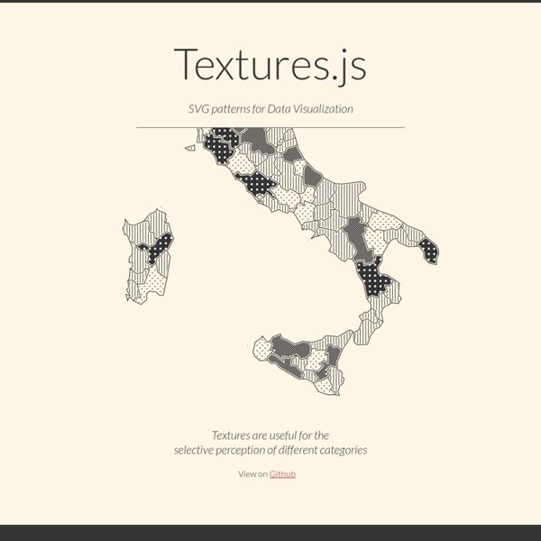
Tabulous.js
Proin elit arcu, rutrum commodo, vehicula tempus, commodo a, risus. Curabitur nec arcu. Donec sollicitudin mi sit amet mauris. Nam elementum quam ullamcorper ante. Etiam aliquet massa et lorem. Aenean tempor ullamcorper leo. Morbi tincidunt, dui sit amet facilisis feugiat, odio metus gravida ante, ut pharetra massa metus id nunc. Mauris eleifend est et turpis. Vestibulum non ante.
Comptes des ménages - Revenu disponible des ménages
Le revenu net réel disponible des ménages est défini comme la somme de leurs dépenses de consommation finale et de leur épargne, diminuée de la variation de leurs droits nets sur les fonds de pension. Cet indicateur correspond également à la somme des salaires et traitements, du revenu mixte, des revenus nets de la propriété, des transferts courants nets et des prestations sociales autres que les transferts sociaux en nature, moins les impôts sur le revenu et le patrimoine et les cotisations de sécurité sociale payées par les salariés, les travailleurs indépendants et les chômeurs. Le revenu disponible ajusté brut des ménages y ajoute les « revenus » des administrations publiques et des institutions sans but lucratif au service des ménages (ISBLSM) pour refléter les transferts sociaux en nature. Ces transferts reflètent les dépenses des administrations publiques ou des ISBSLM sur les biens et services individuels, tels que la santé et l’éducation, au profit des ménages individuels.
Swiper - Most Modern Mobile Touch Slider
Swiper - is the free and most modern mobile touch slider with hardware accelerated transitions and amazing native behavior. It is intended to be used in mobile websites, mobile web apps, and mobile native/hybrid apps. Designed mostly for iOS, but also works great on latest Android, Windows Phone 8 and modern Desktop browsers Swiper is not compatible with all platforms, it is a modern touch slider which is focused only on modern apps/platforms to bring the best experience and simplicity. Swiper, along with other great components, is a part of Framework7 - full featured framework for building iOS apps. Powered With Top Notch Features Library AgnosticSwiper doesn't require any JavaScript libraries like jQuery, it makes Swiper much more smaller and faster. Buy Us A Beer If you like Swiper you can always buy us a bottle of a nice beerso we can continue developement of such amazing product and to keep it always free Donate More Great Products By iDangero.us
Data Visualization 101: Pie Charts
In our Data Visualization 101 series, we cover each chart type to help you sharpen your data visualization skills. Pie charts are one of the oldest and most popular ways to visualize data. This classic chart is the perfect example of the power of data visualization: a simple, easy-to-understand presentation that helps readers instantly identify the parts of a whole. Without further ado, here’s everything you need to know about the pie chart. What It Is The typical pie chart is divided into sections that illustrate a numerical proportion. Where It Came From Scottish engineer William Playfair is generally credited with creating the world’s first pie charts back in 1801. Playfair’s pie chart showed the proportion of land held by the Turkish Empire in Asia, Europe and Africa. Although he invented the form, Playfair never called his invention a “pie chart.” Another series of Playfair’s pie charts in “Chart Representing the Extent, Population & Revenue of the Principal Nations in Europe in 1804.”
tcorral/Design-Patterns-in-Javascript
Data Visualization Libraries Based on D3.JS - Mike McDearmon
There are a lot of ways to visualize data on the Web (with more emerging every day), but the flexibility, versatility, and energized development community surrounding D3.js makes it a great option to explore. The following list of D3 plugins, extensions, and applications below is by no means comprehensive, but oughta be enough to keep you busy for a while. If you’re just getting your feet wet with D3.js, here are some great learning resources to get you acclimated:D3 for mere mortals: Great introductory lessons for those starting from scratch.Try D3 Now: Another great resource for learning about core D3 concepts.Data-Driven Documents (paper): An academic article by Mike Bostock with loads of footnotes.Learning D3, Scott Becker: A quick and effective tutorial series to get yourself up and running.Dashing D3: A very thorough tutorial series covering a LOT more than just D3.Interactive Data Visualization for the Web is a fantastic book by Scott Murray.
datedropper - jQuery Dates Plugin