
Rule filtering based on specific selector(s) support I’ve been using this trick for quite a while, but I never thought to blog about it. However, I recently realized that it might not be as common as I thought, so it might be a good idea to document it in a blog post. If you follow the discussions on www-style, you might have noticed the proposal for a @supports rule to query property and value support. Some people suggested that it should also test for selectors, for example whether a certain pseudo-class is supported. However, you can do that today, albeit in a limited manner (no OR and NOT support). The main principle that you need to keep in mind is that browsers are expected to drop rules with selectors they don’t understand, even partially. Suppose you want to apply the following CSS (for rudimentary custom checkboxes): only in browsers that support the attribute equality selector, the :checked pseudo-class and the ::before pseudo-element. (Thanks to Ryan Seddon for finding that out).
Different Tricks on How to Make Bootstrap Columns All the Same Height Bootstrap 3 (and now Bootstrap 4) are amazing CSS frameworks that can make the lives of developers of any skill-level easier. When I was more of a beginner and I first started using Bootstrap, I used every feature of it possible and used to hack it to get things to work the way I wanted. Now, with more experience, I mostly just use their reset and grid system. I now rarely alter any of its core functionality. Bootstrap's grid system is fantastic and near perfect in my opinion. # Equal Columns? I've made a demo CodePen to illustrate the issue when content in columns are different lengths and how it messes with design. Padding of 25px is added to the top and bottom of all Bootstrap stuffA subtle border wraps all .colsVarious backgrounds are used to see how things stack on each other and how this all works # Option 1: Use JavaScript or MatchHeight.js The first solution I'm going to use is with JavaScript. There's definitely pros and cons to taking a JavaScript approach. Match all heights
Selectivizr - CSS3 pseudo-class and attribute selectors for IE 6-8 About normalize.css – Nicolas Gallagher Normalize.css is a small CSS file that provides better cross-browser consistency in the default styling of HTML elements. It’s a modern, HTML5-ready, alternative to the traditional CSS reset. Normalize.css is currently used in some form by Twitter Bootstrap, HTML5 Boilerplate, GOV.UK, Rdio, CSS Tricks, and many other frameworks, toolkits, and sites. Overview Normalize.css is an alternative to CSS resets. The aims of normalize.css are as follows: Preserve useful browser defaults rather than erasing them.Normalize styles for a wide range of HTML elements.Correct bugs and common browser inconsistencies.Improve usability with subtle improvements.Explain the code using comments and detailed documentation. It supports a wide range of browsers (including mobile browsers) and includes CSS that normalizes HTML5 elements, typography, lists, embedded content, forms, and tables. Despite the project being based on the principle of normalization, it uses pragmatic defaults where they are preferable.
HEAD - A free guide to <head> elements CSS ShortHand Property Cheat Sheet digg Shorthand properties can be used to set several properties at once, in a single declaration, instead of wasting your precious time and space making declaration for each individual property. With css shorthand we make our code less complicated and more readable for those who want to explore it. Unfortunately, quite a few shorthand properties are available, that`s why we`ve collected most useful and most used for you. But be careful shorthand declaration is effective when condensed correctly, sometimes it can bring surprises. We hope that today`s freebie come in handy. Got any handy hints and tips related to CSS shorthand? Enjoy and Good Luck!
animation The animation property in CSS can be used to animate many other CSS properties such as color, background-color, height, or width. Each animation needs to be defined with the @keyframes at-rule which is then called with the animation property, like so: Each @keyframes at-rule defines what should happen at specific moments during the animation. For example, 0% is the beginning of the animation and 100% is the end. These keyframes can then be controlled either by the shorthand animation property, or its eight sub-properties, to give more control over how those keyframes should be manipulated. Sub-properties These sub-properties can then be used like so: Here’s a full list of which values each of these sub-properties can take: Multiple steps If an animation has the same starting and ending properties, it’s useful to comma-separate the 0% and 100% values inside @keyframes: Multiple animations You can comma-separate the values to declare multiple animations on a selector as well. Performance Desktop
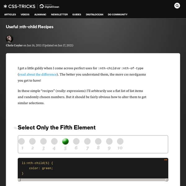
Beginner Concepts: How CSS Selectors Work Share this: monday.com helps you manage your projects. Are you new to CSS? This article is for you! Perhaps the biggest key to understanding CSS is understanding selectors. In the examples below, the CSS would be in a file called something like style.css that is referenced from an HTML document called something like index.html. Here's what that HTML file would be like: <! And the CSS file would contain just the selector blocks like you'll see below. #ID selector #happy-cake { } <! #Leveling Up ID selectors are the most powerful type of selector in terms of CSS specificity. #Class Selector .module { } <! #Leveling Up Class selectors are your friend. #Tag Selector h2 { } <! #Leveling Up Tag selectors are at their most useful when changing properties that are unique to that HTML element. Don't rely on them too much though. #Attribute Selector [data-modal="open"] { } <! #Leveling Up Hardly an issue anymore, but attribute selectors aren't supported in IE 6. #Positional Selectors :nth-child(2) { } #Leveling Up
Link types: preload - HTML: HyperText Markup Language <link> elements can accept a type attribute, which contains the MIME type of the resource the element points to. This is especially useful when preloading resources — the browser will use the type attribute value to work out if it supports that resource, and will only download it if so, ignoring it if not. You can see an example of this in our video example (see the full source code, and also the live version), a code snippet from which is shown below. And while this code won't actually cause preloading in any browsers — because video preloading isn't yet supported in any browsers — it still illustrates the core behavior behind preloading in general. <head><meta charset="utf-8"><title>Video preload example</title><link rel="preload" href="sintel-short.mp4" as="video" type="video/mp4"></head><body><video controls><source src="sintel-short.mp4" type="video/mp4"><source src="sintel-short.webm" type="video/webm"><p>Your browser doesn't support HTML5 video.
CSS Multi-column Layout Module Abstract This specification describes multi-column layouts in CSS, a style sheet language for the web. Using functionality described in the specification, content can be flowed into multiple columns with a gap and a rule between them. Status of this document This section describes the status of this document at the time of its publication. Other documents may supersede this document. This document was produced by the CSS Working Group as a Candidate Recommendation. A Candidate Recommendation is a document that has been widely reviewed and is ready for implementation. Publication as a Candidate Recommendation does not imply endorsement by the W3C Membership. This document was produced by a group operating under the 5 February 2004 W3C Patent Policy. This document has been a Working Draft in the CSS Working Group for several years. The specification was updated in April 2011 to correct a contradiction between the text and the pseudo-algorithm in section 3.4. Table of contents 1. 2. column box
CSS3 transition on click using pure CSS Meet the Pseudo Class Selectors Pseudo class selectors are CSS selectors with a colon preceding them. You are probably very familiar with a few of them. Like hover: a:hover { } They are immensely useful in a variety of situations. Link-related pseudo class selectors :link – Perhaps the most confusion-causing link-related pseudo selector. :visited – Selects links that have already been visited by the current browser. :hover – When the mouse cursor rolls over a link, that link is in it’s hover state and this will select it. :active – Selects the link while it is being activated (being clicked on or otherwise activated). There is a fun technique to remember all the link pseudo class selectors. Input & link related pseudo class selectors :focus – Defining hover styles for links is great, but it doesn’t help out those who used keyboard navigation to get to the link. :target – The target pseudo class is used in conjunction with IDs, and match when the hash tag in the current URL matches that ID. Relational pseudo class selectors
Quelle est la différence entre les chemins relatifs et absolus ? Souvent source d'erreurs, de pages introuvables, d'images manquantes ou de styles non appliqués, le format d'écriture des liens est très important. Et pourtant, on ne prend pas forcément garde à la façon dont on fait pointer ces dernier vers les différents fichiers cible. Suivant la convention d'écriture utilisée, de nombreux problèmes peuvent survenir. En effet, deux types d'écritures cohabitent, chacune avec leur spécificité propre : le chemin relatif (absence de slash initial) le chemin absolu (slash en préfixe du chemin) Sur le web Chemin relatif dossier/page.html La cible (page.html) va être cherchée par le navigateur à partir de la page html ou de la feuille de style qu'il interprète, dans le sous-répertoire "dossier". . ./ : signifie que la page est cherchée à partir du répertoire courant. .. ../ : signifie que la page est cherchée à partir du répertoire parent (on remonte d'un niveau). Il est tout à fait possible de remonter plusieurs répertoires. Chemin absolu /dossier/page.html
Flexible Box Layout Module W3C Working Draft, 23 July 2009 This version: Latest version: Editors: L. Authors and former editors: Neil Deakin, Mozilla Corporation, enndeakin@gmail.com Ian Hickson, formerly of Opera Software, ian@hixie.ch David Hyatt, Apple, hyatt@apple.com Copyright © 2009 W3C® (MIT, ERCIM, Keio), All Rights Reserved. Abstract The draft describes a CSS box model optimized for interface design. Status of this document This section describes the status of this document at the time of its publication. Publication as a Working Draft does not imply endorsement by the W3C Membership. The (archived) public mailing list www-style@w3.org (see instructions) is preferred for discussion of this specification. This document was produced by the CSS Working Group (part of the Style Activity). This document was produced by a group operating under the 5 February 2004 W3C Patent Policy. Table of contents 1 Overview For example: 2 Orientation end