

Bootstrap.
A Web Developer Looks at Drupal Views: Power and Flexibility. In the last Drupal module review, I discussed the contributed module CCK.
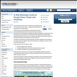
This time, I focus on Views – a module that puts real power and flexibility into your Drupal website. Views pulls from your Drupal database a collection of data, which has been stored through creation of content, CCK fields; or stored by other modules. It then organizes and displays that content according to your specification using the Views data controls. For those of you familiar with SQL statements, that is what Views produces through GUI interface. You do not need to have experience writing SQL queries, but having that familiarity is an advantage for more advanced use. This article is not meant to be a step-by-step guide, and the full capability of Views is beyond the scope of this article. Three examples of how you might use Views: Story Summaries Page First, a taxonomy Vocabulary was created for "News" and under which Terms were created for "News Briefs", "Features", and 'People Remembered".
Views Fields. Last updated April 5, 2007.
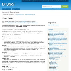
Created by merlinofchaos on March 17, 2006.Edited by add1sun, jlmeredith, hunmonk, Boris Mann. Log in to edit this page. Fields are only applicable to a view if either the page or block type is set to List or Table view. If using a purely teaser view, fields will be ignored. Fields tell Views exactly what to display and in what order. A Web Developer Looks at Drupal Views: Power and Flexibility. How to create views slideshow in drupal 7. In Drupal 7, you can create a catchy slideshow with virtually any content type or even field, from images to text, to video, and to do this you will need Views Slideshow module ( The most common type of slideshow is with images, and in this tutorial we will focus on exactly this type.
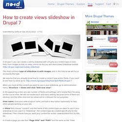
We assume that you already know how to create a content type and/or fields. Drupal 7 custom node view modes. One of the cool new things in Drupal 7 is the ability to easily add new “View modes” for nodes.
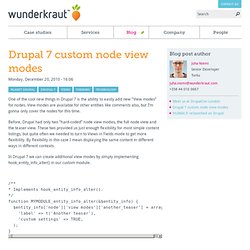
View modes are available for other entities like comments also, but I’m gonna only cover the nodes for this time. Before, Drupal had only two “hard-coded” node view modes, the full node view and the teaser view. These two provided us just enough flexibility for most simple content listings, but quite often we needed to turn to Views in Fields mode to get more flexibility. By flexibility in this case I mean displaying the same content in different ways in different contexts. Drupal 7 (RC2): How to create a customized front page. In this blog, I briefly describe a procedure for creating a customized Drupal front page.

It’s just a series of steps of what to do, not a detailed how-to. Get into the theme directory: $Drupal7_Home/sites/all/themes/danland, where “danland” is the theme name.Copy and paste page.tpl.php into the same directory as it already is. Rename the copied file to page--front.tpl.php. Notice that there are two dashes.Change whatever you’d like to do for your customization in the page--front.tpl.php. For example, for a testing purpose, I change the phrase “Theme by” at the bottom of the page to “Developed by”.Clear Drupal caches: Open a web browser and point the address to your Drupal homepage such as into your Drupal homepage as administrator.Click on “Configuration”Then, under the “Development” section, click on “Performance”Finally, click on “Clear all caches”.Refresh your Drupal homepage, the “Theme by” at the button of the homepage should be changed to “Developed by”.
User Control Panel. Downloads. AT Commerce. AT Commerce is fresh, professionally designed theme for eCommerce sites with baked in support for the Commerce module and Ubercart.
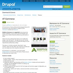
Mobile eCommerce is supported using responsive design methods, so your online store will display and work across mobile channels without any extra work or effort. There are many settings that allow you to modify the design, color and layout - this gets you up and running quickly while allowing you to re-brand the design to your requirements without any coding. The demo is currently using the "Blue Pearl" color scheme. There are two other color schemes included and you can design your own using the color picker. AT Commerce is a sub-theme - you must install Adaptivetheme 7.x-2.x to run this theme. 40 Best Drupal Responsive Themes Free and Premium. Built a website with Drupal CMS, each Responsive Drupal Theme has flexible design that adapts for different types of screen resolutions.
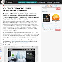
The new modern drupal 7 themes are always come with fully responsive layout design to fix all screen solution and support both computer, tablets, smartphone. So this post we commit to collection best responsive drupal theme with free and premium version to help easy to find professional drupal themes for create any kind of websites for business purpose. Responsive Design Testing.
Absolute Beginners Guide to Drupal. Training Details Date: Monday, March 19, 2012 Session Time: 9:00am-6:00pm Room: 206 Breakfast and Lunch will be provided.

Need more info? Check out the Training 101 page for more! Creating Responsive and Mobile-First Drupal Themes. British Medical Journal - bmj.com. Bmj.com before Drupal Between 1998 and November 2011 bmj.com ran on an old custom made proprietary platform made up of JavaServlets and CGI based application and templating systems.

It served the BMJ well but was expensive to maintain, and updating the site with new features was often difficult. AdaptiveTheme. Responsive HTML5 Base Theme Adaptivetheme is a powerful theme framework designed from the ground up to power modern, cross browser/cross device websites using responsive design techniques.
Adaptivetheme allows you to set up specific layouts for different device groups - such as desktop, tablet and smartphone - all with zero coding. Its all easy point-and-click configuration. A Responsive Drupal theme in 50 lines of code or less. Right now everyone wants a good mobile experience for their site and that is sparking discussions about what theme you can and should use to make your site accessible to the mobile world. At Zivtech, we feel that we have outgrown starter themes because we spend more time overriding than using them (especially in D7 since a lot of the great Zen stuff is baked right in).
The other day I got to thinking, just what would it take to build a responsive theme for Drupal from scratch. Is it so complicated that we need systems upon systems to handle it? You probably guessed, my answer is no. It turns out it takes less than fifty lines of code to build a basic working responsive theme complete with media query powered break points. Susy Grid systems have been around for quite a few years now but the advent of Sass makes them a whole new ball game. Introducing Tony Step by step Now lets take a tour of the code: This line just imports compass and Susy. Here’s where the magic begins. And that’s it! Responsive Web Design. 7 Steps to Building a Responsive Theme in Drupal 7. Steps to build your responsive drupal 7 theme 1) Understand your design and decide on the breakpoints. 2) Start with your theme info file name = RoboSmart description = A responsive mobile-first layout for a corporate site. version = VERSION core = 7.x stylesheets[all][] = css/style.css< 3) Create HTML5 pages for each unique page in your website.
Based on the grid system and the nature of your design, download grids from In the case of the RoboSmart theme we have used a single grid at 600 which is fluid and works for any screen resolution greater than 600px. Start with the mobile design and move the way up for all the breakpoints. 7 Steps to Building a Responsive Theme in Drupal 7. Building Responsive Websites with Drupal. Theming the Comment block in Drupal 7. Ever wondered how you can modify the way the default Comment block outputs the list of comments? In this article I’m going to show you how to override theme_comment_block() in order allow you to display these comments however you want.
If you look into comment.module (look but don't touch), you’ll notice that the Comment block content is given by the theme_comment_block() function: function comment_block_view($delta = '') { if (user_access('access comments')) { $block['subject'] = t('Recent comments'); $block['content'] = theme('comment_block'); return $block; }} So this is what you need to override.
To do that, like usual go ahead and copy the original from its API page: function theme_comment_block() { $items = array(); $number = variable_get('comment_block_count', 10); foreach (comment_get_recent($number) as $comment) { $items[] = l($comment->subject, 'comment/' . ...and then make the modifications you want. So let’s break this theme function down a bit. And that is pretty much it. Best Drupal 7 Responsive Themes. 6 Free Responsive Themes for Drupal 7. Mobile. Are we still designing for mobile? Only? Although there are cases in which it still makes more sense to have only two designs for a website - big screen (!)
And mobile, we are quickly graduating out of that period. Even mobile phones and laptops have so many different screen sizes that it’s difficult to account for all of them in this two-tier approach. Thus i think we are moving out of this intermediate phase in which we have separate layouts for smartphones and we are rapidly going into the next one: responsive layouts that look good on any screen size.