
Teaching with Interactive Data Visualization. d3.js ~ Examples. Calendar View This example demonstrates loading of CSV data, which is then quantized into a diverging color scale.
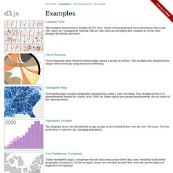
The values are visualized as colored cells per day. Days are arranged into columns by week, then grouped by month and years. Chord Diagram. Books & Links: The Data Visualisation Catalogue. The Data Visualisation Catalogue. Population Pyramid. 2013-01.pdf. Bokeh: Interactive Web Plots & Dashboards. Www.plosone.org/article/fetchObject.action?uri=info%3Adoi%2F10.1371%2Fjournal.pone.0014683&representation=PDF. Visual Analytics for Epidemiologists: Understanding the Interactions Between Age, Time, and Disease with Multi-Panel Graphs. Background Visual analytics, a technique aiding data analysis and decision making, is a novel tool that allows for a better understanding of the context of complex systems.
Public health professionals can greatly benefit from this technique since context is integral in disease monitoring and biosurveillance. We propose a graphical tool that can reveal the distribution of an outcome by time and age simultaneously. Methodology/Principal Findings We introduce and demonstrate multi-panel (MP) graphs applied in four different settings: U.S. national influenza-associated and salmonellosis-associated hospitalizations among the older adult population (≥65 years old), 1991–2004; confirmed salmonellosis cases reported to the Massachusetts Department of Public Health for the general population, 2004–2005; and asthma-associated hospital visits for children aged 0–18 at Milwaukee Children's Hospital of Wisconsin, 1997–2006.
Conclusion/Significance Figures Copyright: © 2011 Chui et al. Introduction. Designing a web-based learning portal for geographic visualization and analysis in public health. Interactive mapping and spatial analysis tools are under-utilized by health researchers and decision-makers as a result of scarce training materials, few examples demonstrating the successful use of geographic visualization, and poor mechanisms for sharing results generated by geovisualization.

Here, we report on the development of the Geovisual EXplication(G-EX) Portal, a web-based application designed to connect researchers in geovisualization and related mapping sciences, to users who are working in public health and epidemiology. Community Health Map: A geospatial and multivariate data visualization tool for public health datasets. A Human–Computer Interaction Lab, Department of Computer Science, University of Maryland, USAb Department of Computer Science, University of Maryland, USAc Department of Kinesiology, University of Maryland, USAd Department of Electrical and Computer Engineering, University of Maryland, USA Available online 13 March 2012 Choose an option to locate/access this article: Check if you have access through your login credentials or your institution Check access.
Visual analytics decision support environment for epidemic modeling and response evaluation. In modeling infectious diseases, scientists are studying the mechanisms by which diseases spread, predicting the future course of the outbreak, and evaluating strategies applied to control an epidemic.
While recent work has focused on accurately modeling disease spread, less work has been performed in developing interactive decision support tools for analyzing the future course of the outbreak and evaluating potential disease mitigation strategies. The absence of such tools makes it difficult for researchers, analysts and public health officials to evaluate response measures within outbreak scenarios. As such, our research focuses on the development of an interactive decision support environment in which users can explore epidemic models and their impact. A Visual Analytics Approach to Understanding Spatiotemporal Hotspots. As data sources become larger and more complex, the ability to effectively explore and analyze patterns among varying sources becomes a critical bottleneck in analytic reasoning.
Incoming data contain multiple variables, high signal-to-noise ratio, and a degree of uncertainty, all of which hinder exploration, hypothesis generation/exploration, and decision making. Data Visualisation in Healthcare Analytics. David Mimno - Understanding Machine Learning with D3: Visualization for Models and Algorithms. Python, R, machine learning and data visualisation. Data Visualization and D3.js Newsletter Issue 12. Method: Data visualization with D3.js and python - part 1 - Next Genetics. View the demo hereHTML source is at the bottom of the post Computers and the internet have changed academia in dramatic ways from greater sharing of data to a larger sense of community.
Science journals are now all digitized and available online either through your web browser or downloadble as a .pdf. Even with all the technology available for presenting data, most published papers still only contain static figures. I am not undervaluing the importance of having nicely formatted figures and graphs. But I do want to show how data can be presented with all the tools available now. Science papers are generally viewed on a computer through a web browser like Chrome, Firefox, or Safari which use javascript/html/css for displaying information.
Guest post: Visualizing data using a 3D printer. In a break from my usual obsessions and interests here is a guest blog post by Ian Walker.
I'm posting it because I think it is rather cool and hope it will be of interest to some of my regular readers. Ian is perhaps best known (in the blogosphere) for his work on transport psychology - particularly cycling - but is also an expert on psychological statistics.Some time ago, I had some data that lent themselves to a three-dimensional surface plot. The problem was, the plot was quite asymmetrical, and finding the right viewing angle to see it effectively on a computer screen was extremely difficult. I spent ages tweaking angles and every possible view seemed to involve an unacceptable compromise. Of course, displaying fundamentally three-dimensional items in two dimensions is an ancient problem, as any cartographer will tell you. Unfortunately, it then took until September 2012 before I could get hold of somebody with a 3D printer who'd let me test my code.
Demo source('r2stl.r') y <- x. Senior Data Analyst. Project/Assignment Title:Senior Data Analyst Level: GS7 Duration:11 months.

Six Types Of Analyses Every Data Scientist Should Know « Data Scientist Insights. Jeffrey Leek, Assistant Professor of Biostatistics at John Hopkins Bloomberg School of Public Health, has identified six(6) archetypical analyses.
As presented, they range from the least to most complex, in terms of knowledge, costs, and time. In summary, DescriptiveExploratoryInferentialPredictiveCausalMechanistic 1. D3.js – thinkDataVis. In this post I will be showing how I made my map for the post, Average age of Brooklyn’s buildings mapped. I did it with: Completely open source toolsD3.js and hexbins.js to render in FirefoxInkscape and Paint.NET for graphical editingOpen Street Map for the basemap Overall Technique The overall technique is based on using D3.js offline in the browser on a one-off basis to create a static visual that you will use elsewhere.
I outline the technique here in my post, Use D3.js on your desktop to publish static visualisations Get Data. David Mimno - Understanding Machine Learning with D3: Visualization for Models and Algorithms.