
Make an HTML5 video a background. Internet Blackout Day on January 18. Pricing Strategy for Creatives. EU regulators ask Google to 'pause' its privacy changes, need more time to investigate. Get 4.5GB of Extra Storage for Free on Dropbox by Uploading Photos. Lost At E Minor. Mentalgassi is an amazing blog documenting street art in Spain.
We're Living in a Space Cloud. — New measurements show the solar system is traveling through a thin interstellar cloud slower than expected. — The bubble in space surrounding the sun, known as the heliosphere, is probably shaped more like a squashed beach ball than a bullet.
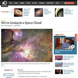
A NASA robotic probe sampling particles flowing into our solar system from the galactic neighborhood shows we're living in a cloud — and likely to stay that way for hundreds or even thousands of years. Art Vs. design. Progressive Enhancement 101: Overview and Best Practices. With an ever-growing variety of browsing situations and platforms that must be supported, the concept of progressive enhancement has become a hot topic of conversation.
Put simply, progressive enhancement is the technique of building websites with strong foundations so that it’s accessible to the wide range of browsing situations — from mobile devices and netbooks, to desktops and screen-readers. Designing a Website’s Introductory Text: Tips and Examples. Many websites choose to display a short explanatory text in a prominent position of their web page layouts to inform visitors what the purpose of the site is.
This introductory text, when crafted well, can help users quickly decide whether they’re in the right place or not. A website has mere seconds to let visitors know that they’ve found what they’re looking for, and your site introduction is your brief elevator pitch towards that. We’ll explore the use of website introductory text in various types of websites to gain a better understanding of trends and techniques for effectively designing them. CSS Typography: The Basics. Typography is an essential component of a website’s design.
This is for good reason: good typography is not only imperative for aesthetic appeal, but also improves site usability when text legibility and readability concepts are applied. Typography is all about proportions and spacing. There are also font styles to consider. How can we use CSS for great typography in our web designs? This is a question we’ll try to answer. This is the first part of a three-part series of guides on CSS typography that will cover everything from basic syntax to best practices and tools related to CSS typography.
Typography CSS Properties There are two main groups of CSS properties that control typography style: font and text. The font CSS property group dictates general font characteristics such as font-style and font-weight. The text CSS property group deals with the characters, spaces, words and paragraphs. Font Sizing A simple use of sizing text is as follows: Absolute-size Relative-size. Home of the Mozilla Project. Internet Archive: Wayback Machine. Say No to SOPA. A List Apart strongly opposes United States H.R.3261 AKA the Stop Online Piracy Act (SOPA), an ill-conceived lobbyist-driven piece of legislation that is technically impossible to enforce, cripplingly burdensome to support, and would, without hyperbole, destroy the internet as we know it.
We at ALA are not alone in our opposition to SOPA. Other opponents of the bill now before the U.S. House of Representatives include Google, Facebook, Twitter, Mozilla, Yahoo! , AOL, LinkedIn, eBay, Tumblr, Etsy, Reddit, Techdirt, Wikimedia Foundation, the American Civil Liberties Union, Human Rights Watch, and the Center for Democracy and Technology. The bill has its supporters, too, including Hollywood, media firms, the U.S. Reps. Behind the law#section1 Speaking personally, every for-sale creative product I’ve helped develop in the past two decades has reached appreciative paying customers through authorized sales channels, from tiny Paypal-powered sites to mighty Amazon and chain stores. Responsive Images: How they Almost Worked and What We Need.
It’s our job, as designers and developers, to pick apart even the seemingly most simple tasks to find ways to improve them.
When Ethan Marcotte coined “responsive web design,” he said that a responsive website is made up of three things: a flexible grid, flexible images and media, and media queries. In doing so, he opened up a world of new and exciting things to obsess over. I chose flexible images. Issue № 343. An Important Time for Design. A Pixel Identity Crisis. A note from the editors: This article was augmented post production with vendor prefix information to cover Webkit-based and Opera browsers.
The pixel has always been the smallest unit in screen-based design. Because it’s been indivisible, it is the concrete unit of measurement among screen-based designers. The phrase “a pixel is a pixel is a pixel” has been adopted to help print designers not used to fixed-screen density understand the concept. Because of this consistency, web designers have adopted pixels over points and other units to build websites.
Article Continues Below Now that hardware is changing and pixel densities are growing, pixels are struggling to find relevance as the stable unit they once were. The hardware pixel#section1.