
FatFonts. FatFonts is a graphical technique conceived and developed by Miguel Nacenta, Uta Hinrichs, and Sheelagh Carpendale.
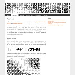
The FatFonts technique is based on a new type of numeric typeface designed for visualization purposes that bridge the gap between numeric and visual representations. FatFonts are based on Indo-arabic numerals but, unlike regular numeric typefaces, the amount of ink (dark pixels) used for each digit is proportional to its quantitative value. This enables accurate reading of the numerical data while preserving an overall visual context. How it works Fatfonts are designed so that the amount of dark pixels in a numeral character is proportional to the number it represents. Archives.
Daniel shiffman. Blprnt.blg. Code.nasa.gov.