
World of Merix Studio.
Scaleable. Other. Climb every mountain: visualising the world's 50 most prominent peaks. Data scientist Robert Mundigi has created a multi-faceted visualisation of the world's 50 most prominent peaks.
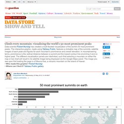
The interactive graphic, made using Tableau Public, features a clickable map of the summits, satellite images of each peak and figures for each mountain's prominence and overall elevation. In mountaineering terms, prominence is the vertical distance between a summit and the lowest contour line encircling it and no higher peak. The different visualisation panels are interlinked, such that selecting a mountain on either the map or bar chart will result in its satellite image being displayed via the Google Maps panel. The image you see upon first loading the page is of Mauna Kea, a volcanic mountain on the island of Hawaii.• Who made this graphic? Robert Mundigi• Where can I find it?
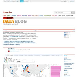
Behind a better life: interactive guide to the data. Turn autoplay off Edition: <span><a href=" Sign in Beta.
Sortable Table: The Better Life Index. Massive Health. Foodmood. How hard do you work? Surging Seas. 1940 U.S. Census Release. The first federal census was conducted in 1790, when America was beginning to grow as a country just after having gained independence from the British Empire.

Over the course of the next 220 years, 23 censuses have collected tons of data and statistics giving us a tremendous look into the evolution of American life. As the American family has changed, so has the actual census.