
Isotope · masonry layout mode. Masonry is the default layout mode.
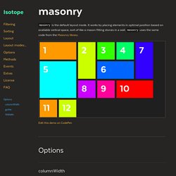
It works by placing elements in optimal position based on available vertical space, sort of like a mason fitting stones in a wall. masonry uses the same code from the Masonry library. columnWidth Aligns items to a horizontal grid. We recommend setting columnWidth. If columnWidth is not set, Isotope will use the outer width of the first item. Use element sizing for responsive layouts with percentage widths. <div class="grid"><div class="grid-sizer"></div><div class="grid-item"></div><div class="grid-item grid-item--width2"></div> ...
Gutter The horizontal space between item elements. To set vertical space between elements, use margin CSS. If set to an Element or Selector String, Masonry will use the width of that element. Masonry.
[Dossier] Tendances Web Design 2015. Les tendances, un vaste sujet qui en ferait bondir plus d’un.
![[Dossier] Tendances Web Design 2015](http://cdn.pearltrees.com/s/pic/th/dossier-tendances-design-99297262)
Avant de commencer, sachez qu’il n’y a pas qu’une seule vérité, qu’un seul cas de figure et encore moins qu’une seule façon de travailler avec les clients. Il est toujours important de rappeler que la notion de tendance, est comme son nom l’indique, une tendance. Il faut donc bien prendre avec des pincettes l’ensemble du document ci-dessous. Cependant, il est vrai que le webdesign d’il y a 5 ans ne ressemble plus du tout à celui d’il y a 10 ans et encore moins à celui d’aujourd’hui (ni de demain d’ailleurs). On peut, par contre, dégager des axes de réfléxion en supperposant diverses sources pour se dire : « Oui, là, le flat est une tendance ou encore, oui le responsive en est une autre ». Cet article est basé sur le document que vous trouverez plus bas de Philippe Rondepierre.
Crossfilter. Fast Multidimensional Filtering for Coordinated Views Crossfilter is a JavaScript library for exploring large multivariate datasets in the browser.
Crossfilter supports extremely fast (<30ms) interaction with coordinated views, even with datasets containing a million or more records; we built it to power analytics for Square Register, allowing merchants to slice and dice their payment history fluidly. Since most interactions only involve a single dimension, and then only small adjustments are made to the filter values, incremental filtering and reducing is significantly faster than starting from scratch. Crossfilter uses sorted indexes (and a few bit-twiddling hacks) to make this possible, dramatically increasing the performance of live histograms and top-K lists. Motion Design. Formations vidéos créatives sur le Motion Design.
Stevenwanderski/bxslider-4. Responsive jQuery Slider. Carrousel + vignette + zoom fancybox [Résolu] - HTML/CSS. Création de site e-commerce. Omni - Onepage / Multipage WordPress Parallax Flat. Version v2.0 of Omni is now available for download.
If you already downloaded Omni before the update, please redownload the theme and update your install. About Omni Omni is a high quality, flat and full responsive WordPress theme for creative businesses or photographers. It’s very easy to include pages and separators to a page. Add unlimited pages and separators to each page and sort them to your own liking!
Testimonials Just wanted to say for anyone looking at buying this theme. Include and Sort Unlimited Pages and Seperators Add Unlimited Seperators Omni includes the option to easily add unlimited separators and set the separator type. Associated Products Key features Features. Kronos - One Page Responsive Wordpress Theme. Creative Freelancer. Freebie: Flat Single Page Website. The freebie for today is called Singolo, it is a flat single page website.
Similarly to the freebie from yesterday, the Flato Lite user interface kit, once again everything used in this template is free. This means wont have to make any modifications, and be able to use it as is from the get to. The main and only font used is Lato, while most of the icons come from the Linecons icon set by Sergey Shmidt. Also make sure you click on the image below, in order to preview Singolo in full resolution. I should also note that Singolo will be sliced and diced into HTML & CSS, but it will be free and available only to my subscribers. MP - Free Minimal Responsive Portfolio Template. Today we have prepared for you another special freebie.
This time we have a free minimal responsive portfolio template, designed exclusively for ForPixels. The template is built using modern HTML and CSS technologies, is easy to customize according to your needs and is fully functional. Just download it, edit your details, upload it on your website and that’s it. The template is designed using the powerful Kube framework and is built and optimized for speed. This portfolio template also includes some shortcodes you can use on your website : headers, buttons, grids, tables and more. The package includes 8 different fully responsive HTML files : The homepage The homepage is built in a grid-like style with 3 columns. The portfolio page The portfolio page has the projects lined up in 2 and 3 items per row, so you can choose whichever you like best. Shortcodes page We have set you up with a few shortcodes you can use on the website.
Freebie: Flat Single Page Website. CSS.
Imprimeur en ligne. Rapport de Stage. Responsive. Code. Flash. Stage. Police. Tendances Webdesign. Inspiration Projet de Formation.