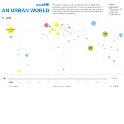

Submap. In - A visualization of migration flows. Urban Population Map. Close Source United Nations, Department of Economic and Social Affairs (UNDESA), Population Division special updated estimates of urban population as of October 2011, consistent with World Population Prospects: The 2010 revision and World Urbanization Prospects: The 2009 revision.

Graphic presentation of data based on The Guardian, 27 July 2007. This map is stylized and based on an approximate scale. It does not reflect a position by UNICEF on the legal status of any country or territory or the delimitation of any frontiers. Notes Because of the cession in July 2011 of the Republic of South Sudan by the Republic of the Sudan, and its subsequent admission to the United Nations on 14 July 2011, data for the Sudan and South Sudan as separate States are not yet available. Data for China do not include Hong Kong and Macao, Special Administrative Regions of China. Data for France do not include French Guiana, Guadeloupe, Martinique, Mayotte and Reunion. Migrations Map: Where are migrants coming from? Where have migrants left? Arab spring: an interactive timeline of Middle East protests.
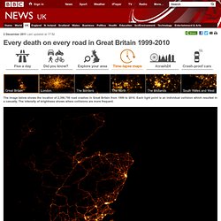
24 hours of Flickr geotagged uploads. Pulse of the City. Every death on every road in Great Britain 1999-2010. 2 December 2011Last updated at 17:52 The image below shows the location of 2,396,750 road crashes in Great Britain from 1999 to 2010.

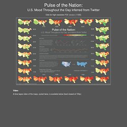
Each light point is an individual collision which resulted in a casualty. The intensity of brightness shows where collisions are more frequent. The video below animates 12 years of road crash data. Each light point is the site of a road collision resulting in injury. Pulse of the Nation: U.S. Mood Throughout the Day inferred from Twitter. Click for high-resolution PDF version (11MB) Video A time-lapse video of the maps, cycled twice, is available below (best viewed at 720p): Mood Variations A number of interesting trends can be observed in the data.

First, overall daily variations can be seen (first graph), with the early morning and late evening having the highest level of happy tweets. Similar variations were discovered independently by Michael Macy and Scott Golder, and first reported in the talk "Answers in Search of a Question" at the New Directions in Text Analysis Conference in May 2010. Weekly Variations Weekly trends can be observed as well, with weekends happier than weekdays. About the Data and Visualization The plots were calculated using over 300 million tweets (Sep 2006 - Aug 2009) collected by MPI-SWS researchers [1], represented as density-preserving cartograms. About Cartograms A cartogram is a map in which the mapping variable (in this case, the number of tweets) is substituted for the true land area. Coverage. Tell-all telephone.
Betrayed by our own dataMobile phones are tracking devices that reveal much about our lives.

One look at our interactive map of data provided by the Green party politician Malte Spitz shows why. Nuclear plants in your neighbourhoodHow many people live near a nuclear power plant in Germany? How many people lives within a radius of 20 kilometres? PISA based Wealth ComparisonHow do families live these days? ZEIT ONLINE analyzed and visualized the data OECD's comprehensive world education ranking report, PISA 2009. A United States of Europe?