
10 Data Visualization Tools To Bring Analytics Into Focus. Data visualizations can help business users understand analytics insights and actually see the reasons why certain recommendations make the most sense.
Traditional business intelligence and analytics vendors, as well as newer market entrants, are offering data visualization technologies and platforms. 10 Tools for Creating Infographics and Visualizations. The author's posts are entirely his or her own (excluding the unlikely event of hypnosis) and may not always reflect the views of Moz.
Hello there! I'm Miranda Rensch, Product Manager at SEOmoz and lover of visual communication. Communicating visually is one of the most effective ways to explain complex concepts and relationships, and can be a great way to explain your services/products and create valuable site content. 7 tools to convert between different data formats. 7 Data Viz Sites to Inspire Your Creative Eye. In the age of data overload, "big data" and "data visualization" are major buzzwords, and they'll likely grow even bigger as we gather more information on a daily basis.

With data visualization on the rise, we rounded up seven sites to help you find useful ways of interpreting big data, as well as infographics that parse information into visually pleasing graphics. These sites range from aggregation blogs to how-tos to tools that allow you to create your own visualizations. Check out the list, and let us know in the comments below what your favorite site is for data visualizations. 1. Big data? Ecco dieci strumenti per capire e far parlare i dati. La crescente mole di dati prodotti quotidianamente da persone e macchine sta rendendo sempre più importante la capacità di maneggiarli per estrarre informazioni utili.

School of Data - Evidence is Power. School of Data - Evidence is Power. Three tips for newspapers getting started in data journalism. To cultivate a loyal audience in today's media environment, newspapers must do more than simply churn out stories.
Editors and their newsrooms should create usable products, like data-driven news and information tools, to serve their readers, said Knight International Journalism Fellow Justin Arenstein at the World Editors Forum in Bangkok during his master's class for editors. Data journalism is “no longer just entertainment and no longer just voyeurism but creating decision-making tools based on news reporting,” said Arenstein, according to the International News Media Association (INMA). Here are a few tips for newspapers getting started with data journalism, gleaned from INMA's summary of the session: Choose stories with long-term value. “What is the pain that my readers are trying to solve in their lives?” Join the open data community. Creative data presentation tips for non-data people, by @rahulbot. Visual Literacy in an Age of Data. Statistician Hans Rosling inserts himself into charts during a TED talk and creates a narrative around the data.
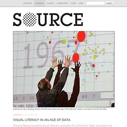
Shazna Nessa explains visual literacy and why it’s critical for data visualizers to take it seriously. It’s not what you look at that matters, it’s what you see. —Henry David Thoreau. Tools. The Times Developer Network is our API clearinghouse and community.
Get the latest news about New York Times APIs, read the API documentation, browse the application gallery and connect with other developers in the forum. This page includes tools and projects from The Times, as well as tools built by developers working with Times APIs. Be sure to visit the Application Gallery for examples of what you can do with Times APIs. Tools From The Times API Tool DBSlayer User-Submitted Tools The New York Times does not support or endorse any user-submitted tools. Feeds. Journalists’ beginner guide to coding. Welcome - The Data Journalism Handbook.
Poynter: i dieci tools del datagiornalismo (tradotti) Welcome - The Data Journalism Handbook. Processing.org. Your Random Numbers – Getting Started with Processing and Data Visualization. Over the last year or so, I’ve spent almost as much time thinking about how to teach data visualization as I’ve spent working with data.
I’ve been a teacher for 10 years – for better or for worse this means that as I learn new techniques and concepts, I’m usually thinking about pedagogy at the same time. Lately, I’ve also become convinced that this massive ‘open data’ movement that we are currently in the midst of is sorely lacking in educational components. The amount of available data, I think, is quickly outpacing our ability to use it in useful and novel ways. Out of Sight, Out of Mind: A visualization of drone strikes in Pakistan since 2004.
Is the weather worse under the Coalition government? Visualised. Is it possible that David Cameron's Britain is a colder place than Tony Blair's?
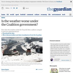
Or one with less sunshine? Well, maybe. For those who feel that the UK is turning - like Narnia under the White Witch - into a land where it is "always winter and never Christmas" we wondered how the weather has changed under this government - and how it compares to previous parties in power. The Met Office handily publishes monthly averages for sunshine, rainfall and temperature on its site. EmotionalCartographyLow.pdf. 13 tool di visualizzazione dati- SegnalazionIT. SegnalazionIT si è più volte occupato di tool di visualizzazione dati.

Quella che segue è la traduzione di un post di Steve Doig sul blog businessjournalism.org. FAQ: The Geography of Hate. Dear Readers, Thanks to everyone (well, almost everyone) for their comments and constructive critiques on our Geography of Hate map. In light of all of the different directions these comments have come from, we wanted to respond to some of the more common questions and misunderstandings all at once. Before commenting or emailing about the map, please keep the following in mind... 1. First, read our original post . Second, read through this FAQ. Third, read the "Details about this map" section included in the interactive map , itself. 3. 4. Slides, Tools and Other Resources From the School of Data Journalism 2013.
The School of Data Journalism, Europe's biggest data journalism event, brings together around 20 panelists and instructors from Reuters, New York Times, Spiegel, Guardian, Walter Cronkite School of Journalism, Knight-Mozilla OpenNews and others, in a mix of discussions and hands-on sessions focusing on everything from cross-border data-driven investigative journalism, to emergency reporting and using spreadsheets, social media data, data visualisation and mapping for journalism.
In this post we will be listing links shared during this training event. The list will be updated as the sessions progress. If you have links shared during the sessions that we missed, post them in the comments section and we will update the list. Infochimps. Ressources utiles. OpenRefine. Communautique d'entraide pour les débutants dans le domaine des données ouvertes. Many Eyes. Journalism in the Age of Data: A Video Report on Data Visualization by Geoff McGhee.
Source - Journalism Code, Context & Community - A project by Knight-Mozilla OpenNews. MEDIAPPRO. Analyse and synthesis of the existing data 1.2.1. Place of the 9 Mediappro partner countries in EU25 A/ Digital access According to the Global Digital Access index 2002 set up by the International Telecommunication Union and aiming at classifying countries into four digital access categories (high, upper, medium and low), the digital access of the 9 Mediappro partner countries is considered as higher or upper on a worldwide scale. Within the EU25, they present a real diversity and an equilibrated repartition. Considering this criterium, the Mediappro consortium should offer a good image of the global situation in Europe. * scale from 0 to 1, 1 is the highest score Source : This index combines eight variables, covering five areas: availability of infrastructure, affordability of access, educational level, quality of ICT services, and Internet use. It can be noticed that several of the 9 partner countries came in the top ten, in 2002, with one variable or more : B/ Internet use Eurostat survey.
Datasets on Datavisualization. Wikileaks US Embassy Cables 29 Nov 2010 Datasets Infographic, Politics Wikileaks began on Sunday November 28th publishing 251,287 leaked United States embassy cables, the largest set of confidential documents ever to be released into the public domain. Here's how media outlets strive to make the data more accessible than its original form.
Datavisualization.ch Selected Tools. Twitterminer. InfoExtractor.