Zoom
Trash

More Perfect Typography with Tim Brown. Tim Brown is the Type Manager for Typekit and one of the leaders in the field of typography.
The following is a summarization of a presentation by Brown that was shot for a recent edition of ‘Build’. Throughout the video, Brown explains the importance of typography in creating an experience through the use of modular scales and the use of typeface which plays a huge part in setting the tone of a layout. History of Typography The Picture from Bill About 500 years ago, a man named Aldus Pius Manutius set up a print shop in Venice that would become the start of typography. Using Typeface to ‘Color’ Your Content The Picture from Antonio. How to Safely Match Web Design and Typography. As web designers, our designs have to be both usable and attractive, communicate information and create a name.

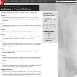
Our designs must be technically proven and tested for our dear readers. With that in mind, web designing is definitely a form of communication and nowadays, this type of communication is very, very important. As a form of communication, we, as web designers do the speaking and we hope our readers and viewers listen. 25 Awesome Graffiti Fonts for Designers. Advertisement Graffiti is the name for images or lettering scratched, scrawled, painted or marked in any manner on property.
Graffiti is any type of public markings that may appear in the forms of simple written words to elaborate wall paintings. Graffiti has existed since ancient times, with examples dating back to Ancient Greece and the Roman Empire. Typography is all about expressing and Graffiti Fonts are an important part of Typography. Graffiti Fonts are widely used in several posters & designs. Typeface Pairing. Fonts - Type topics: Glossary. This section provides a small glossary of terms frequently used in the type world. alignment The positioning of text within the page margins.
Alignment can be flush left, flush right, justified, or centered. Five simple steps to better typography – Part 3Mark Boulton. – April 25th, 2005 – I’m pleased this series is turning out to be so popular and it’s somewhat confirmed what I suspected.
A bit of a thirst for simple typographic design theory. As I’ve been writing this series i’ve deluged by email and comments from people agreeing, disagreeing, asking for more information etc. What’s great is designers are thinking and talking about typography again. Designers are questioning typography and not just letting the font and the software do the work. The third installment of this series is dedicated to just one typographic element - Ligatures. Five simple steps to better typographyMark Boulton. – April 13th, 2005 – Typography, I find, is still a bit of mystery to a lot of designers.
The kind of typography I’m talking about is not your typical “What font should I use” typography but rather your “knowing your hanging punctuation from your em-dash” typography. Five simple steps to better typography ? Part 5Mark Boulton. – May 18th, 2005 – The final part in this series, I’m glad to say is a little more cut and dry than the last in the series.
It’s more about historical typographic theory but with a simple, practical guide to ensuring a balanced use of typeface weights. WebDesignHelper.co.uk - Design Theory 9 - Typography (Part 1) Typography (Part 1) Visual contrast and page design Good typography depends on the visual contrast between one font and another, and the contrast between text blocks and the surrounding empty space.
Nothing attracts the eye and brain of the viewer like strong contrast and distinctive patterns, and you only get those attributes by carefully designing them into your pages. 10 Most Inspiring Videos about Typography. Words aren’t just words.
Rather, words portray meanings and can stir up every emotion from anger to lust. As such, designers have immense power over their audiences simply with the fonts they select and the manner in which those fonts are used. The following are ten 10 masterfully composed videos that provide perfect examples of how typefaces can be used to move audiences. 1. Trollback & Co.: Pop! 20 Free Asian Style Fonts. Fonts, something all designers use.
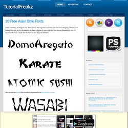
Some just for their signature and some cant even start designing without a nice looking font style. So for all designers out there, a big list of Asian style fonts that you can download for free. To download the fonts, simple click the font you like. Enjoy the list below. Here are some top free fonts that can make an impression for your full color flyer printing. Friday Fresh Free Fonts #77. “What Font Should I Use?”: Five Principles for Choosing and Using Typefaces - Smashing Magazine. Advertisement. Weekly Typography Inspiration # 16. Welcome to the 16th post of Weekly Typography Inspiration series here on AddictiveFonts.com.
In this roundup you will get creative, fanciful, elegant, imaginative and graceful typography showcase for your inspiration, crafted and actualized by professional artists and designers from all over the world, we hope you will enjoy our collection of master pieces of typography. You can tell us about your favorite typography inspiration of this week using comment box. United Social Sports Comp Work Whole Foods Signpainting Typographic Movie Poster Turboneger – Apocalypse Dudes The Ultimate Driving Machine Bauhaus. Recherche d'images. Top 50 Free Fonts Created in 2010. 2010 is just going to end leaving good and bad memories and moments for everybody. 2010 also gave us some of the most professional, creative, fanciful, elegant, imaginative and graceful fonts of all time.
Today we have collected a collection of top 50 free fonts created in 2010. We hope you will like this collection. Clagnut is Richard Rutter. Fonts from Adobe. Typographica. Type Reviews, Books, Commentary. 35 Professional Bold Sans Serif Fonts. Sans-serif fonts should be top pick if you are finding a font specifically for headlines or captions as they look more prominent and appealing in large size. Normally people don’t use them as standard for body text because it is believed sans-serif fonts are more difficult to read as compared to serif fonts, as they don’t have “serifs” (small decoration at the end of strokes).
Therefore if you are finding Free Sans-Serif font to design a large logo or to use it in title\headline of your project, you can select anyone of these high-quality professional fonts. House Industries. Lorem Ipsum - All the facts - Lipsum generator. CSS Typography: Contrast Techniques, Tutorials and Best Practices - Noupe Design Blog.
Sep 15 2008 The main advantage of elegant CSS typography lies in its ability to be both attractive and improves the user experience. When chosen wisely and used carefully, it can be very effective to support the overall design. Fillerati - Faux Latin is a Dead Language.