
Www.iconsbyhour.co.uk. Iconic. Iconmelon. Designing Iconic Across Different Sizes. SVG is great because (as its name suggests), it’s scalable.
This means that SVG images, including icons, will be super-crisp at any size, right? Nope. If you’ve followed our Kickstarter project, you probably know what we’re going to say, so we’ll be brief. It’s easy to assume that vector images are the salvation for legibility, but that simply isn’t the case. Even if an image is put together as vectors, it still renders on the screen through pixels. Additionally, icons have optimal legibility ranges—just like typefaces. That’s why Iconic is being designed at three sizes. This is Tough Designing icons in three sizes is so challenging because each size doesn’t exist in a vacuum. Many of the icons we’ve designed to this point were made with the explicit understanding that they’d need to drastically change before shipping. Specific Challenges So enough generalizations, let’s get into the specific challenges we’re addressing when designing an icon at three sizes.
Modified Proportions Arrowheads. Are Hollow Icons Harder to Understand? A/B testing getting cheaper, startups should take advantage. Until recently, A/B testing was a service usually restricted to the big companies who could afford it.
But at last month’s China Axlr8r Demo Day, accelerator graduate Splitforce showed off a solution for small- and medium-sized mobile app developers to incorporate a lightweight A/B testing SDK into their products. It’s free for apps with up to 1,000 daily active users. The ability to test two variants simultaneously (e.g. a red button and a blue button appear in the same app on two different phones) and real-time analytics are what Splitforce hopes will differentiate it from its fellow budget competitors. The company got a lot of positive feedback at Demo Day, with one former Axlr8r mentor remarking that it’s only a matter of time before they get copied in Silicon Valley. While that could prove troublesome for Splitforce, more competitors in the space means lower costs for the companies that use them. Any developer who doesn’t take advantage of this trend will be at a disadvantage. Blog - Edward Sanchez. The debate of icon / text and icon + text label always fascinated me.
Gmail started out with an all text interface and very few icons, recently it changed to the polar opposite and went on mostly icons with very few labels. But which is better? And why? Novice users are not as familiar as we are with certain conventional icons, making an icon-only interface potentially harder for them to use. On the other hand, to the tech-savvy users, having text labels everywhere may be perceived as cluttered and unnecessary. After some googling on the subject I found a fascinatingly detailed study on the usability of icons only, text only and icons + text. Icons have been used on a limited basis since the early days of computer graphics. It is easy to find enumerations of the supposed advantages of icons in popular literature. All of these claims about icons implicitly compare icons to text in the interface. Icons differ in the degree of abstraction. The Sketchbook of Susan Kare, the Artist Who Gave Computing a Human Face.
Hello there!
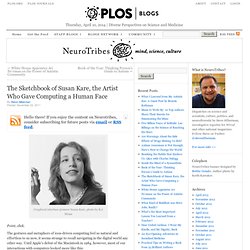
If you enjoy the content on Neurotribes, consider subscribing for future posts via email or RSS feed. Graphical interface pioneer Susan Kare, photo by R.J. Muna Point, click. The gestures and metaphors of icon-driven computing feel so natural and effortless to us now, it seems strange to recall navigating in the digital world any other way. How did we get from there to here? Iconsutra. Know Your Icons Part 1 – A Brief History of Computer Icons. As with great works of art, you must look into the past to appreciate the future.
With roots as far back as the 1970's, the humble icon has come a long way. Following is a collection of icons though history. Although there have been many other operating systems in the time between 1981 - 2010, I've hand picked the ones of the most significance to modern icon design.