
Infographic: How Do You Know if Antibiotics Are in Your Meat? How To Compost In Your Apartment - An Illustrated Guide. Do you feel a tinge of guilt every time you throw out an extra slice of tomato?
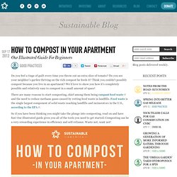
Do you see your neighbor’s garden thriving on the rich compost he feeds it? Think you couldn’t possibly compost because you live in an apartment? We’d love to show you how it’s completely possible and relatively easy to compost in a small amount of space! There are many reasons to start composting, chief among them being rampant food waste and the need to reduce methane gases caused by rotting food waste in landfills. Food waste is the single largest component of solid waste reaching landfills and incinerators in the U.S., according to the EPA. So if you have been thinking you might take the plunge into composting, read on and have fun! Click here to print out a black and white version of the instructions to hang above your bin! RELATED POSTSWhat Is Vermicomposting? Why Graph Search Is Facebook's Big Data Solution Video game driving: A brief history. Top Social Media Infographics in 2012. How the Arab World Uses Facebook and Twitter [INFOGRAPHICS]
Social media has been often touted for the role it played in the popular uprisings that have spread across the Arab world since December 2010.
![How the Arab World Uses Facebook and Twitter [INFOGRAPHICS]](http://cdn.pearltrees.com/s/pic/th/facebook-twitter-infographics-121668468)
Despite the buzz, you may be surprised that only 0.26% of the Egyptian population, 0.1% of the Tunisian population and 0.04% of the Syrian population are active on Twitter. Of all the countries in North Africa and the Middle East, Twitter is most popular in Kuwait, where 8.6% of the population is active users, defined as those who tweet at least once per month. Facebook's more popular throughout the region. In its most popular country, the U.A.E., some 36.18% of the population is on Facebook. 50 Great Examples of Data Visualization. Wrapping your brain around data online can be challenging, especially when dealing with huge volumes of information.

And trying to find related content can also be difficult, depending on what data you’re looking for. But data visualizations can make all of that much easier, allowing you to see the concepts that you’re learning about in a more interesting, and often more useful manner. Below are 50 of the best data visualizations and tools for creating your own visualizations out there, covering everything from Digg activity to network connectivity to what’s currently happening on Twitter.
Food of the Summer Infographic. Filed under: All Infographics , Food Infographics | No Comments » Food of the Summer Infographic Reviewed by Infographics Guy on Sep 3 Rating: Rating: 0.0/ 10 (0 votes cast) Ah summertime. A time for good-old-fashioned summer food and summertime fun. Now, the focus of this graphic is on summer food in the United States, but it could just have easily been about summer food and summer fun, as you can’t have one without the other.
According to the graphic, the most popular days for grilling are Labor Day, Memorial Day, and the 4rth of July. –A whopping 82% of U.S. household own a grill or smoker –45% of grill owners use their grill at least 1-2 times per week during peak summer months. . –167,700,000 of grills were shipped in 2009, up from the amount shipped the previous year, which means Americans are getting “grillier.” There were some things I was surprised by. Let there be no argument then. Design: A- The graphic has a fun, amusement park style feel to it, which is appropriate. Pepto_Infographic_.jpg (JPEG-Grafik, 1728x1471 Pixel) - Skaliert (59. Trend-blend-2009.jpg (JPEG-Grafik, 2382 × 1684 Pixel) - Skaliert (63%) 623_trends_and_technology_timeline.jpg (JPEG-Grafik, 3969 × 2807 Pixel) - Skaliert (37%) Soft drinks zoom.it. Polytopia_project_gen010.pdf (application/pdf-Objekt)