

01_IL_DesignNewReality_2_0.jpg 1,587×2,619 pixels. Open-source Weave liberates data for journalists, citizens. Data nerds from government and academia gathered Friday at Northeastern University to show off the latest version of Weave, an open-source, web-based platform designed to visualize “any available data by anyone for any purpose.”
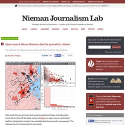
The software has a lot of potential for journalists. Weave is supported by the Open Indicators Consortium, an unusual partnership of planning agencies and universities who wanted better tools to inform public policy and community decision-making. The groups organized and agreed to share data and code in 2008, well before Gov 2.0 was hot. Think of Weave as more programming language than app. It powers websites such as the Connecticut Data Collaborative and Rhode Island’s RI DataHUB. Data is linked, which means you can view the same datapoint from many angles. The software reminds me of SPSS, from my college poli sci days. Georges Grinstein, a professor of computer science at UMass Lowell, develops Weave with a team of some 20 students. Fascinating New Visualization From Yahoo! A new tool from Yahoo!

Gives you a glimpse of what’s being read on its homepage, as well as what’s popular from the last 24 hours. It’s actually a gorgeous display that lets you see different breakdowns of who’s viewing what, when, and why. The visualization is a part of its C.O.R.E. project, which Yahoo! Explains like this: Manuel Lima on the Power of Knowledge Networks in the Age of Infinite Connectivity. Tool detects patterns hidden in vast data sets. Researchers from the Broad Institute and Harvard University have developed a tool that can tackle large data sets in a way that no other software program can.

Part of a suite of statistical tools called MINE, it can tease out multiple patterns hidden in health information from around the globe, statistics amassed from a season of major league baseball, data on the changing bacterial landscape of the gut, and much more. The researchers report their findings in a paper appearing in the December 16 issue of the journal Science. From Facebook to physics to the global economy, the world is filled with data sets that could take a person hundreds of years to analyze by eye. Sophisticated computer programs can search these data sets with great speed, but fall short when researchers attempt to even-handedly detect different kinds of patterns in large data collections. MINE is especially powerful in exploring data sets with relationships that may harbor more than one important pattern.
Shapes for Sounds: A Visual History of the Alphabet. By Maria Popova What the anatomy of your tongue has to do with ship flags and the evolution of human communication.
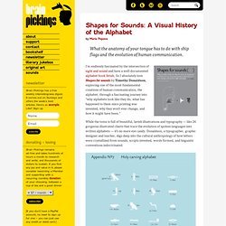
I’m endlessly fascinated by the intersection of sight and sound and have a well-documented alphabet book fetish. So I absolutely love Shapes for sounds by Timothy Donaldson, exploring one of the most fundamental creations of human communication, the alphabet, through a fascinating journey into “why alphabets look like they do, what has happened to them since printing was invented, why they won’t ever change, and how it might have been.” While the tome is full of beautiful, lavish illustrations and typography — like 26 gorgeous illustrated charts that trace the evolution of spoken languages into written alphabets — it’s no mere eye candy.
Donaldson, a typographer, graphic designer and teacher, digs deep into the cultural anthropology of how letters were crystallized from sounds, scripts invented, words formed, and linguistic conventions indoctrinated. Donating = Loving. Visualization: The Spread of Dance Music. Stefanie Posavec on Her Obsessive Analog Data Visualization. Applying Sentiment Analysis to the Bible « OpenBible.info Blog. This visualization explores the ups and downs of the Bible narrative, using sentiment analysis to quantify when positive and negative events are happening: Full size download (.png, 4000×4000 pixels). Things start off well with creation, turn negative with Job and the patriarchs, improve again with Moses, dip with the period of the judges, recover with David, and have a mixed record (especially negative when Samaria is around) during the monarchy. The exilic period isn’t as negative as you might expect, nor the return period as positive.
In the New Testament, things start off fine with Jesus, then quickly turn negative as opposition to his message grows. The story of the early church, especially in the epistles, is largely positive. Methodology Sentiment analysis involves algorithmically determining if a piece of text is positive (“I like cheese”) or negative (“I hate cheese”). Print or online? One masterpiece and one screw-up – VisualJournalism. THE NEW YORK TIMES just ran an interesting article titled ‘It’s All Connected: A Spectator’s Guide to the Euro Crisis’ and the intro ending with ‘The graphic here helps you see the intertwined complexities.’
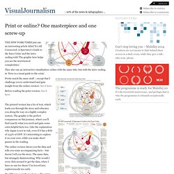
They also ran an interactive visualization online with the same title, but with the intro ending in ‘Here is a visual guide to the crisis’. Pretty much the same stuff – except that I challenge you to understand and gain insight from the online-version: See it here: Before reading the print-version. See it here: