
+150 herramientas WEB para docentes. Why "Infographic Thinking" Is The Future, Not A Fad. We get a lot of infographic pitches.
Almost all of them suck. Why? Because while they may well be "information plus graphics," they often lack what designer Francesco Franchi calls "infographic thinking. " This isn’t just "how to make some numbers and vector graphics look clever together. " It’s a narrative language--it’s "representation plus interpretation to develop an idea," to quote Franchi. Franchi issues a lot of wisdom we’ve heard before--"If we don’t have content, we can’t have design," "You have to be informative but also entertain the reader," etc. "Infographic thinking" doesn’t let designers to interpret a narrative visually; it lets them invite the viewer [to] join in the process of interpretation, too. [via Stellar Interesting; Image: Jakub Krechowicz/Shutterstock] WordPress Stats Infographic. 9 Powerful Free Infographic Tools To Create Your Own Infographics - DATA VISUALIZATION.
Integrating Infographics into the iClassroom. So TechChef4U has caught the Infographics Influenza!
Being a bit of a Pinterest fanatic, I have found an easy way to support and feed my Infographics Habit. Continuing to stock pile Educational Infographics on my Pinterest board, I waited until I found an app-ortunity to share these resources with one of my teachers and create a delectable lesson. During my stint as an 8th Math tutor, I had a few of the teachers approach me about engaging math lessons that they could utilize with 8th Math after the STAAR test. I mentioned the topic of infographics and shared a few of the ones I had collected.
Then I worked with one of the teachers in particular, Mrs. Pinterest: Educational Infographics “Common Core Standards: Interpret information presented visually, orally, or quantitatively (e.g., in charts, graphs, diagrams, time lines, animations, or interactive elements on Web pages) and explain how the information contributes to an understanding of the text in which it appears” The history of distance learning [Infographic] The world of snail-mail, shorthand typing and correspondence courses is a far cry from today's range of certified online courses, Skype language lessons and mobile app-based education.
![The history of distance learning [Infographic]](http://cdn.pearltrees.com/s/pic/th/distance-learning-infographic-26272741)
Distance learning once meant completing assignments via post, or homework-based lessons in conjunction with weekly or monthly seminars. Now, exams can be taken online, students can communicate effectively through online platforms, and lab sessions can be attended through live streaming. MIT is one of the latest course providers to offer online alternatives, and the concept of digital learning has expanded across the globe -- taking root more recently in China. Just how far has distance learning progressed? For more information, view the infographic below. Visual graphics and visual histories.
Cómo la tecnología ha cambiado la educación #Infografía. Microsoft ha presentado una interesante infografía que pone de relieve cómo la tecnología ha influido en la educación.
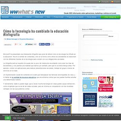
No en el sentido de contenidos, sino en la forma cómo ahora los estudiantes se relacionan con los diferentes facetas de la tecnología para cumplir con sus obligaciones escolares. La infografía está en español (te puede dar un poco de melancolía recordando como eran tus días de estudiantes) y nos plantea una realidad que damos por sentado, pero que no se tenía tiempo atrás. Por ejemplo, contar con aplicaciones para realizar presentaciones escolares, trabajar en grupo a través de servicios en la nube. Un impresionante caudal de contenido en la web que reemplazan las famosas enciclopedias de casa, y ni hablar de la cantidad de recursos educativos que encontramos online que nos pueden facilitar estudiar una determinada materia.
Vía: Windows. Website Monitoring Blog. Infographics. Cool Infographics. Infographics. Patrick Nouhailler. Infographic World. Visual.ly. The Infographics Showcase. Daily Infographic. Michael Stoll. Recently i obtained a map, that i was looking for for a long time.
I couldn’t find it on the obvious websites. I was interested to get a copy, because it shows the city i grew up at the time i grew up there. It’s also the city, where i went to school and to university. Its Konstanz at the Lake of Constance, down in the southmost part of Germany with a border to Switzerland. My former professor, Bernd Jahnke, recently showed me his copy of the map and this fueled my searching again.
During our meeting Bernd Jahnke pointed out, that there was a copy of the map on display at the entrance of a parking garage in the center of Konstanz. Also the day my ad was published i was sitting next to my phone all the time, n-o-b-o-d-y called. I was curious to lern, how he found my advertising and he told me the following. But why is somebody reading a newspaper from the other end of Germany. He agreeed to bring the map to Konstanz, hand it over to my parents in law, where i picked it up recently. Cours AJM Michaeil Stoll actualisé.
Alberto Cairo.