
Ideas, issues, knowledge, data - visualized! Not All Bad Ideas Are Created Equal. Some say ideas are everything.
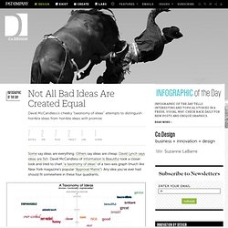
Others say ideas are cheap. David Lynch says ideas are fish. David McCandless of Information Is Beautiful took a closer look and tried to chart "a taxonomy of ideas" of a two-axis graph (much like New York magazine’s popular "Approval Matrix"). Any idea you’ve ever had should fit somewhere in these four quadrants. The upper right zone is the promised land, the intersection of "functional" and "well-structured" ideas where everything from "genius" to "interesting" lies. Information Is Beautiful. Information Is Beautiful Awards. Simply stunning response to our first challenge!
Thank you all for the effort and time dedicated to our spreadsheets. We just loved your creativity and the quality of the submissions. Well done! The amount of interactive pieces caught us by surprise so we asked our lovely sponsors for some extra cash-ola for a new category. So we now have $1,000 to give to the interactive / motion graphics winner. Is The HPV Vaccine Safe? Remember a couple years ago when there was a big kick-off about the safety of the HPV (Human Papillomavirus) Vaccine?
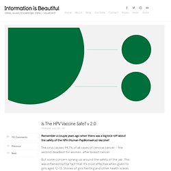
The virus causes 99.7% of all cases of cervical cancer – the second deadliest for women, after breast cancer. But some concern sprang up around the safety of the jab. This was inflamed by the fact that it’s most effective when given to girls aged 12-13. Stories of girls fainting and other health scares snowballed the concern into full-on fear. McCandless, David: The beauty of data visualization.