background preloader

CSS

Facebook Twitter

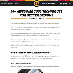
50+ Awesome CSS3 Techniques for Better Designs. CSS3 is gaining momentum, despite the fact that the standard hasn’t even been finalized. There are hundreds of tutorials out there to teach designers how to use it, but unfortunately a lot of them cover the same ground. And some of the tutorials teach designers to do things that they might not think of as useful, though the techniques can usually be adapted to fit a project perfectly. Below are more than fifty awesome CSS3 tutorials. Many are strictly CSS and HTML based, while others also incorporate JavaScript. If you have a favorite technique or tutorial that’s not included below, please share it in the comments! Using CSS3 For Imageless Illustration Various new methods in CSS3 allow a number of very complex graphics to be created using pure CSS and no images. Pure CSS iPhone Illustration A mixture of borders, transforms and gradients to make an animated image of an iPhone.
Creating The Opera Browser Logo in CSS3 A clean illustration of the Opera logo rendered using CSS3 techniques. CSS Layout | layers, absolute and relative positioning and floating elements. Path // → → CSS LAYOUT One of the major benefits of using CSS is that you’re no longer forced to lay your sites out in tables. The layout possibilities of CSS give you complete control over the positions and dimensions of all page elements. If you’ve tried laying out a page with tables, you have probably been irritated in the past by the inability of your browser to render your page exactly as you had wanted.
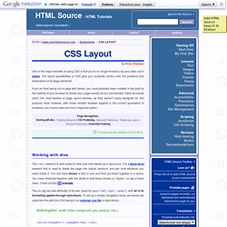
Table structures aren’t the most flexible of page layout devices, as they weren’t really designed for this purpose. This page was last updated on 2012-08-21 Working with divs The <div> element is well-suited to take over from tables as a layout tool. The div tag has few attributes of its own (save for align="left | right | center"), with all of its formatting applied through stylesheets. <div id="navigation">...navigation links... This example code uses some very simple CSS code. Floating Elements Column 1 Column 2 CSS Positioning Browser Compatibility Note: Absolute Positioning.

CSS Layers - CSS tutorial. With CSS, it is possible to work with layers: pieces of HTML that are placed on top of the regular page with pixel precision. The advantages of this are obvious - but once again Netscape has very limited support of CSS layers - and to top it off: the limited support it offers is quite often executed with failures. So the real challenge when working with layers is to make them work on Netscape browsers as well. First look at this example: Second look at the code: To create a layer all you need to do is assign the position attribute to your style. The position itself is defined with the top and left properties. Finally, which layer is on top is defined with the z-index attribute. You can either position your layer calculated from the upper left corner(absolute) or calculated from the position where the layer itself is inserted (relative).
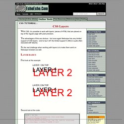
While the position property indicates the out spring of our coordinate system, the left and top properties defines the exact position of our layer. A CSS styled table. A css only dropdown menu further examples. 24th May 2006 Menu #1 - 24th May 2006 This first example is a flexible width top level list that expands to fit the text.It has a fixed height and uses a background image that stretches the full width of the outer div, in this case 750px, and a background div in each top level link to mark the right hand edge of the link. The top level hover varies the text color and the bottom border color.The sub level hover varies the background color and adds a background square bullet against the top line of each list item.

Sub level drop down lists can be positioned anywhere (left/right) beneath the top level list. The sub levels are a fixed size, but can easily be changed to suit your requirements, and have a single pixel border. Menu #2 - 30th May 2006 A simple looking menu this time, but looks can be deceiving.This one is for those people who have no room for a drop down/ flyout menu. The hover state varies the background and foreground shades of grey. Menu #3 - 4th June 2006 Menu #4 - 6th June 2006. Learn HTML5, JavaScript and CSS With Mozilla's "School of Webcraft. Mozilla is getting ready for the January semester of School of Webcraft, a 100% free developer training resource run in partnership with Peer 2 Peer University. Last semester, the School of Webcraft offered 15 classes; now, Mozilla is trying to get around 30 classes going for the January semester. Classes will be between six and 10 weeks long; they'll revolve around topics relevant to web designers and developers, including HTML5, JavaScript and CSS.
Previous classes have also included non-developer topics such as organic SEO. Requisite skill levels will run the gamut from novice to expert. Students learn through a combination of free and open learning materials, online study groups and hands-on assignments that test their hacking skills. If you're a leader in the developer community, you can also step up and lead a course yourself. Registration opens on January 8; until then, you can sign up for the School of Webcraft e-mail list.

Practical CSS Layout Tips, Tricks, & Techniques. The Web Standards Project’s (WaSP) Browser Upgrade Initiative (BUI), has spurred many a designer to move towards more standards compliant web design, using CSS rather than tables for layout to save user bandwidth while enhancing underlying semantics, accessibility, and reach. “Tables are dead…”#section1 Several designers have taken Jeffrey Zeldman’s lead in posting tutorials that have helped us get over the initial hump of table-less design. The first efforts have focused on creating two or more columns using CSS positioning instead of tables, thus allowing for a (complete) separation of structure from presentation.

These broader techniques have been documented and archived at Eric Costello’s glish and Rob Chandanais’ Blue Robot. Others have chimed in, including Owen Briggs’ Box lesson and Tantek Çelik’s box model hack/workaround, detailed by Eric Costello, and explained by Tantek. “...Long live tables”#section2 The question#section3 One Step at a Time#section4 And the HTML: caption 1 caption 2. CSS Positioning. Review the W3C CSS standard recommendation.
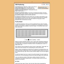
To use CSS for layout effectively, it helps to know how it's used to position page content. This article gives an overview of the methods and rules that govern visual rendering in the CSS2 specification. It also points out some things to watch out for. Although the specification applies to any device for displaying web pages, this article focuses on how it works in browsers. Many details are left out for the sake of simplicity. For a definitive reference, see the standards publication. It's important to remember that a given browser may not support a given feature or may even implement it incorrectly. The Box Model To understand positioning in CSS you must first understand the box model. Margin border padding content Margins are always transparent. When referring to boxes throughout this article, the term "margin edge," "border edge", etc. means the the outer boundary of the corresponding box area as shown above.

Box Types Containing Blocks. CSS from the Ground Up. Introduction If you are frightened by the prospects of using Cascading Style Sheets, there's no need to be. Using a computer can be daunting for someone coming to it afresh but after a while, you think nothing of it. It all comes down to taking small steps to begin with and that's what I'm going to do in this series of tutorials. One step at a time! Whether you normally use a WYSIWYG editor and stay clear of that source stuff in the background or even if you have never created a Web page at all, this tutorial will set you off in the right direction.

It assumes little or no knowledge of putting a Web page together. What will you need? Nothing special. Don't panic! A graphics editor is not essential because I won't be worrying too much about graphics to begin with. Oh, you will also need a browser, but that goes without saying. Step One – A Basic Page Before we can do anything, we need a basic Web page. <html><head></head><body> This is my Web page </body></html> <head>... The <body>... The <! Advanced CSS Layouts: Step by Step. Abstract The Challenge: Replicate WebRef's front page using CSS. The Solution: CSS and lots of iterations. Rogelio Lizaolo improves on Kwon Ekstrom's CSS version of WebRef's tabled home page. Months in the making, the final design successfully duplicates WebRef's layout without the use of tables.
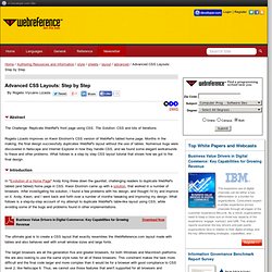
Numerous bugs were discovered in Netscape and Internet Explorer in how they handle CSS, and we found some elegant workarounds to these and other problems. What follows is a step by step CSS layout tutorial that shows how we got to the final design. Introduction In "Evolution of a Home Page" Andy King threw down the gauntlet, challenging readers to duplicate WebRef's tabled (and fabled) home page in CSS. The ultimate goal is to create a CSS layout that exactly resembles the WebReference.com layout made with tables and also behaves well with small window sizes and large fonts.

The target browsers are all the generation five and greater browsers, for both Windows and Macintosh platforms. Tableless layout HOWTO. Abstract and status It has been advocated many times that tables shouldn't be use in HTML for layout purposes. This page shows one way to create a 3 columns layout using CSS only. Please send comments and suggestions to Dominique Hazaël-Massieux. Translations of this article are available. Introduction HTML is a structural language, which means it is - or should be - used to add structure into a text through tags. But since the apparition of tables in HTML, it has been very often used for layout purpose, usually split a web page into columns.

This document describes one way to create a 3 columns layout and links to other layout techniques. Layout description The technique described below is the one used in the page for new W3C users and allows to build a 3 columns layout, with the following features: It's ideal for homepages since it allows to have a complete text in the center and nice lists of links on the side. Implementation This layout uses CSS absolute positionning. Top 50 Best CSS Articles and Resources. Top 50 Best CSS Articles and Resources January 11th, 2009 | Design | Modern web design is not possible without Cascading Style Sheets (CSS).

The flexibility of CSS allows web developers to create websites that load faster and are easier to update. This post features a collection of the best articles and resources dedicated to CSS techniques, tips, hacks, tools, and tutorials. CSS Tips and Techniques - Push Your Web Design Into The Future With CSS3 [Smashing Magazine] - CSS Typography: Contrast Techniques and Best Practices [Noupe] - Powerful CSS Techniques for Effective Coding [Smashing Magazine] - 4 Uber Cool CSS Techniques for Links [Css Globe] - 10 Principles of the CSS Masters [NETTUTS] - 12 Principles For Keeping Your Code Clean [Smashing Magazine] - 101 CSS Techniques Of All Time - Part 1 [Noupe] - Resetting Your Styles with CSS Reset [Six Revisions] - 53 CSS Techniques You Couldn’t Live Without [Smashing Magazine] - 101 CSS Techniques Of All Time - Part 2 [Noupe] CSS Templates and Layouts.

A circular menu with circular sub menus. Date : 10th November 2008 For all modern browsers Information A follow on from the simple single level circular menu, this one adds a sub menu level of smaller icons in a circular pattern within the top level circle. There is also the facility to add a simple description of each icon. Tested in IE6, IE7, Firefox, Opera, Safari (PC) and Google Chrome. The icons are taken from the Milky set. If you want a zip file of this menu then please email me, but check the requirements in the copyright information below. Copyright Because of all the time and effort spent in producing this demonstration I would ask that you respect my copyright.

Terms and Conditions This demonstration can be used subject to the following terms and conditions. Frames without frames - Introduction. A word of caution This method no longer works in IE6 under specific circumstances - please see the compatibility section for more information. Overview This series of pages demonstrate how to recreate all the goodness of frames with not a frame tag in sight. The source order of your elements can be as semantically and pedantically logical as you wish and you can use pixels, ems or percentages to position them. Yes, yes, I know - you want to get to the nitty gritty, the actual frames without frames stuff.

Inspiration I was knuckling down to make an all-singing, all-dancing demo expounding the wonders of Eric Bednarz's ghost in the box hack since the question "How can I produce frames-like results in CSS? " Framework Ah yes. The xml prolog (that's the funny looking tag at the very top - <? Next thing is set to set the body's autoflow to hidden - now all the absolutely positioned elements will stay firmly in place just as if they were set to be fixed. Except it isn't. Pretty simple, huh? SkillShare Forum - CSS Beauty - Scaling image in div to fit full screen but maintain aspect ratio. Toggle. This is a test! Can you see me? Pros: It does not need JavaScript (e.g. for NoScript users)Status is remembered across reloads with no need for cookie tricks Cons: It works in Gecko based browsers (Firefox, SeaMonkey, Flock, Netscape...) and in Opera, but it does not work in Safari and IE :( The relevant styles: The relevant HTML: <label for="mytoggle" class="toggle">Toggle Div visibility... -- Giorgio Maone There's a browser safer than Firefox, it is Firefox, with NoScript.