
How Minimal is Too Minimal? Minimalism, interestingly enough, is usually born out of excess.

In all arts, in all ways of life, we start out by taking and adding whatever we can. When we start to realize that more is not necessarily better, and that we can get by with less stuff, we try to simplify by removing unnecessary elements so we can focus on what’s truly important. What is Minimalism? Minimalism, in its purest form, is the reduction of something to its bare essentials. Think of a car. In web design, minimalism translates to producing a site from the basics. Minimalism is an exercise in restraint, with the eventual goal being a design that helps the user focus and accomplish their tasks as quickly as possible.
When designing minimalist websites, you should keep three things in mind: Subject: What’s the most important thing on the web page? Why Use Minimalism? This minimalist thinking is the basis of modern web design — we begin with content, perhaps a brand, but nothing else. Don’t Worry, You Can Still Be Pretty. When Less is More. As designers, we all know that a minimalist design can achieve beautiful results.

Still, many designers have trouble creating one; either they have a hard time making a page with so few elements look good or the final result just doesn’t look “complete.” There are many articles on the Web about minimalism and this article aims to help you achieve a minimalist design that is beautiful but not bare. To top it off, we’ll present a small showcase of minimalist designs, so that you can analyze why some designs work and others don’t.
What Is Minimalist Design? Minimalist design has been described as design at its most basic, stripped of superfluous elements, colors, shapes and textures. Its purpose is to make the content stand out and be the focal point. The design movement began in Switzerland and was then applied to a variety of media: graphic design, architecture, music, literature, painting and, more recently, web design. We’ll go over the basic principles of minimalist design. Less Is More 1. Trends and Examples. Minimal Design Website Gallery and Community. Effective Minimalism in Experience Design. Minimalism.

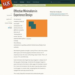
It’s not easy to complete a study of successful minimalism. For starters, the more effective examples there are of “minimalism in action,” the less material there is for us to study. Nevertheless, minimalism is a guiding aesthetic behind some of today’s best websites. Minimalism’s greatest strength is clarity of form; clean lines, ample white space, and minimal graphical elements lend an air of simplicity to even the most confounding subject matter. That is, of course, if it’s used effectively. Some minimalist sites forget that easy navigation is always one of the top goals of web design. This is why a beautiful minimalist site combined with great usability is so impressive: an easily navigated, simple site can be a very powerful form of communication. The art of minimalism Minimalism exists all around us: in architecture, fashion, sculptures, graphic design, painting, literature, music, and other applied fields…the list goes on and on. Palmito Ranch. 60 Clean and Minimal Websites for Inspiration.
During the last few months we have looked at using negative space and minimalist design.

Today we bring you 60 of the best-looking minimalistic sites currently on the world wide web. Sit back and get inspired… Minimal Design Keeping things simple is the whole purpose of minimal design. Why overcomplicate what's already a very full web with thousands more links and buttons?! Some of the sites have gone completely minimal without any effects apart from well laid out content, where as others choose to display the huge amount of content with sliders, drop downs and some very uniquely designed objects. Minimal design is actually a lot more difficult to achieve than you might think; keeping your designs clean but bursting with important information is a fine balance. 1: TouchTech Top feature: I love the color scheme, but the way the circles pop out from the cloud on loading the site is really funky. 2: Weltunit Top feature: Well displayed products make this site straight to the point. 3: Polar Gold.