

Elastic Design. It can be difficult to move from a static, pixel-based design approach to an elastic, relative method.
Properly implemented, however, elastic design can be a viable option that enhances usability and accessibility without mandating design sacrifices. A pixel is an unscalable dot on a computer screen, whereas an em is a square of its font size. Because font sizes vary, the em is a relative unit that responds to users’ text-size preferences. It is perhaps easier to adopt a print-like, static approach to design because there is less to think about when dimensions don’t change. To employ an elastic approach, however, is to fully exploit the capabilities of computer displays and web browsers. You may want your website to display in a specific way, but your users may want it another way. To understand how Elastic Design works, we must first take another look at a subject that would seem to be played out: namely, different methods of text sizing.
Elastic text#section1 For example: Too wide! Fixed vs. Fluid vs. Elastic Layout: What's The Right One For You? - Smashing Coding. Advertisement The problem has boggled the minds of Web designers for years: fixed, fluid, elastic or a hybrid layout design?

Each option has its benefits and disadvantages. But the final decision depends so much on usability that it is not one to be made lightly. So, with all the confusion, is there a right decision? By considering a few factors and properly setting up the final design, you can end up with a successful layout design that reaps all the benefits. This article discusses the pros and cons of each type of layout. Also consider our previous articles: Pros And Cons Of 6 CSS Layout Patterns: Part 2. Last time we began talking about some different css layout patterns.
We looked at fixed-width, fluid/liquid, elastic, and hybrid designs. Today we’ll look at the 2 layouts we didn’t include last time, responsive, and fluid/elastic grids. I’ll then offer some additional thoughts about which layout you might choose for a project. 6 CSS Layouts As a reminder and to once again make sure we’re talking about the same thing, here are the quick definitions for each layout. Fixed-Width — Overall width is fixed with absolute measurements (px). Responsive Layouts The idea behind responsive layouts is to have the design respond to various conditions that your visitor controls. Pros And Cons Of 6 CSS Layout Patterns: Part 1. There are a number of css layout patterns you can use when developing a website.
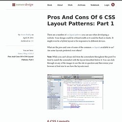
Your design could be of fixed-width or it could be fluid or elastic. It might even be a hybrid layout or be responsive to different devices. What are the pros and cons of some of the common css layouts available to us? Are some layouts preferred over others? Note: While you can’t always tell from the screenshots throughout this post I’ve tried to match the screenshot with the layout described below it. 6 CSS Layouts You’re likely familiar with all of the css layouts below, but to make sure we’re on the same page, let’s quickly define each. Fixed-Width — Overall width is fixed with absolute measurements (px). How To Develop Elastic Grid Layouts In CSS.
Flexible layouts are created by using relative measurements as opposed to absolute measurements.
The question is relative to what? With elastic layouts the measurements are set relative to something internal to the design, usually the size of the type. We previously talked about fluid layouts, which I defined as using measurements relative to the browser window. Moving from a fluid layout to an elastic layout is actually quite simple. In fact we only need to make one change to the css we previously used to make the layout change. Before getting to the code let me say the definitions above aren’t necessarily used by all. Fluid Grids. Early last year, I worked on the redesign of a rather content-heavy website.
Design requirements were fairly light: the client asked us to keep the organization’s existing logo and to improve the dense typography and increase legibility. So, early on in the design process, we spent a sizable amount of time planning a well-defined grid for a library of content modules. Article Continues Below Over the past few years, this sort of thinking has become more common. Thanks to the advocacy of Mark Boulton, Khoi Vinh, and others, we’ve seen a resurgence of interest in the typographic grid, and how to use it on the web.
However, our client had one last, heart-stopping requirement: the design had to be fluid and resize with the browser window. Minimum screen resolution: a little white lie#section1 Instead of exploring the benefits of flexible web design, we rely on a little white lie: “minimum screen resolution.” As it turns out, it’s simply a matter of context. With ems, it’s easily done.