
10 principes d’ergonomie/UX à appliquer dans vos tableaux de bord. Après le Design graphique, ce deuxième volet de notre série spéciale « Dataviz » se concentre sur l’ergonomie et l’expérience utilisateur (UX).
Sur votre dashboard, tout se joue dans les premières secondes. Souvent, la première impression est décisive. Si l’aspect général est clair, concis, et cohérent, vous avez déjà fait 50 % du travail. Vous devez donc soigner votre mise en page en priorité. Are Infographics Still Relevant? Making data visualisations: a survival guide. Let's focus Export - Mapping Tools Radar visual literacy.pos. Version 2.6.
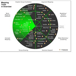
A simple and versatile visual brainstorming software supporting a variety of visual templates and methods (incl. mind mapping). www.mind-pad.com The Headcase Mind Mapper is a reasonably priced mind mapping program that - according to some reviews- is still quite buggy. www.nobox.de A comprehensive, high-quality mapping suite enabling concept and mind maps, as well as a variety of other formats, such as network diagrams or technical drawings. www.conceptdraw.com/ Supports a whole range of mapping methods, incl. Www.smartdraw.com Based on the cognitive mapping approach, Banxia's decision explorer helps group clarify their rationale and reach consensus-based decisions. www.banxia.com Powersim is a commercial, full scale simulation and network diagramming software.
Milestones in the History of Thematic Cartography, Statistical Graphics, and Data Visualization. The 2013 Awards Are Open! The Art of Data Visualization. David McCandless : « L’interaction est le futur de la datavisualisation » David McCandless, précurseur du design d’information, a donné une conférence à Paris dans le cadre des Rencontres RSLN aux Techdays.
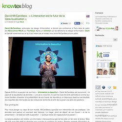
Après un entretien sur les définitions du design d’information, Claire et Camille reviennent sur ce qu’il faut retenir de ce rendez-vous entre McCandless et son public. Depuis 2009 et la parution de son livre « Information is beautiful » David McCandless est surnommé « le pape de la visualisation de données ». Lors de la rencontre, il a permis à ses fervents admirateurs comme aux moins familiers d’assister à la présentation de son travail, de répondre à un data-quizz basé sur les résultats des requêtes des internautes sur les moteurs de recherche et enfin de lui poser une série de questions. Cas pratiques Pour nous plonger au cœur de son monde, McCandless a ponctué son intervention de cas pratiques. La datavisualisation doit révéler une information intéressante qui permet de créer un lien avec le lecteur.
Guest Post: The Future of Data Visualization. Data is everywhere - and readily accessible The open data movement is finally beginning to have some real impact.
Governments are beginning to open up and give people access to the data they have rights to. Some corporations are realizing they don’t need to keep closed doors on all of their data, especially if they are doing the right thing anyway. The number of places to find open data on the web is growing rapidly, and shows no signs of slowing.
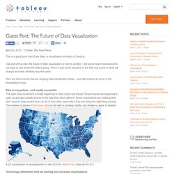
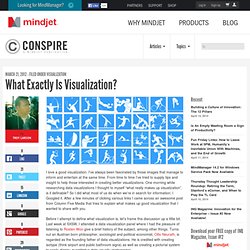
A D3 visualization of unemployment in the US from Nathan Yau, data via the BLS Technology determines how we develop and consume visualizations The devices we use to view data visualizations have changed drastically with the advent of tablets, smartphones and other portable computing devices. Other technologies in the visualization chain are constantly evolving, as well. What Exactly Is Visualization? I love a good visualization.
I’ve always been fascinated by those images that manage to inform and entertain at the same time. From time to time I’ve tried to supply tips and insight to help those interested in creating better visualizations. Some thoughts on visualisation. Can someone please stop the infographic madness? A few years ago, we started doing info graphics by actually doing a lot of research on data and then working with a great group of guys to create art and visualization.
One of them was good enough to be linked from Apple’s website. Old magazine hands called these infographics, charticles. Wired and the old Red Herring were particularly good at this stuff. (No surprise, because my former editor and goddess of the charticle, Joanna Pearlstein works(worked) for both those publications.) USA Today, The New York Times and The Wall Street Journal, too had been creating these graphics for a long time, except they didn’t use them as a way to generate web-buzz.
Mint, a financial management company did a great job of using infographics to draw attention to their blog and by extension to their service. It is my belief that in modern times, no success goes unpunished. Like this: Information graphics. Information graphics or infographics are graphic visual representations of information, data or knowledge intended to present complex information quickly and clearly.[1][2] They can improve cognition by utilizing graphics to enhance the human visual system’s ability to see patterns and trends.[3][4] The process of creating infographics can be referred to as data visualization, information design, or information architecture.[2] Overview[edit] Infographics have been around for many years and recently the proliferation of a number of easy-to-use, free tools have made the creation of infographics available to a large segment of the population.

Social media sites such as Facebook and Twitter have also allowed for individual infographics to be spread among many people around the world. In newspapers, infographics are commonly used to show the weather, as well as maps, site plans, and graphs for statistical data. "Graphical displays should: Scientists Say Infographics Can Save Morons From Themselves. Really? It’s a sad fact of our cultural moment that anyone can marshall their own "facts" to support just about any argument or political position imaginable.

(Thanks, Internet.) What’s worse, psychology studies have shown that rebutting factually impoverished arguments with actual facts has precisely the opposite effect one would hope: it actually makes people cling even tighter to their fictions. Statistical graphics. Statistical graphics, also known as graphical techniques, are information graphics in the field of statistics used to visualize quantitative data. Overview[edit] Exploratory data analysis (EDA) relies heavily on such techniques. They can also provide insight into a data set to help with testing assumptions, model selection and regression model validation, estimator selection, relationship identification, factor effect determination, and outlier detection. In addition, the choice of appropriate statistical graphics can provide a convincing means of communicating the underlying message that is present in the data to others.[1]
Statistical Graphics and more » Blog Archive » Statistical Graphics vs. InfoVis. The current issue of the Statistical Computing and Graphics Newsletter features two invited articles, which both look at the “graphical display of quantitative data” – one from the perspective of statistical graphics, and one from the perspective of information visualization.
Robert Kosara writes from an InfoVis view: Visualization: It’s More than Pictures! Information visualization is a field that has had trouble defining its boundaries, and that consequently is often misunderstood. It doesn’t help that InfoVis, as it is also known, produces pretty pictures that people like to look at and link to or send around. But InfoVis is more than pretty pictures, and it is more than statistical graphics. The key to understanding InfoVis is to ignore the images for a moment and focus on the part that is often lost: interaction.
Data visualization. Data visualization or data visualisation is viewed by many disciplines as a modern equivalent of visual communication.
It is not owned by any one field, but rather finds interpretation across many (e.g. it is viewed as a modern branch of descriptive statistics by some, but also as a grounded theory development tool by others). It involves the creation and study of the visual representation of data, meaning "information that has been abstracted in some schematic form, including attributes or variables for the units of information".[1] Data 2 Wisdom - D.I.K.W.